Key takeaways ✨
|
Most marketers spend hours perfecting a subject line, agonizing over a call-to-action button, and A/B testing preview text. Then they get to the footer and paste in whatever was there last time. That’s a missed opportunity, and in some cases, a compliance risk.
Your footer is the most consistent piece of real estate in every email you send. It’s also one of the few parts of your message that is legally regulated. Getting it right protects your business, builds trust with subscribers, and reinforces your brand identity every single time you hit send.
Why the footer actually matters
When used thoughtfully, the footer tells recipients who you are, gives them a way to reach you, and provides an easy exit if they no longer want to hear from you. That last part isn’t just good manners; laws like CAN-SPAM in the United States, CASL in Canada, and GDPR in the EU require it.
Beyond compliance, a well-built footer signals professionalism. A footer with a real address, a working unsubscribe link, and clear sender information tells subscribers this is a legitimate business that respects their inbox. Skip these details, and even a great campaign can look like spam.
What’s required
Regulations vary slightly by region, but a few elements are consistently non-negotiable for commercial email:
- A physical mailing address. CAN-SPAM in the US requires a valid postal address; this can be a street address, a P.O. box, or a registered commercial mail receiving agency. If mailing globally, include your registration number.
- A clear unsubscribe mechanism. Subscribers need an obvious, functioning way to opt out of your email program. That request must be honored promptly, typically within 10 business days under CAN-SPAM, and even faster under GDPR expectations. Not to mention bulk sender requirements from the major mailbox providers that require the unsubscribe request to be honored in 48 hours or less. Your subscribers expect this to be in near real time.
- Accurate sender identification. The “from” name and footer text should make it obvious who is actually sending the email. Don’t hide behind a vague brand name if a specific company entity is legally responsible for the message. If your parent brand is the umbrella for several others, consider adding language that points out the relationship between them.
- No misleading information. This isn’t a visible line of text, but it’s a requirement: everything in your footer must be accurate and not designed to deceive the recipient about the source of the email.
- A link to your privacy policy. This builds trust, and subscribers have come to expect it. While it’s not technically mandated, I consider this a requirement.
Quick check: if you removed everything from your footer except the address and the unsubscribe link, would you still be compliant? If not, something’s missing.
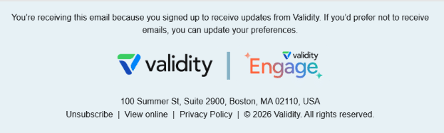
This example covers all the bases, and I love that the logo is present here as well.
What’s nice to have
Once the legal boxes are checked, you have room to make the footer work harder for your brand and your subscribers. Consider adding the following:
- Preference center link. Instead of an all-or-nothing unsubscribe, let subscribers adjust frequency or topics. If your preference center leads to the ability to unsubscribe, ensure you include the word “unsubscribe” in the link so it’s clear to subscribers where they can take that action if desired. Filters and algorithms are also looking for the word “unsubscribe” in this section of your email.
- Contact information. A phone number or support email gives your brand a human dimension. I’ll take this opportunity to say: please allow a reply to your email. This isn’t a footer thing, but rather a nice-to-have for your customer. More and more, mailbox providers are looking for this when making filtering decisions.
- Company tagline or short mission statement. Subtly reinforces brand identity.
- Logo or wordmark. Keeps the footer visually consistent with the rest of the email.
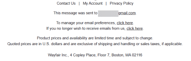
This example is good since it includes the required elements, but also it’s clean and easy to read and find the preference center or unsubscribe link. This is important for accessibility reasons.
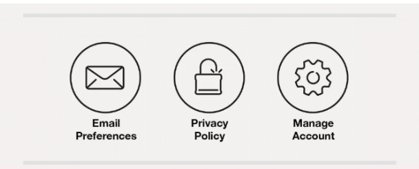
Speaking of accessibility, I love this example from Omaha Steaks because they have big CTA–type buttons. This makes accessing these links very easy, and it appears just before the disclaimer information. They do still have the unsubscribe link in the footer as well.
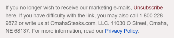
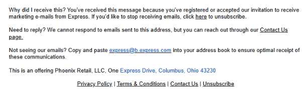
In the next example, I like that they’re reminding the subscriber that they’re receiving this message because they registered or accepted their invitation to receive marketing messages. This helps people remember that they signed up, which is one of the main reasons people mark a message as spam—they don’t remember signing up. This gets bonus points for having two places to unsubscribe. It would be perfect if they’d allow a reply (that’s a blog for another day), they do at least link to their “Contact Us” page.
Best practices for a footer that works
Keep it clean. A footer crowded with a dozen links and disclaimers is easy to ignore and hard to read on mobile. Prioritize the required elements, then add only a few extras that genuinely add value.
Don’t bury the unsubscribe link. Hiding this link doesn’t save subscribers; it just frustrates them into marking your email as spam instead, which hurts your sender reputation far more than a clean opt-out ever would. Some brands try to hide their unsubscribe links anyway out of fear of losing subscribers. It backfires every time.
Design for mobile. Most email opens happen on a phone. Footer text should stay large enough to read, and links should be spaced far enough apart to tap accurately.
Stay consistent: Use the same footer format, fonts, and colors across every campaign. This consistency makes a sender recognizable and trustworthy over time.
Test your links. Broken unsubscribe links or dead social icons are a common and avoidable mistake. Check every footer link before a send goes out, especially after a template update.
Revisit it periodically. Regulations evolve, and so does your business. An address that was accurate two years ago, or a social channel your company no longer uses, can quietly become a liability or a dead end. Review your footer at least once a year.
The takeaway
The footer might be the smallest section of your email, but it carries outsized responsibility. It keeps you compliant, it builds subscriber trust, and it’s an extension of your brand. Treat it with the same intentionality as the rest of your campaign, and it will do quite a bit of work for you in return.
Don’t let a footer misstep tank your sender reputation. See how Validity Engage keeps every send compliant, deliverable, and on-brand—automatically.
AI-powered email intelligence Built on the world’s largest email data network, Validity Engage removes risk and boosts email performance—so you can produce exceptional results in less time.

Julie Stuck is a Sr. Email Strategist at Validity.