Like most people starting new jobs, I’ve spent the majority of the past two months or so feeling pretty uncomfortable.
And it’s been great.
Comfort is a relative term, and so for me, it means complacent.
So for the past 60 days or so, I’ve been the one asking questions rather than answering them. And it’s been illuminating.
I learned pretty early on to embrace the gaps in my knowledge. Ones I didn’t even know existed.
Coming from the agency world, email was simply part of the toolkit. We sent email, just like we wrote blog posts and posted to social media. Of course we valued our subscribers, but generally speaking, no marketing activity was any more important than another.
To measure success, I did like any other marketer; I analyzed dashboards and created spreadsheets. When it came to email, success meant opens, clicks, and obviously, revenue generated.
I’ve had lengthy discussions with people like Justine Jordan, Lauren Smith, Kevin Mandeville, and Chad White, just to name a few. Each time, the veil that had been cast over my eyes as a marketer misled by the dashboard fell a bit more.
Because here’s the thing about dashboards: they measure everything but the heartbeat of the user.
Below are the three biggest takeaways that have forever changed my view, not only on dashboards, but on the way we measure and view email in general.
Opens and clicks are worthless…without context
Traditional marketers tend to have a myopic view on success.
We identify a desired set of outcomes, and campaigns either succeed or fail. Technology, and more specifically the software industry, has made measuring these outcomes much easier.
Problem is, depending on the platform or software you’re using, your measurements are restricted to said platform’s capabilities. As a result, we tend to determine success only by the capabilities we do have.
It’s a highly subjective approach.
Opens and clicks, for example, are measured in every software imaginable. And while this data can be handy, it doesn’t suggest success—or failure—in and of itself. Yet this is how many—if not most—email campaigns are measured on in regards to success.
Opens and clicks are more a measure of strong brand equity—“An email from Litmus. I love that company”—but not necessarily a measure of success.
Opens can also be skewed with images being automatically turned on in certain clients.
iPhone, for instance, turns on images in your email automatically. Images turned on equals email marked as open. Therefore, if your open rates are higher on iOS than in Outlook (which doesn’t display images by default), you may be drawing false conclusions.
With so many moving parts and inconsistencies, asking for the open and click rate for any given email campaign is the wrong question. Instead, we should be asking…
Who’s forwarding your email?
Says my colleague Chad White in our Viral Email Report: “Forwards expand the reach of your messages and generate additional conversions, but they have significant meaning beyond that. Forwards are a powerful indication of the overall health of your email program, because they are a sign that you’re fulfilling your subscribers’ needs at the highest level.”
Who’s printing it? (Yes, people actually still do print emails!)
Printing is not only a sign of virality, it’s also a sign of utility. If subscribers need your message posted somewhere, or even placed on their boss’ desk, you’re also fulfilling your subscribers’ needs at a high level.
Who’s actually reading your emails instead of deleting them?
If you really want to measure subscriber engagement, you have to measure the gaps between opens and clicks. How long did people spend in your email? Did they read it or delete it? Insight like this not only clarifies success as it relates to your email campaigns, it also informs your entire content strategy going forward, as you’ll notice trends regarding which types of content resonate more.
Gmail (and other client) open data can be misleading
If you’re anything like me, there’s a really good chance that you’ll open the same email several times, each time on a different device.
The reasons for this vary, and while they may seem trivial to us, this is invaluable information for marketers.
Knowing where your subscribers are viewing your email is critical. It informs design decisions, as well marketing decisions. But it’s not always accurate.
In December 2013, Google introduced a series of updates to the way Gmail loads images in email.
Gmail started to cache images for emails opened in a web browser or a Gmail mobile app.
Email tracking relies on a unique image being included in a campaign and that image being downloaded and displayed within the email. Every time the image is downloaded from the server, the tracking software marks that as an email open.
When an image is cached, it is downloaded from the original server and stored on that server. Any subsequent opens will be associated with the proxy server, rather than the original server.
With its updates, when Gmail caches images, those images—including open tracker pixels, like the ones used with Email Analytics—are stored on Gmail’s servers. Gmail then loads the same images from the same servers for everyone—regardless of whether they open using Gmail in a web browser or a Gmail Android or iPhone/iPad app.
This means that an email opened in Gmail with a web browser will be indistinguishable from an email opened in a Gmail mobile app.
Open and click data has been a source of frustration for marketers for as long as email has been sent, as each email service provider (ESP) has its own characterizations of “opened” and “clicked.”
Image caching has thrown another wrench in this reporting since Gmail’s opens are now not accurately represented.
Email is Easy
Email suffers from what I like to call the “Ease of Use Paradox,” in that the easier an action is to perform, the easier the action appears to be.
In reality, email is quite complex.
For example, if your ESP has a WYSIWYG (what you see is what you get) editor—which allows you to see how your email will look as you’re creating it—it may alter your design or insert unsupported code. This significantly affects how your email renders in the inbox.
Or maybe a decent percentage of your audience is using Microsoft Outlook 2003. Since Outlook automatically blocks images, your email could wind up looking something like this…
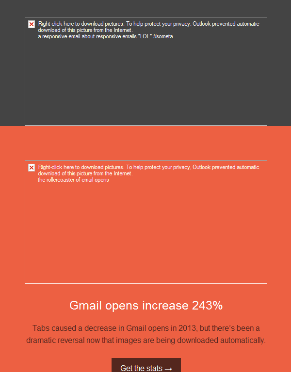
Image blocking in Outlook
In these cases, ALT text is a must to ensure a good subscriber experience.
Email is so complex, that I’m not even going to try and explain all of its intricacies. This infographic will do so much more succinctly than I possibly could.
Are you making email better?
This is a call to action to all marketers: we need to be doing more to make email better. We need to stop using clicks and opens as the main determinant of success. We need to stop sending email to people who don’t need it.
Forget whatever conjecture you’ve heard about “email is dead.”
Email is only as dead as your strategy.
Email is the primary form of communication, retention, and the most direct way to drive revenue for companies. With a typical return of 45:1 on every dollar invested, email is the best ROI for digital marketers.
How are you measuring it?
 | See All The Data You’re Not Getting from your Email Software with Email Analytics |
The info in this blog is 2+ years old and may not be updated. See something off? Let us know at hello@litmus.com.

John Bonini was the Growth Director at Litmus
