Of all the communication channels available, 72% of consumers prefer companies to interact with them via email. Email marketing also happens to have the highest return on investment across channels, and companies have attributed nearly 23% of their total sales to email. Consumers want to receive email and data shows that it’s worth the investment—are you getting the most out of email that you can? Read on for these tips to optimize your subscriber journey.
Using email to its full advantage is all about providing your customers with best possible experience. If they’re happy with the emails they’re receiving, then you’ll reap the benefits (which hopefully includes lots of sales). From the email signup, to the email itself, to the landing page—and everything in between—optimizing for every step is key to email marketing success.
The Signup
Email marketing starts before you actually send an email—it begins with your signup process. The difference between a well-designed signup process and a sub-optimized one can be the difference between a growing list and one that’s shrinking due to unsubscribes.
For starters, your subscribers should be obtained by filling out a form of some type—registering for a conference, downloading a report, or signing up for your tools or services. Never purchase an email list—everyone that you send to should have explicitly agreed to receive emails from you. You run the risk of being unsubscribed from, marked as spam, or even fined under some anti-spam laws, like the Canadian Anti-Spam Law, if you send unsolicited emails.
Your forms are the first step in the subscriber journey so it’s crucial you get them right. With optimized signup forms you can acquire more organic subscribers—the ones likely to exhibit the strongest engagement and stick with you the longest. While The Ultimate Guide to Email Signup Forms outlines many tips for getting your forms right, here are a few pointers:
- Strip form fields down to their minimum: Adding form fields can decrease conversion rates, so only include fields that are crucial. A/B test to see what works for you, or consider using progressive profiling to build your subscriber’s profile over several interactions.
- Provide valuable content: Include a clear value proposition about why subscribers should give you their email. Are they going to receive helpful content? Get a free t-shirt?
- Test your forms: Ensure that your forms work and that each signup is going to the right list in your email service provider (ESP).
- Allow all email domains: It’s a mistake to try and prevent certain email domains from signing up using your forms—don’t create any additional friction.
Once your subscribers give you their email address, be sure to send a welcome email. Whether it’s welcoming them to a newsletter, or a free trial, thank your subscribers for signing up. You’re top of mind at this point, so they will be expecting an immediate email from you.
The Inbox
You’ve accomplished your goal of growing your email lists. Now what? Don’t blow it by sending emails that don’t get opened. With an increasingly crowded inbox—and ever-decreasing attention spans—getting your subscribers to open your emails is a challenge. You only have seconds to grab your readers’ attention and interest them enough to open and read your email—you’ve got to get it right.
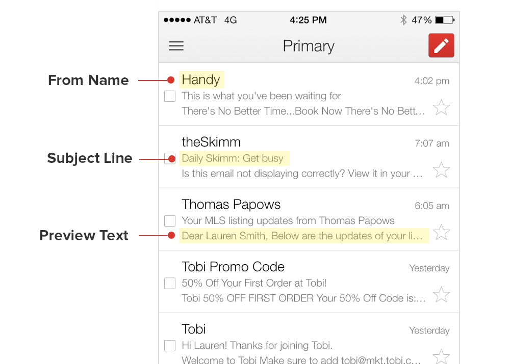
Use a recognizable from name
Is your from name recognizable and trustworthy to external audiences? Since this is the field that appears first in most email clients, and likely the first thing your subscribers see, the answer to that question should be yes.
Typically, you’ll find the names of companies, brands, or individuals here. However, if your subscriber doesn’t know who an email is from, the likelihood they’ll open diminishes. Subscribers may even mark an email from an unknown source as spam.
Carefully consider the relationship between the subscriber and your brand—are they more likely to recognize the name of your brand/product, or the name of an individual at your company? A/B testing over time can reveal the right approach for you—it may be a mix.
Include an optimized subject line
There is no set formula for creating the perfect subject line. What works for one brand may not work for yours; it all depends on your audience. This is another aspect of your email that is ideal to A/B test.
Since you only have about 50 characters standing between you and your email’s success, optimizing this portion of your email is crucial. There are lots of tips on how to write the perfect subject line, but generally you want to:
- Be useful and specific
- Use timely topics and urgency
- Avoid using promotional or spammy language
In addition, many email clients will truncate subject lines after they reach a certain limit—cutting off a portion of your subject line. Preview your subject lines across mobile, desktop, and webmail inboxes to verify it’s displaying as you intended.
 | MAKE THE BEST FIRST IMPRESSION WITH SUBJECT LINE CHECKEROptimize your from name, preview text, and subject line with Subject Line Checker, available in Litmus Builder. |
Take advantage of preview text
In many inboxes, there is an extra line or two—or even three—of text that can work with your subject line to encourage the open. Preview text is a snippet of copy pulled in from the body of your email and typically displayed underneath the from name and subject line in a subscriber’s inbox. It is alternatively referred to as snippet text or a preheader.
Like everything in email, support for preview text varies. Even when preview text is supported, no two inboxes look the same—both placement and character count vary.
While there are lots of tips and tricks for optimizing your preview text, here are a few bits of advice:
- Think of it as a second subject line: Use similar testing strategies like you would for subject line testing. Do your subscribers respond better to urgency, humor, or symbols?
- Front load keywords: Since some clients only supported a few characters of preview text, pack the beginning of your preview text with keywords and phrases that perform. However, make sure it’s long enough to fill the space in iOS and Apple Mail inboxes.
- Avoid repetition: Don’t just copy the subject line or headline! Try personalization, including a call-to-action (CTA), or even try mentioning an article that’s located further down in the email to encourage scrolling.
The best part is that changing or testing preview text is easy—there’s no HTML or design required. It’s pulled from the first few lines of text found within an email and can either be displayed or hidden in the body of your campaign. If you’ve planned for the headline or first few lines of text in the body of your message to play off the subject line, adding separate preview text isn’t necessary.
Oftentimes preview text contains social sharing links or instructions to “View this email in web browser,” “Forward to a friend,” or “Having trouble viewing this email?, as it’s pulled from the logo or hero image in an email. Since text like this doesn’t encourage your subscribers to open your email, use a little HTML and CSS to hide or define your preheader text.
The Email
You’ve convinced your subscribers to open your campaign. Now it’s time to get the email right. Here are some tips to keep in mind:
Optimize for viewing across environments
Discovering where your audience is opening your emails can help you focus your design and testing efforts. While responsive design is great tactic for ensuring compatibility across all environments, it’s not supported everywhere. Consider using these mobile-friendly elements as a backup for when media queries aren’t supported:
Simplify content and design
Your subscribers are distracted—so keep your content and design simple, allowing them to scan your email quickly. Only include information that is relevant and needed to convince your subscribers to take an action. Nix all of the extra content and consider putting that on a landing page.
If your design is two or more columns, chances are it’ll look crowded on the small screen of a mobile device. Consider using a one-column design for increased legibility, allowing your subscribers to easily read and interact with your email.
Make text bigger
Your subscribers shouldn’t have to zoom in to read your message, so use large fonts. We recommend using a minimum size of 14px for body copy and 22px for headlines. Keeping text at least 14px will avoid broken navigation bars and other layout elements on iOS, which automatically resizes small copy to a minimum of 13px.
Use clear, touch-friendly CTAs
Once someone opens your email, they should almost immediately be able to identify what the CTA(s) are in your email. The content should clearly point to the action that the subscriber is supposed to take.
In addition, the CTA(s) should be extremely easy for the subscriber to take action upon. Ensure that your links and buttons are touch-friendly. Don’t include back-to-back links or lots of text near CTAs. You’ll want to surround each one with plenty of white space so they are easily clickable—and touchable. If you’re using buttons, we recommend using at least a 44x44px minimum button size.
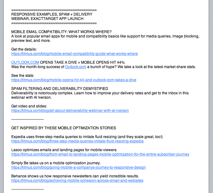
Don’t forget the text version
Unless you’re sending a plain text email, multi-part MIME (Multipurpose Internet Mail Extensions) should be part of every email campaign. Multi-part MIME bundles together a simplified plain text version of your email along with the HTML version of your email.
Here are some reasons why sending in multi-part MIME is a necessity:
- Spam filters like to see a plain text alternative
- Some email clients and apps can’t handle HTML (we’re looking at you, Apple Watch)
- Some people simply prefer it and opt to only receive the plain text version
While we have plenty of detailed tips for optimizing plain text emails, here are a few to keep in mind:
- Define headers and CTAs: Try using capslock or symbols to create hierarchy, differentiating headlines and CTAs from body text.
- Include whitespace: Use line breaks between different content sections, headlines, and CTAs for increased legibility.
- Use bulleted lists: While bullet points aren’t supported, you can use other characters, like -, *, or +, to assist with creating hierarchy.
Design defensively
While images will be displayed in many desktop, mobile, and webmail inboxes, in many they will be disabled.
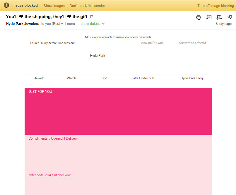
With so many email clients blocking images by default, email designers have to be prepared. Luckily, there are a number of strategies to help combat image blocking:
- Include ALT text: When images in email are turned off or disabled, ALT text (which is short for alternative text) often renders in place of the image. Use ALT text to provide some context for subscribers when images are disabled.
- Use bulletproof buttons: CTAs should be viewable—and actionable—regardless of whether images are present or not. While text links will display in an image-off environment, typical image-based buttons will not. Add a little HTML and inline styles and rest-assured that your CTA buttons will display even when images are blocked.
- Balance imagery and text: Ditch the solely image-based email and opt for a balance of live text and imagery. It ensures that your emails are accessible, eliminates the HTML-to-text ratio spam issue, and allows for the email to be legible and easy to interact with regardless of whether images are present or not.
- Add in background colors: Adding background colors throughout your email, particularly behind images, allows for hierarchy and, to an extent, design to be present in an images-off environment.
A/B test and preview your designs
We’re big advocates of testing—whether it be A/B testing or QA testing. Both are great tactics to ensure you’re providing your subscribers with the best email experience possible.
Use A/B testing to compare the results of one version of an email against another version of an email. It can give marketers concrete evidence of which tactics work on their audiences and which don’t. There are countless things to test, including headlines, preheader text, from names, and images. It’s one of the most effective and easiest ways to make measurable improvements to your campaigns.
There are seemingly countless ways that email clients can break your designs. What looks great in one inbox, could look completely mangled and broken in another. Preview your campaigns across mobile, desktop, and webmail clients before sending. You’ve convinced your subscribers to open your email—don’t ruin it with a broken design.
Preview your campaigns across 40+ real email clients with Litmus. Book a demo of Litmus today!
The Landing Page
Your subscriber’s experience doesn’t end with your email—it continues onto the landing page, or website. Similar to the email, keep the content streamlined and include a clear CTA. Also, if your email is mobile-friendly, your website should be, too. You wouldn’t want your subscriber to get all the way to the landing page only to be turned off by an inaccessible experience.
PS. Elements on the landing page are great to A/B test, too!
GET TIPS TO IMPROVE YOUR SUBSCRIBER EXPERIENCE
Subscribe to the Litmus newsletter and get email tips about creating great email delivered straight to your inbox.
The info in this blog is 2+ years old and may not be updated. See something off? Let us know at hello@litmus.com.

Lauren Smith is an Acquisition and Lifecycle Marketing leader.
