A lot has been said about email design being stuck in the past. Designers tackling their first projects bemoan the use of tables and inline styles. Marketers plotting out their first campaigns refuse to think beyond the batch-and-blast mentality.
But a few intrepid senders refuse to let the (sometimes) outdated technologies and mentalities surrounding email design hold them back. They are pushing the boundaries of email design, using techniques commonly found in advanced web design to surprise, delight, and connect with their subscribers.
Let’s take a look at the challenges associated with experimental email design and round up some of our favorite futuristic email campaigns.
Power up your email strategy
Gain expert insights and industry benchmarks from the latest State of Email Report. Elevate your email game.

Email design doesn’t have to be limiting
When most people think of email marketing, they think of stodgy, boring newsletters sent out by companies looking to sell something. And, if you’re tasked with creating an email campaign, you’re likely looking at a pile of HTML tables and inline CSS and counting the minutes until you’re done hacking together an email that works OK everywhere.
While it’s true that the foundations of email design are a bit old, there’s really no limit to what you can do with them, given a little creativity, planning, and lots of testing. Yes, email designers have to use table-based designs (thanks, Outlook!), inline CSS, and swim through a sea of hacks but, as the examples below show, you can still pull off some amazing things in the inbox.
To prove the point, here are some of our favorite examples of emails that are breaking the rules and pushing the boundaries of email design.
A Carousel in an email?
A while back, UK retailer B&Q sent an email that set the industry ablaze.
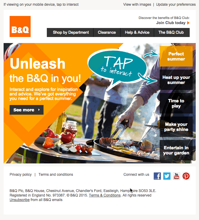
In this campaign, users can hover over or tap on buttons and watch as different content sections slide smoothly in and out of the email. Commonly termed a carousel, this technique has been widely used in the web world, but is rare for email campaigns. Some may complain that carousels are ineffective and merely for show, but the B&Q campaign is a great example of how to use cutting edge techniques to surprise email subscribers.
The email uses a number of CSS3 properties, along with some clever targeting, to perform its magic. By using CSS transitions, animations, z-index, and the overflow property, the designers have crafted a clever email that just begs to be tapped.
What’s even more impressive is that everything falls back beautifully for email clients that don’t support these more advanced techniques.
Crazy colors and Star Wars
UK email agency Action Rocket has been leading the charge in email design for a while. With their cleverly titled weekly digest of email news, Email Weekly, they test out some creative techniques that may eventually see their way into client campaigns.
One of our favorite examples is their email that asked the question, “What colour is this email?”.
Using CSS keyframe animations, they animate the background colors of the heading section, which creates a mesmerizing, hallucinatory effect. It’s subtle at first, but once a subscriber catches on to the animation, they can’t turn away.
Another great example from Action Rocket is their recent Star Wars-inspired digest that made use of the experimental -webkit-perspective property, along with CSS transforms, to recreate the iconic opening crawl of everyone’s favorite sci-fi movie.
Infographics in an email?
While email agency display block consistently sends great emails, it’s their recent infographic email that really caught our attention.
Similar to the background colors in the Email Weekly example, display block uses CSS keyframe animations to add some life to an already well-designed campaign. What’s really great is that the email is beautifully responsive, stacking each section nicely on mobile devices. The responsive design and animated icons all serve to enhance some great data about mobile email usage.
We haven’t seen many infographics like this in an email, which makes it all the more impressive and ground-breaking. We’d love to see more examples of infographics, which is why we’re holding a Community Contest devoted to them!
HTML5 Video and Interactive Tours
We like to practice what we preach, which is why we make our emails nice and responsive, despite having a predominantly desktop audience. That’s also the reasoning behind some of our own cutting-edge email campaigns, like our HTML5 video background from last year’s Email Design Conference (which we’re hosting again this summer…).
Our designer, Kevin, used some advanced email client targeting to progressively enhance an otherwise simple design. If you’re curious how exactly he pulled it off, he wrote a blog post detailing the process.
And, to celebrate the launch of our email code editor, Builder, he took things even further by building an interactive tour right in an email.
Making use of CSS animations, the checkbox hack, and liberal use of the CSS content property, he shows off some of the features of Builder right in the inbox—giving subscribers a taste of the product without even having to log in. There’s a lot of code powering it, but you can check it out right in Builder (kind of like email Inception).
Tastier Email Menus
Like the carousel email, designer Jerry Martinez took inspiration from the web to implement a hamburger menu for mobile subscribers.
Navigation elements are always a trick for email designers—especially on mobile. Since they tend to take up significant amounts of space when stacked, they can distract from the main call-to-action in a campaign. To solve the problem, Jerry crafted an elegant hamburger menu that allows mobile users to selectively display navigation items.
We were so impressed with Jerry’s solution, that we invited people to show off other creative navigation patterns in one of our Community Contests…
Community Contests: The Truly Cutting Edge
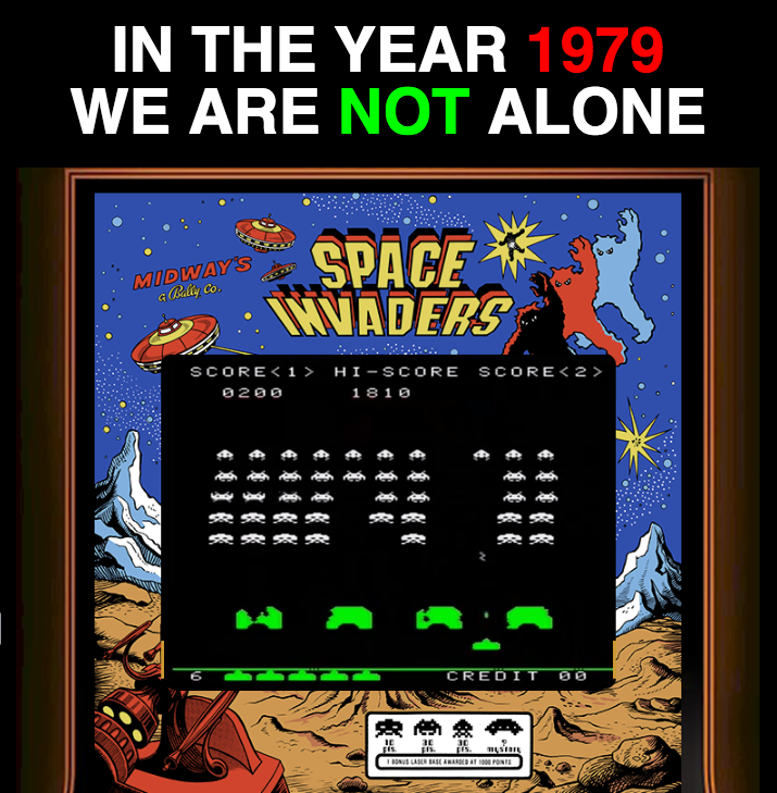
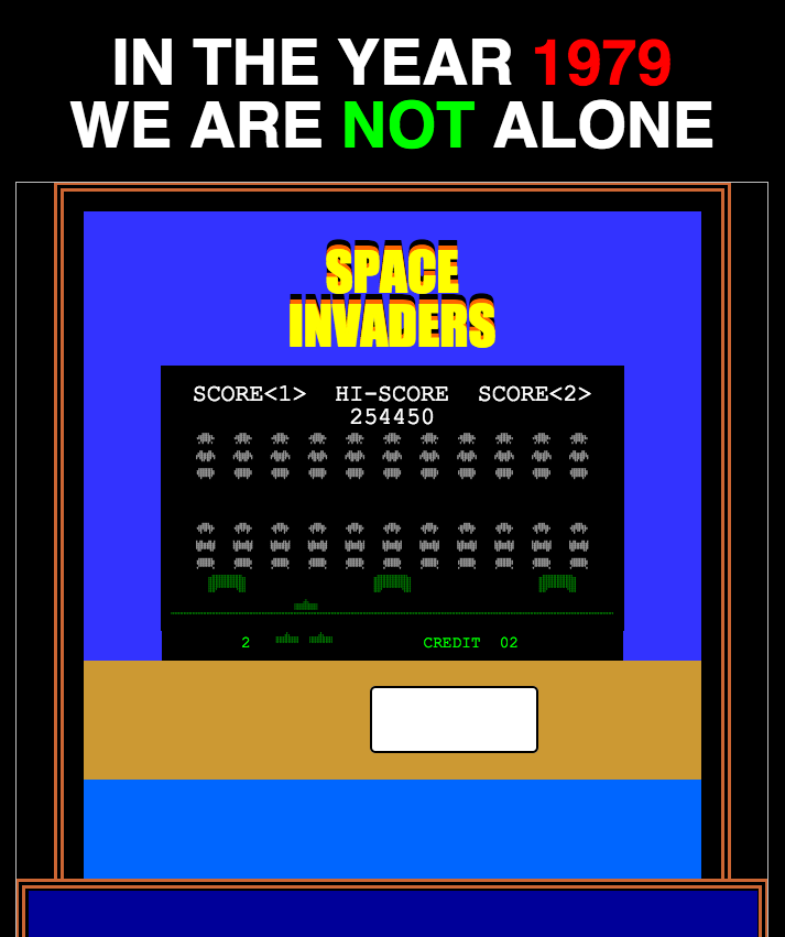
Our Community Contests are where we really challenge people to come up with some crazy ideas. Each month, we give them a theme and let them stretch their skills. Our first contest, looking at creative uses of ALT text, yielded some amazing results, like Space Invaders in an email:
For our second contest, we had people come up with interesting navigation patterns. We were blown away by some of the results, like Remi Parmentier’s gooey navigation concept:
Trying something new?
While it’s exciting to try out new things in email, a lot can go wrong if you don’t test your campaigns thoroughly. Email Previews make it easy to test any technique in desktop, webmail, and mobile email clients.
The info in this blog is 2+ years old and may not be updated. See something off? Let us know at hello@litmus.com.

Jason Rodriguez was the Community & Product Evangelist at Litmus
