As mobile opens continue to rise (they’ve increased over 500% in the past four years!), so has the talk of mobile email strategies like responsive design. In our Responsive Email 101: HTML and CSS Basics webinar, we took a look at the mobile email landscape, the foundations of creating responsive emails, and why these techniques are crucial to improving the subscriber experience. We also covered email client support and demonstrated how to code a responsive email from scratch.
We had a full house for the webinar, so while we tried to answer as many questions as we could during the Q&A portion, we weren’t able to get to them all. Below, we’ve rounded up some of the most commonly asked questions.
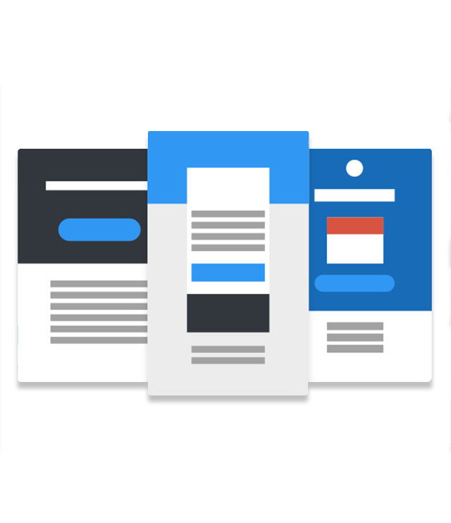
Getting Started With Responsive Design
Do you think the rise in mobile opens has reached its saturation, or do you think it will continue to increase?
While we’ve seen a huge jump in mobile opens over the past four years—over 500%—we’ve already seen its growth start to flatten out a bit. However, we think mobile opens will continue to rise slowly with the proliferation of more mobile devices.
What is the difference between fluid, adaptive, and responsive design?
Fluid design consists of relative widths with no media queries. Adaptive design consists of fixed or relative widths at multiple viewports/breakpoints. Responsive design consists of relative widths at multiple viewports/breakpoints. Here are some great resources to help you better understand the differences between them:
- Scalable, Fluid or Responsive? Understanding Mobile Email Approaches
- Fixed vs. Fluid vs. Adaptive vs. Responsive
- Which layout? Static, liquid, adaptive, or responsive?
- Liquidapsive
Which approach has the best email client support—fluid, adaptive, or responsive?
From a pure support perspective, fluid emails have the best support. Both adaptive and responsive design require the use of media queries, which have limited support.
However, it does not mean that fluid design is the best approach for emails. Fluid design is a good compromise for creating a mobile friendly version of an email, but maintains the full-width design of the email at its core. It really comes down to your specific audience, where they open their emails, and your design strategy for optimizing your subscribers’ experiences.
What is a media query?
A media query (@media) is a conditional statement that triggers a set of CSS for a specific set of rules. You can learn more about media queries and email with the following resources:
Is there any data on the effect that responsive design has on emails?
You bet! We recently did a report with MailChimp on the effect that responsive design and email testing has on clicks. We found that responsive design results in a 15% increase in clicks for mobile users.
With mixed support and so many workarounds, moving towards responsive design seems overwhelming. How do I get started?
With such limited support from current email clients, responsive email design can be hard to implement. Our first recommendation is to educate yourself as much as possible about responsive email design before diving in. We recommend checking out the resources at MailChimp, Campaign Monitor, and Litmus to help guide you.
If you aren’t comfortable diving right into actual development of responsive email, consider using simple drag-and-drop email editors to build your emails. Products like StampReady, Canvas, and MailChimp will take the hassle out of email coding for you.
If you are comfortable diving into code, check out Litmus Builder, a code editor built specifically for email design. Try implementing basic responsive email techniques as a start—it will provide a great experience for users who open their email in clients that support responsive design (mainly Apple devices).
Also, be sure to preview your emails before sending! You can send emails to yourself using PutsMail or see what your email looks like in over 40 different email clients with Litmus.
If you ever have any questions or run into coding problems with responsive email design, just head over to the Litmus Community for help.
Do you recommend any responsive frameworks?
Yes! We recommend checking out ZURB’s responsive framework Ink (heads up: this framework requires a workaround to render correctly in Outlook 2007-2013). If you like Sass, Faust Gertz made a Sass version of Ink and Alex Ilhan has a Sass email framework called Zenith. In addition, Dan Denney from Code School has an awesome email workflow called Emayll and Brian Graves has an amazing collection of Responsive Email Patterns.
Optimizing For Clients That Don’t Support Media Queries
If a client doesn’t support responsive design, what will display in that client?
Every single email client renders emails differently, especially when it comes to mobile email apps. Essentially, if they don’t support responsive design, it will fall back to some version of the full-width email. Sometimes it will be a “zoomed out” full-width version, sometimes it will be a scaled up “zoomed in” version, and sometimes a client like Gmail may automatically increase font sizes to make a “mobile friendly” version of the email.
The best thing to do is to always preview your email before sending it. You can send emails to yourself using PutsMail or see what your email looks like in over 40 different email clients with Litmus.
What is the best way to approach responsive design for clients that don’t support it, like the Gmail app for Android? What type of “backup” should we have in place?
We recommend making your emails mobile friendly to begin with. This means having a minimal amount of email content and designing for a mobile use case, such as larger font and button sizes. A one-column design out of the box makes it easier to render your email for Gmail app, too.
For those comfortable with advanced coding techniques, the best way to develop your emails and account for lack of responsive support in the Gmail app is the “hybrid coding approach.” It essentially uses a mobile-first approach and scales the email up to a desktop width using some email-specific hacks. You can read more about how to implement the hybrid coding approach here:
- The Hybrid Coding Approach
- Hybrid Coding Redux-Raising the Bar
- Hard-Won Lessons in Responsive Email Design
Code Questions
Can you put your media queries in a separate CSS document and link to that document in the head?
It is not recommended to use linked stylesheets (<link> tag) for emails due to limited email client support. All styles should be embedded in the <head> of an email.
What are the most common breakpoints for responsive email design? How many breakpoints is ideal?
With the most opens occurring on iPhones, it’s important for your emails to start implementing breakpoints at a minimum of 414px, which is the width of the new iPhone 6 Plus.
There is no “ideal” number of breakpoints for a given design—it all comes down to your individual design and optimizing the experience for your subscribers. It is ideal to account for at least one breakpoint to make your email responsive.
Do you recommend using tables or divs?
Email design absolutely requires using a table-based layout and structure. The reason for this is a lack of support for <div>’s by email clients, like Outlook desktop clients, as it pertains to the actual structure and foundation of the HTML. Some email clients do support <div>’s and can be extremely powerful to use for certain hacks and workarounds, especially for responsive email.
Can you change the align=“left” or align=“right” attributes within a table using media queries? Or, is it only for changes to style?
You can’t technically change the align HTML attribute in CSS, but there other workarounds. You can wrap each individual table in an empty <div> and use the float property or the display property to swap tables around. ActionRocket has an great blog post on using this advanced technique.
With responsive emails, how is support for background images? What are the ideal dimensions for saving background images if I want them to be full-width?
Background images are very well supported for mobile email clients. There are no “ideal” dimensions for saving background images. You should always try to have relatively small file sizes so your subscribers can download your email quickly. You can use the Image Check feature in Litmus to test your image download speeds.
Do styles have to be inline to get them to work with many of the email clients?
Yes. Several email clients remove any CSS styles in the <head> of emails, notably Gmail, making inlining CSS styles a necessity for emails.
Is it better to use pixels or ems for font size in emails?
It is better to use pixels for defining font sizes in emails, as many email clients do not support ems.
Is it possible to replace images using media queries?
It is possible to replace background images using media queries, but not inline images (<img> tags).
What is the best way to optimize images so they render sharply on retina displays?
For retina, you typically want to make the image twice the size of its final display. For example, a 100×100 image should actually be 200×200, but scaled down to 100×100 using HTML attributes or CSS styling. Typically, this technique should only be used for smaller images that need to be sharp—not large images such as photos. There are a couple of great discussions on the Litmus Community about designing for retina:
Does display:none; or display:block; work in responsive email?
It’s not a matter of whether the display property works in responsive email, but whether it is supported by email clients. Like most CSS, it’s supported by some and not others. It is most notably not supported by Gmail.
Is there any email client equivalent of a web browser’s “inspect element?” It would be useful to troubleshoot my responsive designs.
There isn’t an exact equivalent of a web browser’s “inspect element.” However, the Interactive Testing feature in Litmus is extremely helpful. Also, Litmus Builder has 1-click testing and re-testing functionality to make iterating on email very quickly.
Otherwise, we would recommend just troubleshooting in a WebKit browser (Chrome or Safari). Since the majority of mobile opens happen on WebKit, which has great CSS support, developing and troubleshooting in a WebKit browser is a good replication of what will happen for those email clients.
Is padding universally supported across email clients?
Padding is almost universally supported across email clients. The margin property, on the other hand, does not have great support. We highly recommend using padding.
How do you stack three columns properly using alignment? Should you use center alignment in addition to left and right? Or, do you not recommend using three column layouts at all?
Yes, you can stack three columns in responsive email design, although your options for stacking and reversing them are more limited or more difficult to do than a two-column design. The alignment of the tables depends on how you want to stack them, but you would typically align all three tables to the left.
ActionRocket has an great post on an advanced technique for reverse stacking tables.
Litmus Builder
What is Litmus Builder?
Litmus Builder is the world’s first code editor built for email designers by email designers. It’s completely free to create, edit, and share emails.
Is Emmet built directly into the Litmus Builder?
It is! Our Emmet integration makes shorthand coding a breeze.
Where can we find responsive email templates within Litmus Builder?
Litmus Builder has a gallery of 20+ email templates in the Templates section. All templates are completely free to use. Check out our full help documentation for Litmus Builder.
Try Our Free, Pre-Tested Responsive Templates
Responsive email lets you fine-tune your designs for an increasingly mobile audience. Simplify your email design process with a host of free, pre-tested templates on Litmus Community.
 | Introducing Litmus Community TemplatesKickstart your next campaign with one of Litmus’ pre-tested templates. |
The info in this blog is 2+ years old and may not be updated. See something off? Let us know at hello@litmus.com.

Kevin Mandeville was a Product Manager at Litmus
