Interactivity continues to be one of the hottest trends in email design—and interactive hotspots are one of the most popular interactive elements in a marketer’s toolkit. Hotspots let your subscribers uncover additional information when they hover or click on an item in your email—and allow marketers to provide an additional layer of detail to their emails without making your email design feel too crowded.
In the February edition of our monthly newsletter, we used the power of interactive hotspots to show off some exciting updates we’ve made to the Litmus platform:
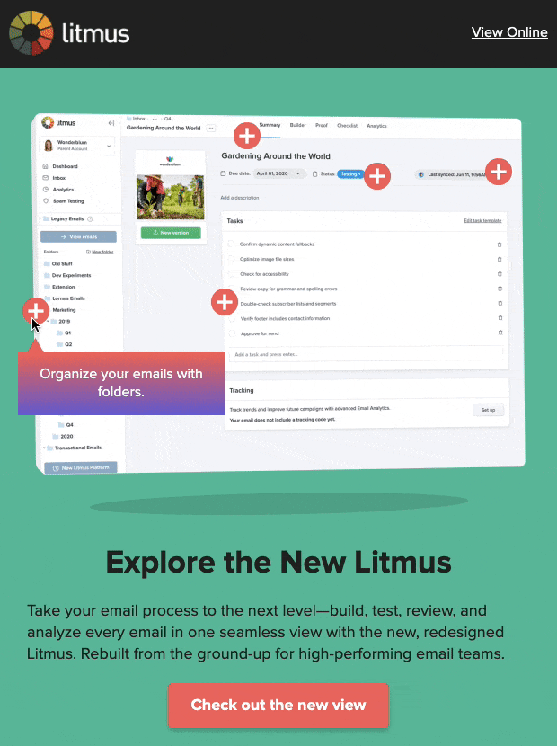
After we sent out the campaign, we received many questions from fellow email geeks about how exactly we created our hotspots—and how we made them work in Gmail. That’s why we’re here to share our step-by-step guide.
Read up on the details of how we designed and coded our hotspots below or check out the hotspot code on Litmus Builder—that’s where you find the exact placement of all the code elements we describe below.
1. Before you get started: Important considerations
Hover or click?
There are many different ways to code interactive hotspots in email. If I wanted hotspots that only activate on click or tap, I would consider using the Checkbox Hack, for example. However, we went with hotspots that activate on hover for a few reasons.
First, :hover is better supported in email clients than :checked—especially in one of our largest email clients, Gmail. Secondly, interactivity is still not very common in email so I wanted to make it as easy as possible for users to discover that they can interact with it. After all, hovering over a hotspot and seeing a tooltip appear immediately takes less effort than hovering and then clicking. Because I wanted to find a way that balanced functionality and support for the widest audience possible, hovered hotspots were the way to go.
Email client support: Are hotspots effective for your audience?
Interactive hotspots are a great way to make your email more engaging and more effective, but—like many interactive techniques—they aren’t supported in all email clients.
Before incorporating this technique into your repertoire, you definitely want to consider which email clients matter most to you and your stakeholders. According to Email Client Market Share, 79% of all email clients support the fully interactive versions of this hotspot technique. But your audience’s email client usage might look completely different from the global average. Take a close look at your own business’ market share for the most accurate data.
At Litmus, we used our Email Analytics tracking to determine that some of our top clients are Gmail (36.8%), Apple Mail (20.0%), and iPhone (13.2%) which make up a majority (70%) of our audience. Email clients that will show the fallback version make up only 30% of our audience.
With this data, it made sense for us to focus on creating a great interactive experience for our users, but this may not be the case if your audience skews more heavily towards Outlook for Windows. However, you should be constantly tracking and testing to make sure you have the most accurate and up-to-date analytics data! Email client market shares change over time as certain clients and devices become more popular (many companies have switched from Outlook to GSuite, for example), so it’s best not to rely on historical knowledge as to how things have always been done.
Check what level of functionality your top email clients support below.
Fully Interactive – Desktop
This is where hotspots are fully functional at desktop viewports.
- Apple Mail
- iPad
- Gmail
- Outlook (MacOS)
Fully Interactive – Mobile
This is where hotspots are fully functional at mobile viewports.
- iPhone Mail
- Gmail App (Android)*
- Samsung Mail
Fallback – Animated PNG
These clients (except for the ones with asterisks **) support animated PNGs and Dark Mode targeting, so we used a custom fallback transparent animated PNG that would animate on any background.
- Outlook.com
- Outlook App
- AOL
- AOL App
- Yahoo
- Yahoo App
- Outlook (Windows)**
- Windows Mail**
* Gmail App (iOS) shows hotspots but they aren’t tappable.
** These clients only show the first frame of animated PNGs, and do not support Dark Mode targeting. Even if we were to use an animated GIF, the flat colored background would mismatch with the Dark Mode view. On top of that, you can’t swap Light/Dark mode GIFs out since these clients also don’t support Dark Mode targeting. For these clients, we made sure that the first frame of the animated PNG still looked good.
2. Design planning: Mapping out the subscriber experience for all use cases
Did you determine that you have a solid business case for using interactive hotspots, and that a large portion of your audience will be able to enjoy it? Great! Now we can start designing out the potential views to build for.
Why do you need different views, you ask? The hotspot element won’t look the same on mobile and desktop. Plus, you’ll have to design a fallback for everyone who won’t be able to see the interactive version of the element. For us, we identified four key use cases that we tackled at the design stage:
Interactive: Desktop Width
When laying out the design for this, try not to overlap the tooltips with the hotspots too much.
We went with Animated PNGs for the hotspot images because we needed to achieve a smooth alpha-channel transparency that only PNGs can provide so that they could overlay the background image, and the slight animation—you see the hotspots pulsing—brings attention to the fact that you can interact with them.
Fallback: Desktop Width with fluid resizing to Mobile Width

The fallback version also uses an Animated PNG version of the entire hero section to emulate the effect of the hotspots being triggered.
At Litmus, we already use a hybrid fluid method for mobile resizing, so we can expect that all these fallback images will resize smoothly down to any screen width without requiring a specific mobile responsive version.
Interactive: Mobile Width
Because we want the tooltips to still be legible on smaller screens, we had to reconfigure the design so that all the tooltips show up in one central location whenever a hotspot was hovered instead of being attached to each hotspot individually.
Dark Mode
And of course, you don’t want to neglect the Dark Mode view.
3. Building your framework of key components
What are the elements that we need to make this work? Here, I’ll break down what each of the classes do. (Why do I use classes instead of targeting CSS selectors with other methods like specificity or chaining? Using shorter selectors speeds up the performance, and good class nomenclature makes it easier to understand and maintain so you can use it again and again!)
.wrapper-primary
- Wrapper for the entire interactive section.
.bgimg
- Background image foundation that you’ll position all your hotspots and tooltips on.
.wrapper-secondary
- Wrappers for each section, with absolute positioning hack. (See explanation in “Positioning” section below.)
.hot-tool-wrapper
- Wrappers that contain each individual hotspot/tooltip section, with inline styles that position within the Desktop layout.
.hotspot-01, .hotspot-02, .hotspot-03, etc…
- The actual images for the hotspot icons. They have individual class designations because they need to be individually positioned. Also, you don’t need to use an image—you can also use coded shapes if you prefer.
.tooltip-wrapper
- Wrapper for the tooltip and attached optional caret.
.caret (optional)
- These are optional because you may or may not want a caret for your design. These have custom inline CSS using margins to position it within the .tooltip-wrapper.
- These are hidden under the mobile responsive view because they don’t make sense with the new layout.
- Like the hotspot images, this can also be a coded CSS shape if you prefer.
.tooltip-content
- The actual tooltip content that appears when a hotspot is activated.
4. Putting it all together
Positioning the hotspots and tooltips
Because these hotspots and tooltip sections inevitably overlap each other, I needed a solution for placing them that resembled absolute positioning—which is unfortunately not well-supported in email. Luckily I found some inspiration with techniques from Mark Robbins and Justin Khoo (two of my favorite #EmailGeeks!) that use max-height:0, max-width:0, and margins to position elements in email!
CSS
.wrapper-secondary {
  max-height: 0px;
  max-width: 0px;
}
.hot-tool-wrapper {
  position: relative;
  display: inline-block;
  max-width: 0px;
}
HTML
<div class="wrapper-secondary">
  <div class="hot-tool-wrapper" style="margin-top:5px; margin-left: 55px;">
      [Hotspot & Tooltip content in here]
  </div>
</div>
Setting up the hover interaction
The mechanism causing the tooltips to appear is actually quite simple. The tooltips (.tooltip-wrapper) are hidden by default, and then when the hotspot (.hot-tool-wrapper) is hovered over, the tooltip is revealed. That’s it!
The opacity and transition styles add a slight fade to the interaction, making it feel more smooth.
CSS
.tooltip-wrapper {
  max-height: 0;
  opacity: 0;
  overflow: hidden;
  transition: 0.3s;
}
.hot-tool-wrapper:hover .tooltip-wrapper {
  max-height: none !important;
  opacity: 1 !important;
  transition: 0.3s;
}
Looking for a refresh on how to use hover effects in email? Check out this blog post.
Make it mobile responsive
To transform the desktop design to the mobile design, I needed to:
- .wrapper-primary, .bgimg
Resize the wrapper and background image - .hot-tool-wrapper
Zero out the original desktop positioning to make it easier to separate the hotspots and tooltip positioning on mobile - .hotspot-01
Re-position the individual hotspots to fit the smaller background image - .caret
Hide the carets - .hotspot-01 + .tooltip-wrapper
Reposition the tooltips so that they all appear in one area on the bottom
CSS
@media only screen and (max-width: 480px) {
  .wrapper-primary, .bgimg {
    width: 350px !important;
    height: 235px !important;
  }
  .hot-tool-wrapper {
    margin-top: 0 !important;
    margin-left: 0 !important;
  }
  .caret {
    display: none !important;
  }
  .hotspot-01 {
    margin-left: 130px !important;
    margin-top: 0 !important;
  }
  .hotspot-01 + .tooltip-wrapper {
    margin-left: 60px !important;
    margin-top: 130px !important;
  }
}
Set up the fallback
Finally, here are all the pieces that go into making sure the interactive and fallback versions show up for the correct email clients. Many of these techniques can be found on How To Target Email Clients. Here, I’ve separated out each targeting technique by email client to make it easier to see what’s going on. Please refer back to the original code to see how these have all been combined together in the final product.
Targeting All Outlook (except MacOS): CSS
.outlookshow { display: none !important; }

body[data-outlook-cycle] .outlookshow { display:block !important; width: auto !important; overflow: visible !important; float: none !important; max-height:inherit !important; max-width:inherit !important; line-height: auto !important; margin-top:0px !important; visibility:inherit !important;}

body[data-outlook-cycle] .outlookhide { display:none !important; display:none; overflow:hidden; float:left; width:0px; max-height:0px; max-width:0px; line-height:0px; visibility:hidden; }

[class~="x_outlookshow"] { display:block !important; width: auto !important; overflow: visible !important; float: none !important; max-height:inherit !important; max-width:inherit !important; line-height: auto !important; margin-top:0px !important; visibility:inherit !important;}

[class~="x_outlookhide"] { display:none !important; display:none; overflow:hidden; float:left; width:0px; max-height:0px; max-width:0px; line-height:0px; visibility:hidden; }
Targeting All Outlook (except MacOS): HTML
<!--[if !mso]><! -->
<div class="outlookhide">
        [Interactive Content Here]
</div>
<!--<![endif]-->

<!--[if !mso]><! -->
<div class="outlookshow">
<!--<![endif]-->
        [Fallback Content Here]
<!--[if !mso]><! -->
</div>
<!--<![endif]-->
Targeting Yahoo: CSS
This must be nested within the <body> tag to target the Yahoo App as well, and you can use any unicode character in place of ☃ as long as it doesn’t get auto-converted by your ESP. This technique also happens to target AOL as well, which is an unfortunate side-effect because AOL actually supports interactivity very well. But due to the fact that AOL market share isn’t very significant for our audience, I had to make a judgment call to cut it.
<body>
<!-- START force fallback on Yahoo -->
<style>
    .& #☃ .yahoohide {display: none !important;}
    .& #☃ .yahooshow {display: block !important;}
</style>
<!-- END force fallback on Yahoo -->

</body>
Targeting Yahoo: HTML
<table id="☃"><tr><td>

<div class="yahoohide">
    [Interactive Content Here]
</div>

<div class="yahooshow">
    [Fallback Content Here]
</div>

</td></tr></table>
The final result
To see how all these elements come together in the final product, check out the element’s full code or see the full code of our February newsletter to see it all in the context of an email.
Now, over to you!
Are you planning to use hotspots in any of your upcoming campaigns? Have you used hotspots in the past but built them using a different technique? We’d love to see how creative email marketers like you are using hotspots to make your emails even more special. Share your thoughts and ideas in the comments below or reach out on Twitter @litmusapp.
We can’t wait to see all the beautiful, interactive emails you’ll build!
The info in this blog is 2+ years old and may not be updated. See something off? Let us know at hello@litmus.com.

Alice Li is the Principal Email Engineer at Zillow.
