Between dozens of email clients, seemingly countless rendering quirks, and changing support for HTML and CSS, coding email campaigns is complex. Unfortunately for email designers, that complexity means email design is becoming more time-consuming, so we created the ultimate guide to using snippets in email design.
At The Email Design Conference, Code School’s Dan Denney framed the problem perfectly:
The biggest challenge in creating emails is not Gmail…it’s time.
When it comes to email design, time is of the essence and putting a development workflow in place is crucial. In order to keep up with the rapidly changing demands of email design, it’s increasingly important to make your workflow as efficient as possible.
So, what can you do to optimize your workflow? One word: Snippets.
With the help of snippets, you can build emails more easily—and more quickly—than ever before. Spend less time building and troubleshooting emails, and more time creating better email experiences for your subscribers.
What are snippets?
Snippets are email modules of reusable code you can use in an email template or broader email design system. They’re ideal for elements that are commonly used across email designs, like doctype, bulletproof buttons, and links. Rather than having to re-write the code each time one of these elements is used, you can use a snippet. Using snippets automates your coding and drastically speeds up development time.
How to use snippets
Regardless of which email editor you’re using to build your emails, you can use snippets to optimize your workflow. Here’s a look at how to use them in the most common editors.
Dreamweaver
In Dreamweaver, you can add or edit snippets by visiting: Windows → Snippets → New/Edit. You can even save your snippets in groups (i.e., table-related snippets, image-related snippets, etc.) for easy searching.
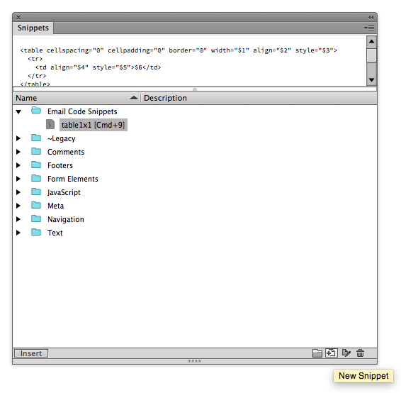
While coding your email, use snippets by double clicking on the snippet title, clicking insert, or using a keyboard shortcut.
Litmus Builder
Within a Builder project, click on the Snippets icon at the top right of the editor.
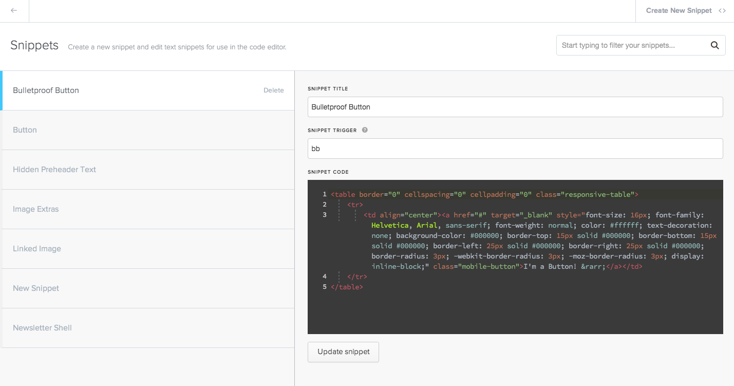
You can create and edit new snippets within that interface, and trigger snippets within your code via keyboard shortcuts. You can also add edit points inside of the snippet using {braces}. Once you trigger a snippet, you can automatically jump to pre-defined edit points in the snippet for fast and easy customization.
Sublime Text
To view existing snippets or add new ones in Sublime Text, visit: Tools → Snippets/New Snippet. Each snippet is saved in its own .sublime-snippet file.
Add snippets into your code through keyboard shortcut triggers. For example, in the code below, the snippet is triggered when “hello” is typed within the code. You can also add edit points inside of the snippet using dollar signs in sequential order ($1, $2, etc.).
<snippet>
  <content><![CDATA[
  /* Insert snippet here */
  ]]></content>
  <!-- Optional: Set a tabTrigger to define how to trigger the snippet -->
  <!-- <tabTrigger>hello</tabTrigger> -->
  <!-- Optional: Set a scope to limit where the snippet will trigger -->
  <!-- <scope>source.python</scope> -->
</snippet>
Atom
View, edit, or add snippets in Atom by visiting: Atom → Open Your Snippets. Each snippet is saved as its own snippets.cson file.
Similar to Sublime Text, snippets in Atom work via a keyboard shortcut trigger. You can also add edit points inside of the snippet using dollar signs in sequential order ($1, $2, etc.).
'Name':
'prefix': 'tabtrigger'
'body': """
/* Insert snippet here */
    """
Coda
Snippets in Coda are referred to as “Clips.” To add or edit a clip, visit: Sidebar → Clips. Clips can be saved in groups, and they work on a keyboard shortcut trigger. You can also add edit points inside of the snippet by defining custom placeholder points in the UI.
Snippet library
Within each editor you can create a library of your snippets. Everything within the library should be up-to-date and pre-tested. As the world of email constantly changes, be sure to frequently test your snippets and add new ones when necessary.
While there are many more, we’ve assembled a comprehensive list of some of our favorite out-of-the-box snippets to use for email development. Feel free to add them to your snippet library!
Doctype
A doctype tells an email client to render an email in standards or quirks mode. There are two recommended forms of doctypes to use for email. The first is the HTML5 doctype:
HTML5
<!doctype html>
XHTML
The second is the XHTML doctype:
<!DOCTYPE html PUBLIC "-//W3C//DTD XHTML 1.0 Transitional //EN" "http://www.w3.org/TR/xhtml1/DTD/xhtml1-transitional.dtd">
Campaign Monitor breaks down which HTML doctypes are good to use, and there’s a great discussion about it on the Litmus Community, too. If you don’t specify a doctype for your email, email clients will render the email in “quirks mode” which may result in rendering issues.
Meta Tag
If you’re coding your email to be responsive, there are several key meta tags that you should include.
UTF-8
The first recommended meta tag sets the character encoding to utf-8, which is the typical encoding for an email. This can be changed if necessary.
<meta http-equiv="Content-Type" content="text/html;" charset="utf-8" />
Viewport
The second recommended meta tag sets the responsiveness for the email.
<meta name="viewport" content="width=device-width, initial-scale=1" />Windows Phone
The third recommended meta tag is specifically to make the email responsive on Windows Phone.
<meta http-equiv="X-UA-Compatible" content="IE=edge" />Tables
HTML emails use tables to structure content. Tables can be quite tedious to code by hand, so we’ve developed basic snippets for simple table layouts.
Table 1×1
<table cellspacing="0" cellpadding="0" border="0" width="{width}" align="{align}" style="{style}">
  <tr>
    <td align="{align}" style="{style}">{content}</td>
  </tr>
</table>
Table 2×1
<table cellspacing="0" cellpadding="0" border="0" width="{width}" align="{align}" style="{style}">
  <tr>
    <td align="{align}" style="{style}">{content}</td>
    <td align="{align}" style="{style}">{content}</td>
  </tr>
</table>
Table 3×1
<table cellspacing="0" cellpadding="0" border="0" width="{width}" align="{align}" style="{style}">
  <tr>
    <td align="{align}" style="{style}">{content}</td>
    <td align="{align}" style="{style}">{content}</td>
    <td align="{align}" style="{style}">{content}</td>
  </tr>
</table>
Table 2×2
<table cellspacing="0" cellpadding="0" border="0" width="{width}" align="{align}" style="{style}">
  <tr>
    <td align="{align}" style="{style}">{content}</td>
    <td align="{align}" style="{style}">{content}</td>
  </tr>
  <tr>
    <td align="{align}" style="{style}">{content}</td>
    <td align="{align}" style="{style}">{content}</td>
  </tr>
</table>
Table 2×3
<table cellspacing="0" cellpadding="0" border="0" width="{width}" align="{align}" style="{style}">
  <tr>
    <td align="{align}" style="{style}">{content}</td>
    <td align="{align}" style="{style}">{content}</td>
  </tr>
  <tr>
    <td align="{align}" style="{style}">{content}</td>
    <td align="{align}" style="{style}">{content}</td>
  </tr>
  <tr>
    <td align="{align}" style="{style}">{content}</td>
    <td align="{align}" style="{style}">{content}</td>
  </tr>
</table>
Table 3×2
<table cellspacing="0" cellpadding="0" border="0" width="{width}" align="{align}" style="{style}">
  <tr>
    <td align="{align}" style="{style}">{content}</td>
    <td align="{align}" style="{style}">{content}</td>
    <td align="{align}" style="{style}">{content}</td>
  </tr>
  <tr>
    <td align="{align}" style="{style}">{content}</td>
    <td align="{align}" style="{style}">{content}</td>
    <td align="{align}" style="{style}">{content}</td>
  </tr>
</table>
Table 3×3
<table cellspacing="0" cellpadding="0" border="0" width="{width}" align="{align}" style="{style}">
  <tr>
    <td align="{align}" style="{style}">{content}</td>
    <td align="{align}" style="{style}">{content}</td>
    <td align="{align}" style="{style}">{content}</td>
  </tr>
  <tr>
    <td align="{align}" style="{style}">{content}</td>
    <td align="{align}" style="{style}">{content}</td>
    <td align="{align}" style="{style}">{content}</td>
  </tr>
  <tr>
    <td align="{align}" style="{style}">{content}</td>
    <td align="{align}" style="{style}">{content}</td>
    <td align="{align}" style="{style}">{content}</td>
  </tr>
</table>
Bulletproof Buttons
Creating buttons in email is quite the hassle thanks to Outlook rendering quirks. There are four recommended types of bulletproof buttons, which display regardless of whether or not images are present.
VML Button
The first bulletproof button method was developed by Stig Morten Myre from Campaign Monitor and is a VML-based button approach:
<div>
  <!--[if mso]>
    <v:roundrect xmlns_v="urn:schemas-microsoft-com:vml" xmlns_w="urn:schemas-microsoft-com:office:word" rel="noopener" target="_blank" href="{link}" style="height:{height}px;v-text-anchor:middle;width:{width}px;" arcsize="{arcsize}%" strokecolor="#{strokecolor}" fillcolor="{fillcolor}">
      <w:anchorlock/>
        <center style="color:#{color};font-family:{font};font-size:{font-size}px;">{button text}</center>
    </v:roundrect>
  <![endif]-->
  <a rel="noopener" target="_blank" href="{link}" style="background-color:#{bgcolor};border:{border};border-radius:{border-radius};color:#{color};display:{display};font-family:{font};font-size:{font-size}px;line-height:{line-height}px;text-align:{align};text-decoration:{decoration};width:{width}px;-webkit-text-size-adjust:none;mso-hide:all;">{button text}</a>
</div>
Campaign Monitor has also created buttons.cm, a simple tool to generate the VML-button code above.
Padding-Based Button
The second method is a live text approach with a padding-based button:
<table border="0" cellspacing="0" cellpadding="0">
  <tr>
    <td bgcolor="#{bgcolor}" style="padding: {padding}; border-radius:{border-radius};" align="{align}">
      <a rel="noopener" target="_blank" href="{link}" target="_blank" style="font-size: {font-size}px; font-family: {font}; color: #{color}; text-decoration: {decoration}; display: {display};">{button text}</a>
    </td>
  </tr>
</table>
The main downside to this button is that it’s not 100% clickable.
Border-Based Button
The third bulletproof button method involves creating a border around the link to make a large clickable area:
<table border="0" cellspacing="0" cellpadding="0">
  <tr>
    <td>
      <a rel="noopener" target="_blank" href="{link}" target="_blank" style="font-size: {font-size}px; font-family: {font}; color: #{color}; text-decoration: {decoration}; border-radius: {border-radius}px; -webkit-border-radius: {webkit-border-radius}px; background-color: #{bgcolor}; border-top: {border-top}; border-bottom: {border-bottom}; border-right: {border-right}; border-left: {border-left}; display: inline-block;">{button text}</a>
    </td>
  </tr>
</table>
The key downside to this method is that Outlook 2007-2013 does not respect border widths on link tags, so it does cause some reduction in the artificial padding of the button.
Padding+Border-Based Button
The final method involves a combination of the padding and border buttons:
<table border="0" cellspacing="0" cellpadding="0">
  <tr>
    <td align="{align}" style="border-radius: {border-radius}px;" bgcolor="#{bgcolor}">
      <a rel="noopener" target="_blank" href="{link}" target="_blank" style="font-size: {font-size}px; font-family: {font}; color: #{color}; text-decoration: {decoration}; border-radius: {border-radius}px; padding: {padding}; border: {border}; display: inline-block;">{button text}</a>
    </td>
  </tr>
</table>
This hack is used to avoid the padding rendering issues in Outlook.
Images
There are numerous key factors to consider when using images in email. For example, you must define the height and width in HTML attributes for images to render correctly in Outlook. And, using ALT text is extremely important not only for accessibility purposes, but since 43% of users view email with images off. Finally, to prevent extra padding and gaps around images, you should set them to display:block;.
<img src="{src}" width="{width}" height="{height}" border="0" alt="{alt}" style="{style}; display: block; border: 0px;"/>Links
Basic Link
When using a link in an email, you’ll need to set inline styles on it, such as font-size, font-family, and text-decoration. Here’s a simple snippet that has these inline styles already in place:
<a rel="noopener" href="#" style="{style}">{style}</a>Remove Blue Links on iOS
There are several strategies to removing blue links on iOS, but here’s a simple snippet that has uses a single CSS declaration to do so:
a[x-apple-data-detectors] {
  color: inherit !important;
  text-decoration: none !important;
  font-size: inherit !important;
  font-family: inherit !important;
  font-weight: inherit !important;
  line-height: inherit !important;
}
Hidden Preheader/Preview Text
Preheader or preview text is copy pulled in from the body of your email that is typically displayed underneath the from name and subject line in a subscriber’s inbox. Using hidden preheader text is a way to define the copy used, and prevent it from impacting the actual design of the email.
Here’s the snippet:
<div style="display:none;font-size:1px;color:#{color};line-height:1px;font-family:{font};max-height:0px;max-width:0px;opacity:0;overflow:hidden;mso-hide:all;">
{preheader text}
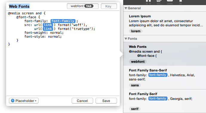
</div>Media Queries
Media queries are a component of cascading style sheets (CSS), the language used to style websites and email campaigns. With media queries, you can fine-tune email designs so that they are more usable across mobile, desktop, and webmail inboxes.
Here’s a list of all the important media queries you’ll need when designing emails:
Base Media Query
@media screen and ({declaration}) {
  {content}
}
Max-Width Media Query
@media screen and (max-width: {width}) {
  {content}
}
Min-Width Media Query
@media screen and (min-width: {width}) {
  {content}
}
iPad 1 & 2 + iPad Mini Media Query
@media screen and (min-device-width: 768px) and (max-device-width: 1024px) and (-webkit-min-device-pixel-ratio: 1) {
  {style}
}
iPad 3 & 4 Media Query
@media screen and (min-device-width: 768px) and (max-device-width: 1024px) and (-webkit-min-device-pixel-ratio: 2) {
  {style}
}
iPhone 2G/3G/3GS Media Query
@media screen and (min-device-width: 320px) and (max-device-width: 480px) and (-webkit-min-device-pixel-ratio: 1) {
  {style}
}
iPhone 4/4S/5/iPhone 6 (zoom view) Media Query
@media screen and (min-device-width: 320px) and (max-device-width: 568px) and (-webkit-min-device-pixel-ratio: 2) {
  {style}
}
HTC ONE + SAMSUNG GALAXY S4/S5 Media Query
@media screen and (device-width: 360px) and (device-height: 640px) and (-webkit-device-pixel-ratio: 3) {
  {style}
}
iPhone 6 (standard view) + iPhone 6 Plus (zoom view) Media Query
@media screen and (max-device-width: 375px) and (max-device-height: 667px) {
  {style}
}
iPhone 6 Plus (standard view) Media Query
@media screen and (max-device-width: 414px) and (max-device-height: 776px) {
  {style}
}
Outlook Conditional Comments
With the plethora of rendering issues that comes with having to support Outlook, it is sometimes useful to target Outlook with specific styles. Outlook can be targeted using conditional mso comments for either HTML or CSS content.
Microsoft Word rendering
<!--[if mso]>
  {content}
<![endif]-->
Outlook 2000-2013
<!--[if (gte mso 9)|(IE)]>
  {content}
<![endif]-->
More Outlook conditional comments:
- Outlook 2000
- Outlook 2000-2002
- Outlook 2000-2003
- Outlook 2000-2007
- Outlook 2000-2010
- Outlook 2002
- Outlook 2002-2013
- Outlook 2003
- Outlook 2003-2013
- Outlook 2007-2013
- Outlook 2010
- Outlook 2010-2013
- Outlook 2013
WebKit
One of the best ways to progressively enhance your email is by targeting WebKit rendering engines. Approximately 47% of email opens occur in inboxes powered by WebKit.
@media screen and (-webkit-min-device-pixel-ratio: {value}) {
  {style}
}
Gmail
Gmail does not support classes or id’s in the <head> of emails, which is why CSS must be inlined in email. However, Justin Khoo of FreshInbox discovered a new hack in which Gmail will read CSS in the of emails.
If you use the lang or title attribute as an attribute selector whose value is in a list of white-space separated values one of which is an exact match, Gmail will read that CSS. That’s a mouthful, so here’s a snippet to help you out:
* [lang~="{name}"] {
  {style}
}
Yahoo
Yahoo Mail recently introduced its own unique media query, allowing us to easily target certain styling for the webmail.
@media yahoo {
  {style}
}
Android
James White recently posted on the Litmus Community a hack to center emails on Android 4.4.
body { margin:0 !important; }
div[style*="margin: 16px 0"] { margin:0 !important; }
Snippets in Community
Want even more snippets? Have some favorites you’d like to share? With the help of email geeks everywhere, we already have dozens of useful snippets, such as the code to remove blue links on iOS devices, in the Litmus Community.
Sort existing snippets by the email client it was created for, or the type of snippet (i.e., hack, image, link, etc.). You can add your own, and create a snippet library of your favorites. And, you can save even more time by importing snippets from Community directly into Builder. Coupled with Builder’s Instant Previews, coding with snippets might be the fastest way to make amazing email campaigns.
Check out snippets in Community →
The info in this blog is 2+ years old and may not be updated. See something off? Let us know at hello@litmus.com.

Kevin Mandeville was a Product Manager at Litmus
