Key takeaways ✨
|
Big, flashy email design is taking a backseat. Today’s best emails are cleaner, simpler, and more intentional—and micro-animations are quickly becoming the detail that brings them to life.
From subtle hover effects to animated CTAs, marketers are using micro-animations to add movement, guide attention, and create more engaging emails without overwhelming subscribers. It’s a trend we predicted in our recent State of Email webinar and one that sparked major buzz during our Litmus Live industry trends session.
The takeaway? Small movements can make a big impact. Here are a few micro-animation best practices and 10 ideas you can start testing today.
Table of contents
- What are micro-animations?
- Best practices to keep in mind
- 10 micro-animation examples
- Get even more micro on micro-animations
What are micro-animations?
Micro-animations are animated GIFs, but smaller—subtle attention-grabbers that load faster and are more mobile-friendly. They can be as simple as a CTA button changing color, just subtly enough to catch subscribers’ attention without being too flashy or too obvious if the animation doesn’t load.
Micro-animations help brands amplify their personality and tone, driving more visual engagement and an improved user experience. They prompt actions like click-throughs and can also provide subscriber reassurance—for example, by acting as a loading indicator while rich content loads.
Best practices to keep in mind
Like any part of email marketing, following a few best practices can help micro-animations have a bigger impact.
- Use micro-animations purposefully. Every animation should have a function in the email—highlighting a CTA or supporting navigation, for example.
- Know your baseline HTML file size before adding any animation. Gmail clips at 102KB, so if you’re already over that limit, skip them.
- Keep total asset weight under 1–1.5MB across the entire email. Use only a few frames, stop the loop after two to three repeats, and compress GIFs to an optimal size.
- Ensure there is a static fallback in place. Some mailbox providers strip out the code, and some won’t play GIFs. Design the static version first, then layer motion on top.
- Don’t place them below the fold. Micro-animations rely on visual impact, which is completely wasted if subscribers don’t see them as soon as the email is opened.
- Design with small-screen users in mind. Don’t make animation effectiveness dependent on precise cursor movements—clicks and swipes are the way to go.
- Be cautious about deploying anything that flashes or strobes. This could trigger photosensitive seizures for some subscribers. Read more about email accessibility here.
Send with total confidence
Preview emails in 100+ clients, catch errors, and ensure accessibility. Cut QA time in half.

10 examples of micro-animations in action
There’s already a broad set of use cases for micro-animations. Here are ten favorites from emails we’ve seen this year.
1. Accentuating your brand
A micro-animation in the logo is clever. It doesn’t scream out, but it does make you look. And because the animation lives in the logo, it can easily be used across many templates without creating something new each time. The tactic is even more effective because many email subscribers use preview panes—so they see the animation gets seen before opening the email.

2. Increasing CTA effectiveness
Subtle pulses or color shifts help key elements—like CTA buttons—stand out, increasing visibility and engagement, and boosting click-through rates in the process.

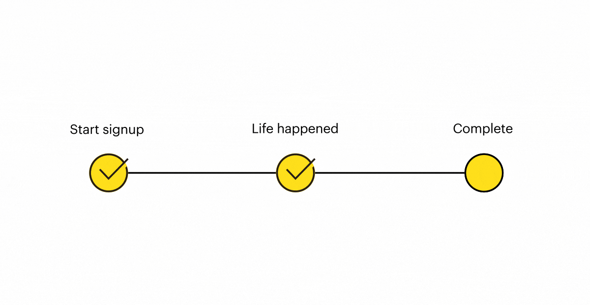
3. Improving task completion
Getting new customers to complete an action—activating their subscription or finishing their account setup, for example—is critical to the early relationship. Doing so drives engagement and reduces future churn. This clever example highlights the incomplete action and calls attention to the benefits being missed.
4. Taking loyalty to the next level
Many businesses run loyalty programs that encourage customers to hit their next tier through increased activity or spending. Micro-animations can help visualize the gap and motivate subscribers to take the steps needed to earn their next reward.

5. Driving urgency
Micro-animations command attention—which makes them great for conveying urgency. In this example, a rapidly moving parcel reassures customers that even the most urgent maintenance and repair needs can be met quickly via next-day delivery.

6. Illustrating product features
Some products lend themselves perfectly to micro-animation—helping readers visualize what they look like in real life. Great examples include:
| Brand | Subject Line | Preview Text | Visual |
|---|---|---|---|
| Stride Rite | Finally! ✨Shoes You Can Actually Find in the Dark | Stride Rite’s “logo glow” shoes, which can be seen in the dark. |  |
| My M&Ms | 🔥Last Chance! Flash Sale Ends in Hours! | M&Ms that can be personalized from an uploaded photo. |  |
| Yves Rocher | La BB Crème qui révèle votre éclat 💙 | The different shades available for a beauty product. |  |
7. Product storytelling
Starbucks UK shows how micro-animation can elevate product storytelling in email. In this promotion for its tiramisu-inspired drinks, a full-width animated GIF subtly highlights the drink’s mascarpone-style foam and cocoa topping, creating a sense of movement and texture that reinforces the dessert inspiration behind the product.

8. Cross-channel engagement
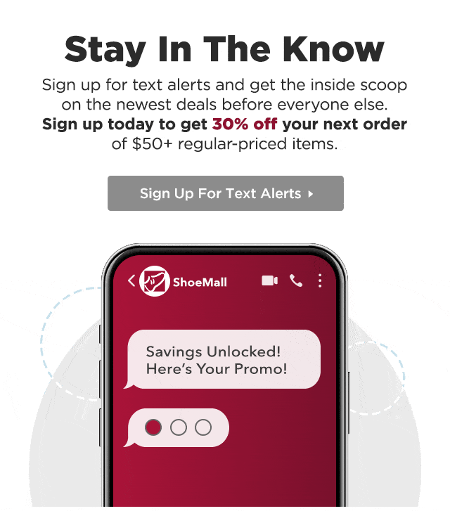
While email is the central pillar of many marketing programs, it naturally complements other channels like mobile and social, and is often used to drive acquisition for them. These requests tend to get buried in email footers, surrounded by competing content. A subtle wiggle or shake goes a long way toward making them stand out.
9. Finessing feedback
Customer feedback is a vital part of any email program’s ongoing improvement. Good senders know this and proactively ask how they’re doing. But like social and mobile requests, feedback prompts often appear far down the email—and benefit just as much from a little animation to grab attention and highlight the response options.

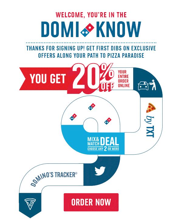
10. Going big with micro-animations
OK, so this last example is probably a micro-animation-plus…but it does an excellent job of pulling together welcome email best practices into one highly entertaining visual journey. New subscribers are welcomed and then walked through everything they need to know: benefits, how to order, mobile and social prompts, an introduction to the order tracker, and a clear and compelling CTA. And while it’s not quite a micro-animation, the whole package comes in at 322KB—well below recommended guidelines.
Get even more micro on micro-animations
Want to dig deeper into micro-animations? Here are some great resources where we’ve been covering this topic:
- Webinar: 2026 Email Marketing Predictions
- Blog: Where is email marketing headed in 2026?
- Webinar: Litmus Live takeaways and tactics you can start implementing now
And if we’ve got you fired up and ready to put micro-animations to work, find out how Litmus can help with testing, proofing, accessibility checking, and ongoing monitoring—everything you need to make sure your micro-animations are macro-effective.
Get email insights from marketers worldwide
Dive into the State of Email Reports for the latest trends, innovations, and best practices across the email marketing industry.


Guy Hanson is the VP of Customer Engagement at Validity
