Design can be the most perplexing thing about email. One of the prime reasons for launching our #NoFailMail initiative is to help email designers, developers and marketers conquer all the things that can break email, whether images, formatting, or email clients.
It’s obvious, but we’ll say it anyway: You must find and fix design errors before you send your next email. Design failures can prevent your readers from opening and acting on your messages and affect your brand reputation.
In this post, you’ll learn about five common email design fails that plague email and how to fix each and every one of them.
On to the fails!
Email Fail # 1. Not designing for multiple screen sizes.
The email world isn’t divided into desktop and mobile anymore. Your subscribers can read your email on everything from a “smart” TV screen on the wall to a smartwatch on their wrists.
They might not even be reading your messages. Instead, they could be listening while a home assistant like Alexa or Google Home or a screen reader reads your emails out loud..
A 2016 study by Litmus and Fluid showed that 51% of all subscribers unsubscribe from email that didn’t display or work well on their smartphones—and 43% report those emails as spam. Those stats prove that designing for multiple screens is no longer a nice-to-have.
A quick look at the Email Client Market Share shows you how mobile dominates the landscape. Four of the top 10 email clients are mobile-only, and they claim a total of more than 40% of all email opens:
- Apple iPhone, 29%
- Apple iPad, 10%
- Samsung Mail 4%
- Google Android, 3%
Responsive and hybrid design, which uses fluid tables and images to make content flow across different sizes, is the best option to create emails that render properly across clients and platforms.
Our free ebook, The Ultimate Guide to Email Optimization and Troubleshooting, will help you understand which approach likely will work best if you’re transitioning from desktop-centric to mobile-optimized formats.
In the meantime, these five workarounds will make your emails more readable and easier to act on whether your subscribers are viewing them on desktops or mobile devices:
- Use a larger font size.
It sounds crazy–a bigger font on a smaller screen?–but it works. Readability without forcing people to pinch, zoom or scroll your messages from side to side to see your content is the goal. We recommend a minimum font size of 14px for body copy and 22px for headlines. - Design a touch-friendly CTA.
The finger is not as precise as your computer mouse. Replace clickable links with buttons. Then, size those buttons at a minimum 44px X 44px, which is roughly the size of an average fingertip. - Slim down to one column.
Two- or three-column email layouts don’t read well on smaller screens. Remember that your goal is to make your email content easy to read without pinching, zooming or side-scrolling. If you’re not ready to move up to responsive design, opting for a single-column layout will make your emails more readable across more screen sizes. - Streamline your content.
Do you really need all that content in your email to get clicks or conversions? Use link-tracking and other tools to figure out what your readers are clicking on and what they’re ignoring. Move to one primary copy block, or two at the most. Grab attention with a strong hero image instead of a cluster of smaller product photos.
Also, aim for shorter sentences and copy blocks. Five lines of copy in a standard desktop format can easily wrap to 10 or 15 on mobile. - Pump up the white space.
White space is the blank area around images and copy blocks. Use it liberally to focus attention on areas of content, to give CTA button more breathing room, and to break up paragraphs in a copy block.
Email Fail #2: Letting blue links break your design
Auto-linking is a helpful but sometimes annoying trait in both iOS and Gmail. You see this when dates, phone numbers, and addresses automatically become clickable/tappable blue links.
These can be helpful in plain-text or personal emails because they’re convenient–one tap can launch a map or click-to-call, or save an event to a calendar. But they can also be hard to read against any background that isn’t white. They also interfere with your branding for that email.


Thankfully, there are ways to disable those blue links. In iOS Mail, you can overwrite blue links by styling Apple Mail’s data detector selector (Learn how). Blue links in Gmail can be fixed by using the method (that’s wrapping addresses or phone numbers into a tag and defining the styling for that span, or you can overwrite all default styling by adding a Gmail-specific style declaration to your CSS (Here’s how).
 | DO YOUR EMAILS HAVE BLUE LINKS?Preview your emails in 90+ popular email clients and devices and spot errors—including blue links—before you send. |
Email Fail #3: Images gone awry
Ah, images. They can go wrong in so many ways, but when you use them right, they bring your emails to life. So, it’s worth your time to check out the image fails we see every day and how you can keep them from breaking your design:
- Using the wrong image format
The solution here isn’t to use the “right” image format, whether it’s a JPEG, a GIF, a PNG or an SVG, because there isn’t a single right format. Each format differs from the others in file size, compression, quality and best use case.For a detailed comparison of the pros and cons for the most common image formats, see “PNG, GIF, or JPEG? Which is the Best Image Format for Email?” on the Litmus blog. - Not optimizing for Retina display
“Retina display” is a term coined by Apple to refer to high-DPI displays seen on mobile devices. Images that aren’t optimized for Retina display often show up blurred or fuzzy, leading to a subpar visual experience.
Non-Retina v. Retina Images To get your visuals retina-ready, create your image at around twice the size you plan to display it, then define the image size as your intended size in the HTML. If you want to display a 300×200-pixel image, create it at 600×400 and define it as 300×200 using HTML attributes or CSS properties.
Be sure to keep an eye on the file size though. While using retina images improves the look of your visuals, it also increases their file sizes, and that means your images could take longer to load in the inbox. If you use several Retina-optimized images, you could trigger message clipping in Gmail.
| Test your image file-size + load timeWith Litmus Checklist you can test your images for file-size, load time, and broken links. Plus, instantly see how your campaigns look in popular email clients. |
Email Fail #4: Not designing for images off
The other problem with images comes when they don’t render. Some email clients automatically block images from loading until the user permits it. Or, users themselves prefer to block images by default and choose which ones they want to see.
Either way, image-blocking reduces your email’s ability to communicate as soon as the message opens. Although you can’t force users to unblock images, you can take steps to make an images-off message look good. ALT text and bulletproof buttons are easy to implement and can help you rescue conversions that you might have lost without images to drive them:
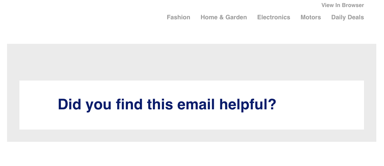
- Use basic or styled ALT text. ALT text is the combination of words you choose to describe the image and which appears when the image is blocked. It should be standard practice–most email editors give you a space to write your image description–but a quick run through the inbox reveals almost every other email had images but no ALT text. Here’s what an image-heavy email looks like without ALT text, when images are disabled:
 Here’s that same email with images enabled. See what your customer would have missed?
 A good ALT text practice is to write an effective description, not just an image label. To go a step beyond, try styled ALT text. Here, you add a bit of inline CSS to change the font, color, size, style and weight of the ALT text.
 - Use bulletproof buttons
If you put your call to action inside an image, it will be invisible when images are turned off. A bulletproof button uses HTML and CSS instead of image formats like JPGs and GIFs. They don’t rely on image-rendering to appear in the email. And here is the same email with images enabled:
 Here’s that same email with images enabled. See what your customer would have missed?
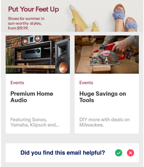 A good ALT text practice is to write an effective description, not just an image label. To go a step beyond, try
 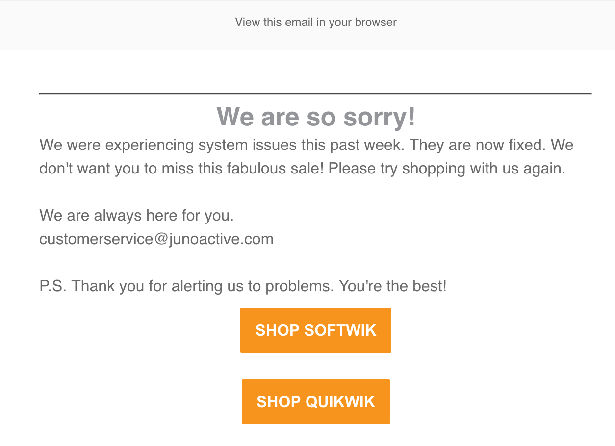 And here is the same email with images enabled:
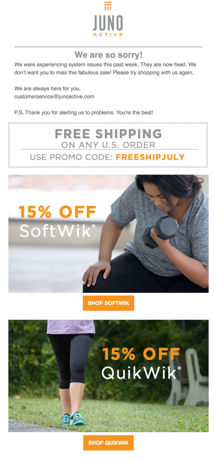
Jason Rodriguez, Litmus community and product evangelist, outlines four basic approaches to button design in his guide, “The Ultimate Guide to Bulletproof Buttons for Email Design.” Check it out to see the coding, examples, and pros and cons of each approach.
Email Fail #5. Not optimizing for plain-text email
No, we aren’t going to revive the Great Text-Versus-HTML Debate of the early 2000s. But plain-text email still plays a significant role in your email strategy, especially with the growth of smartwatches, screen readers and home assistants, none of which render HTML.
These tips will help you create a compelling plain-text email, whether it’s a stand-alone message or the text version of a multi-part MIME message:
- Write short but clear headlines. Use at least one line of white space to differentiate each headline from the copy block below it. Set it off with typographical devices like dashes or equal signs.
- Break up long copy blocks. Use more but shorter copy blocks to avoid the dreaded and unreadable gray river of copy.
- Create information hierarchy with lists. All the type in a plain-text email is the same font and point size. So, you have to work harder to guide your reader to your key points. Use lists to highlight information in a series. Set each item off with a text-friendly designation, such as a dash (–) or asterisk (*). (Bullets don’t work in plain text.)
- Use white space liberally. White space organizes related information for easy scanning. Use wide margins and extra line breaks between copy blocks, calls to action and headers or administrative footers.
- Define CTAs. What did people do before they had CTA buttons? They used attention-getters like white space to separate them from other copy and with typographical devices like arrows (>> and <<) to set them off. Avoid long lists of CTAs and surround them with white space to make them click- or finger-friendly.
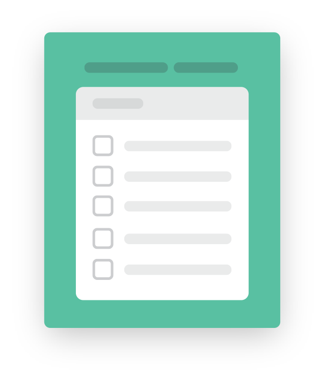
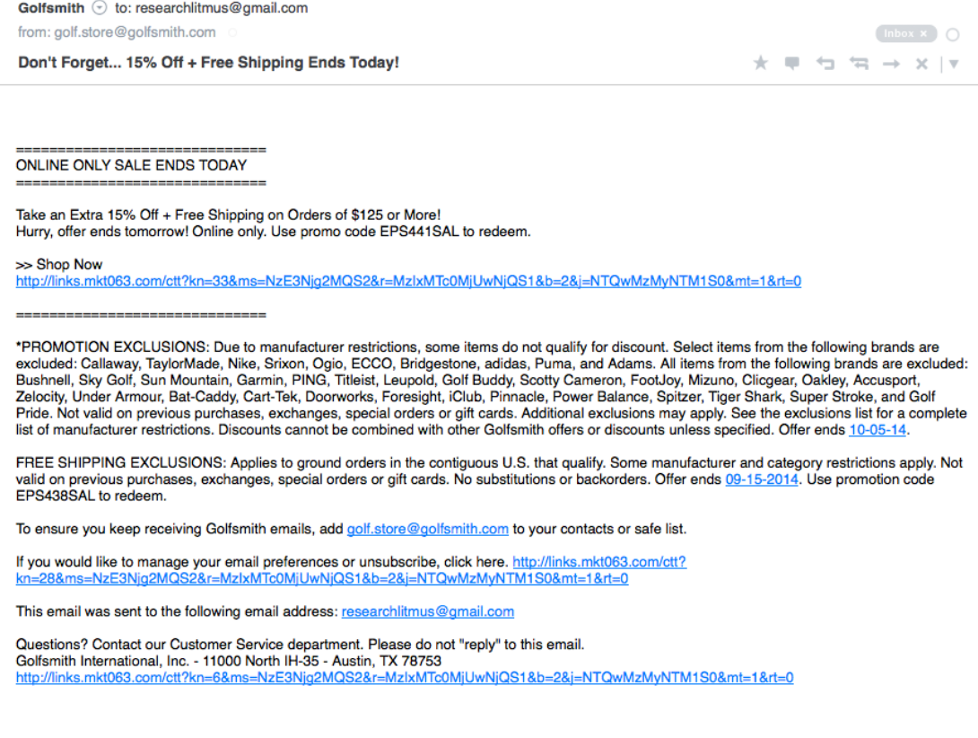
This email illustrates all these best practices for plain-text emails:
We covered more ways to send #NoFailMail in these earlier blog posts:More tips and resources for #NoFailMail
- #NoFailMail: Why Avoiding Errors is the Key to Email Success
- How Testing Helps You Avoid the 5 Biggest Email Fails
- 5 Copywriting Fails You Should Avoid
Want more resources like these? Sign up for our newsletter to keep up with the latest in email.
The info in this blog is 2+ years old and may not be updated. See something off? Let us know at hello@litmus.com.

Bettina Specht is the Product Marketing Lead at Beefree.
