Key takeaways ✨
|
As email marketers, we all strive to deliver great emails to our subscribers’ inboxes. We run spam tests and email testing to ensure our design renders perfectly on all devices and email clients.
The hundreds of hours that go into your email design and email copy go poof if your code renders your email inaccessible. Accessibility is a pillar of email design because without an accessible design, a portion of your subscribers can’t see or click on your email at all. This makes it impossible for them to take action on your email, and worse, gives them a terrible experience.
If you’re just getting started with making your email code more accessible, it can be overwhelming. But there are a few simple tricks that you can implement easily—and have a big impact on email accessibility.
Table of contents
- Accessibility coding standards
- Accessible coding and screen readers
- Accessible email code checklist
- Dodging accessible email coding mistakes
- Coding for dark mode
- Coding accessible, interactive emails
- How to code accessible tables for email layouts
- Tools for accessible and inclusive coding
Accessibility coding standards
Email markup consortium recently analyzed over 400,000 emails and found that 99.97% of HTML emails contained accessibility issues that prevent many subscribers from reading the email. 🤯That’s basically every email send!As email marketers, we must do better.
“The most common thing I hear about accessibility is that ‘nobody is looking at my email with images off,’ or ‘nobody is using screen readers,’ and that’s just not true,” says Carin Slater, email marketing expert. “When someone signs up for your inbox, it’s like being invited into their home. You need to respect who they are as people. That’s what accessibility is all about.”
If you’re not sure where to start with accessible coding, it’s time to study up on standards like the Web Content Accessibility Guidelines (WCAG). These standards outline exactly how to code emails to make sure they’re accessible to everyone—not just what’s legally required of you in the U.S. and internationally.
These internationally recognized standards outline how to make websites, apps, and other digital properties accessible to people with disabilities. While WCAG isn’t a law on its own, it’s the widely recognized guide for making web and digital experiences accessible to everyone.
Accessibility made simple
Creating accessible emails is no longer optional—it’s required. Learn about accessibility’s impact on brands from two industry experts.

Accessible coding and screen readers
When we think about accessible coding, what most people jump to is optimizing for screen readers. A screen reader is an assistive software that reads text on a computer screen (in this case, your email). It’s most commonly used by those with visual impairments, but anyone who has engaged Amazon’s Alexa, Apple’s Siri, or Google Assistant has used a screen reader. The World Health Organization estimates there are around 2.2 billion people with visual impairments, many of whom are considered blind.
What happens when your code isn’t accessible? Let’s take images as an example. Without ALT text, screen readers have no way of properly describing an image out loud.
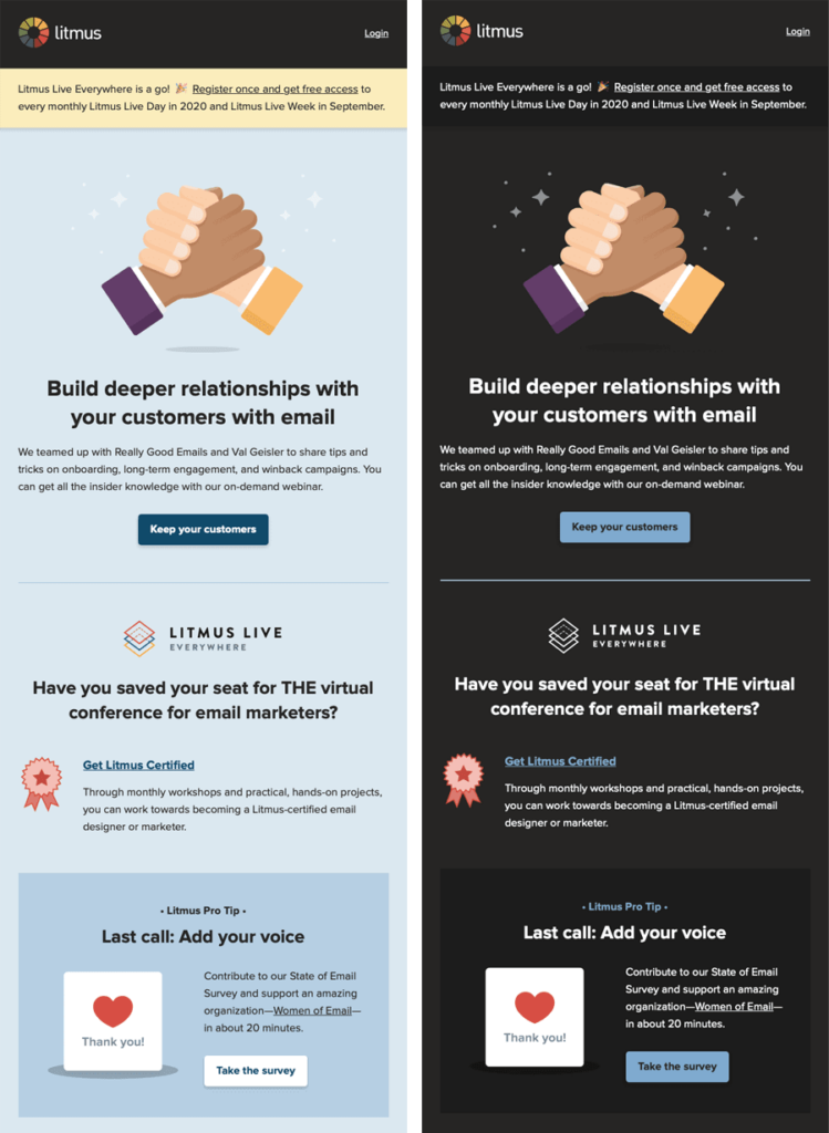
Let’s look at this really simple email header from one of our own emails. This header contains an image of the Litmus logo without ALT text.
![]()
Here’s how a screen reader will read out our email header, if we hadn’t optimized it for accessibility.
Audio Player
00:00
00:00
Use Up/Down Arrow keys to increase or decrease volume.
Screen readers end up listing out a ton of garbled letters from your code.That means your subscribers with screen readers have to sort through confusing letters and numbers in an attempt to hear your message. That’s not super helpful, and the body of the email hasn’t even started yet! With that kind of experience, what are the chances they’d open another email? (Hint: Zero.)
Accessible email code checklist
Sometimes, we forget to set ALT tags for our images, use a color combination that’s difficult to read, or fail to optimize our emails for screen readers. It happens to the best of us.
Here is your accessibility checklist so your code is always readable by all of your subscribers—and easier for you to write with accessible language, too.
Are your emails accessible?
Use this free pre-send email accessibility checklist as a starting point to make
sure your email copy, design, and code is accessible to everyone.
1. Add a language code to your <HTML>
Not all of your subscribers will read your email on their laptops or phones—some will use screen readers to access your email. Since your email content will be read out loud, it should be in the right language so the pronunciations are correct. After all, you wouldn’t want your email written in French to be pronounced in American English, would you?
To prevent that from happening, you have to tell screen readers what language your email is written in. If there’s no language code specified in your emails, screen readers can’t pronounce the copy correctly—and your eloquent email may come out sounding completely wrong.
That’s why it is key to check your <HTML> for a language code—that’s a simple snippet of code that specifies your email’s language. If it isn’t already in your code, add lang=“xx”—replace xx with the appropriate language code for your email. Check out this list of all possible language codes and localities—which allows you to account for different accents, like a differentiation between British and American English.
There are a few special cases to consider:
- If you’re using any XML in your <HTML> tag, you’ll also need to add xml:lang=“xx”.
- If you’re including the Outlook 120dpi fix in your email code, you’ll need this solution to specify a language. Here’s how our code looks with this fix:
<html
xmlns_v="urn:schemas-microsoft-com:vml"
xmlns_o="urn:schemas-microsoft-com:office:office"
lang="en" xml_lang="en">
Pro tip: it’s possible to populate the language code dynamically if you have localization set up within your ESP.
2. Always include ALT tags for your images
It’s important to keep in mind that the images in your emails might not always be visible for your subscribers. Maybe they have their images off, or they have a bad connection, or they’re using a screen reader. If you’re including a lot of important information in your images, that messaging will be lost. That’s where ALT text comes in. You can set text that’s visible to your subscribers (or read out by their screen reader) so they still get the same messaging as people that can see your images.
“If the image is of a specific product, and then the headline underneath the image is the name of the product, then your alt text shouldn’t just be the name of the product. In a screen reader, that would read something like, ‘iPhone iPhone iPhone iPhone iPhone,’ which is just a terrible experience,” says Carin.
Wherever you have an <IMG> tag in your email code, be sure to set the ALT tag. If you have populated ALT tags already, double check to make sure that text matches the text on the image. If you have empty ALT tags, make sure that there isn’t any text on the image that needs to be populated for a screen reader to see.
There are some cases where you should add an empty ALT tag: alt=“” to the images. Do this when:
- There are no ALT tags on your images.
- There is no text in the image itself.
- The image is purely decorative and does not add any meaning to the email.
If you don’t include the empty tag, screen readers will read out the URL of the image—and no one wants a long URL read out to them!
Once you’ve set all of your ALT tags—empty or not—for the images in your email, add font styling into the <IMG> tag for styled ALT text. This styling lets you get fancy with your ALT text and lets you alter the appearance of the font, color, size, style, and weight.
3. Include role=”presentation” attribute on all <TABLE> elements
Most email marketers rely on tables to structure their email layout, but those can cause serious issues for screen readers. If a screen reader identifies a table in your email’s code, it will read out loud as one. It might literally tell you how many rows and columns there are, telling you each column’s position and content, making it impossible to understand your message.
That’s why it’s key to tell the screen reader that you’re using the table for layout purposes only. You can do that by adding role=“presentation” to every table in your email. This role tells the screen readers to remove any semantic meaning from the tables—so instead of reading out row and column numbers, it focuses on the content instead.
Let’s look at this really simple email header from one of our own emails:

Before we optimized for accessibility, our code looked like this:
<code style="color: #fff; background: #333;">
<table width="100%" cellpadding="0" cellspacing="0"
border="0"><tr>
<td align="center" bgcolor="#2f343c" valign="top"
style="padding: 0px 15px;">
<table class="w100p" width="600" cellpadding="0"
cellspacing="0" border="0"><tr>
<td class="w100p" width="600" align="center">
<table cellpadding="0" cellspacing="0" border="0">
<tr><td style="font-size: 1px; line-height: 30px;">
</td></tr></table>
<a rel="noopener" target="_blank" rel="noopener" target="_blank" href="https://litmus.com?utm_campaign=soeanalytics2019rt&utm_source=email&utm_medium=marketing&utm_content=%%dynamic_content_1456%%">
<img src="https://pages.litmus.com/l/31032/2016-08-16/954sb7/31032/95886/litmus_logo_white.png"
width="134" height="50" style="color: #ffffff;
font-family:'proxima_nova', Helvetica, Arial, sans-serif;
text-align:center; font-weight:bold; font-size:36px;
line-height:40px; margin: 0 auto; padding: 0;" />
</a>
<table cellpadding="0" cellspacing="0" border="0">
<tr><td style="font-size: 1px; line-height: 30px;">
</td></tr></table>
</td></tr></table>
</td></tr></table>
</code>
Did you notice that it’s missing ALT attributes and the tables aren’t set to role=”presentation”?
Those small oversights have a big impact on accessibility. Here’s how a screen reader interprets the code above:
Screen reader: Non-accessible email header
And here is that same code that’s been refactored by adding the ALT=”” attribute and role=”presentation” to <TABLE> tags to be screen reader-friendly:
<code style="color: #fff; background: #333;">
<table role="presentation" width="100%" cellpadding="0"
cellspacing="0" border="0"><tr>
<td align="center" bgcolor="#2f343c" valign="top"
style="padding: 0px 15px;">
<table role="presentation" class="w100p" width="600"
cellpadding="0" cellspacing="0" border="0"><tr>
<td class="w100p" width="600" align="center">
<table role="presentation" cellpadding="0" cellspacing="0"
border="0">
<tr><td style="font-size: 1px; line-height: 30px;">
</td></tr></table>
<a rel="noopener" target="_blank" rel="noopener" target="_blank" href="https://litmus.com?utm_campaign=soeanalytics2019rt&utm_source=email&utm_medium=marketing&utm_content=%%dynamic_content_1456%%">
<img src="https://pages.litmus.com/l/31032/2016-08-16/954sb7/31032/95886/litmus_logo_white.png"
width="134" height="50" alt="Litmus" style="color: #ffffff;
font-family:'proxima_nova', Helvetica, Arial, sans-serif;
text-align:center; font-weight:bold; font-size:36px;
line-height:40px; margin: 0 auto; padding: 0;" />
</a>
<table role="presentation" cellpadding="0" cellspacing="0"
border="0">
<tr><td style="font-size: 1px; line-height: 30px;">
</td></tr></table>
</td></tr></table>
</td></tr></table>
</code>
Screen reader: Accessible email header
As you can hear, there’s quite a difference!
How to code accessible tables for email layouts in Litmus
If there’s one aspect of accessible coding you take away from this article, it’s adding role=presentation to your tables. This will dramatically impact your accessibility and takes very little time to do.
“Doing this is so important because it lets screen readers know that they don’t need to read it out like a table,” says Carin. “I came up through email in a very regulated industry, and everything had to look a certain way, so I often would use tables or bullet points in the code to do that. Those are both important cases for ARIA labels to let a screen reader know that it’s not actually meant to be read that way.”
Here’s how to do it in Litmus:
1. First, log in to your Litmus account and click on Litmus Builder. Choose from one of your templates or start coding your email directly with HTML.
2. As you build your tables, add role=presentation.
3. When you’re done, double check your work in the QA checks tab in Builder. Litmus Accessibility Checker can help you identify exactly what you’re missing with dozens of helpful accessibility checks.
4. Then, update your Previews and QA tab to finish your testing process.
5. Send it! *happy dance*
4. Use semantic elements to structure your content
Semantic elements make it easy to highlight content hierarchy, showing subscribers (and screen readers) what’s a headline and what’s paragraph copy. Including semantic elements gives your subscribers who use screen readers the option to “scan” through an email more easily.
When double checking your copy, make sure any headline-worthy copy is enclosed within an <H> tag: <H1>, <H2>, <H3>, and so on. Similarly, make sure any body copy is housed within a <P> tag. When going through your email, screen readers put emphasis on specific headers, and setting up these <H> and <P> tags will make your email easier to navigate.
5. Left-align your copy, if possible
When it comes to your body text, it may be tempting to center align. However, when it comes to accessibility, this is a big don’t!
When you center your text, the starting edge changes for every line, which forces your subscribers to work harder to find the beginning of each line. That’s a challenge for people with dyslexia and other reading impairments.
If you have any copy that’s longer than two lines, left-align that copy. This is especially important for mobile, since the narrow width often produces more lines of text than you may realize. You may need to left-align your text responsively on mobile.
6. Check the contrast of your copy
Check the contrast ratio of your text colors against the background colors of your email. You may have subscribers that have color deficits, and if your colors do not provide enough contrast for them, they may not be able to read your email. There are two ways you can check your contrast ratio:
If you need to manually input your color codes, check out https://contrast-ratio.com/.
Dodging accessible coding mistakes
Of course, we all make mistakes. Here’s a quick shortcut so you can easily fix your code:
| Common Accessibility Error | Fix It By… |
|---|---|
| All-image emails | Adding images where necessary within the code of your email |
| No ALT Text | Adding descriptive alt text to each image. |
| Poor color contrast or disappearing text in dark mode | Choosing a color scheme that has high contrast. Think opposite sides of the color wheel. |
| No text alignment | Left-aligning your copy text. This makes it much easier for screen readers (and tbh, everyone.) |
| Disorganized code | Adding role="presentation" to your tables, and semantic elements like<H2>, <H3>, or <p> to create a hierarchy your screen reader can read.(Plus it’s cleaner code for you!) |
Unlock endless revenue
Let’s take a look at how much email-driven revenue you could be leaving on the table.

Coding for dark mode
Litmus Market Share shows 35% of emails are opened in dark mode, making it a potentially significant chunk of your subscribers. Since it launched in 2018, it’s created quite a few headaches for email marketers—especially when it comes to accessibility.
That’s because some email clients leave your email exactly as it is, some email clients completely invert your colors, and some only partially do.
To make sure any Dark Mode styles stay accessible to users—specifically, that your color contrast works and is readable to users with colorblindness or low vision, you can use two different methods to control what your email looks like:
- @media (prefers-color-scheme: dark)
This method works in very much the same way as applying a block of styles inside a @media query for your Mobile Responsive view, except this CSS block targets any user interface that’s set to Dark Mode. @media (prefers-color-scheme: dark) allows you to create the most robust custom Dark Mode themes where you can implement anything from Dark Mode-specific image swaps, hover effects, background images… basically almost anything you can do with traditional CSS. This method requires you to add Dark Mode meta tags and styles to the <head> of your email in order to work in Apple Mail.
- [data-ogsc]/[data-ogsb]
S/O to Mark Robbins for showing us how to target the Outlook app. This method allows for image swapping on Outlook.com. To do it, duplicate the @media (prefers-color-scheme: dark) styles you already applied and add the appropriate [data-ogsc] prefixes to each CSS rule.
Coding accessible, interactive emails
Interactive emails are some of the most fun and challenging to create. Adding elements like polls, surveys, hot spots, quizzes, offer reveals, and reviews gives your subscribers a chance to engage directly with your email. With most of these types of interactivity, however, you need a fallback option or a generic version to make them accessible.
But one of our favorite underused interactive elements can actually help your accessibility efforts: Hover effects.
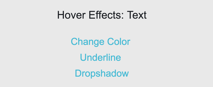
At Litmus, we use hover effects on our CTAs, links, and images to indicate clickability. Hover effects are a simple interactive element that can make your emails more engaging and improve your subscribers’ experience by making them easier to interact with.
Here’s how to do it:
Embed CSS
.txt-color:hover { color: #8ddaeb !important; }
HTML – Text Hover Color Change
<!-- start TEXT HOVER COLOR CHANGE -->
<a rel="noopener" rel="noopener" href="#" style="color:#43b9d3; text-decoration:none;">
<span style="line-height: 21px;" class="txt-color">
Change Color on Hover</span></a>
<!-- end TEXT HOVER COLOR CHANGE -->
Though hover effects are only supported in AOL, Apple Mail, Gmail, and Yahoo! Mail, they’re a popular effect and worth implementing in your email code. You can fade an image, change the color of your CTA button, add a pop-up tab, and more.
Create emails that everyone can experience
Maximize your email’s impact by designing accessible content for all. Accessibility checks are always at your fingertips with Litmus.
Accessibly coding with email personalization
We often think of accessibility as an “extra” aspect of coding, but it’s really the foundation of personalization. You can’t build tailored experiences for your subscribers if they can’t read or click on your email to begin with.
“In email marketing, we talk a lot about 1:1 personalization, but true 1:1 communication is impossible if users can’t access your content,” says Lauren Castady, Associative Creative Director at Oracle Digital Experience Agency.
Merge tags pull in data from your ESP or database to personalize words, designs, or images in your email. But what a lot of email marketers don’t know is that merge tags work in ALT Text—so you can still add personalization from your images into your descriptions. For example, if you’re sending a “Happy Birthday [NAME]!” email, you can add an extra message for anyone unable to see those images.
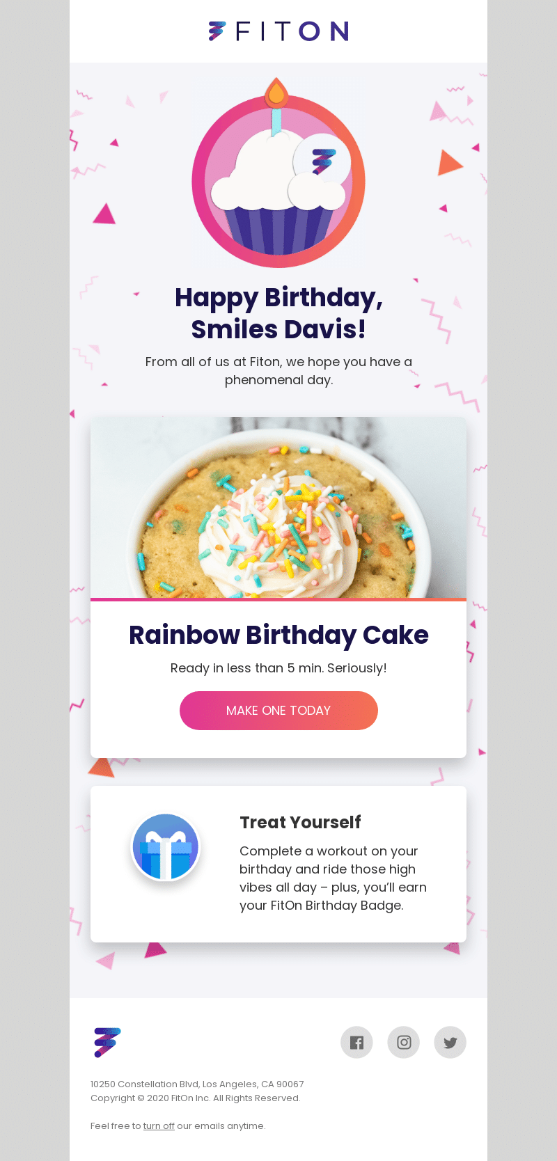
“If you’re using a personalized image with someone’s name on it, like a birthday cake, don’t miss the ALT text. You can either add a merge tag for an extra layer of personalization or make the ALT text generic enough that it matches the message without losing the experience. It does take a bit more coding, but you can do it as long as you have that data in your ESP.”
Here are some examples to try:
Generic ALT text with a flexible fallback personalization parameter in the image
<img alt="a good morning cup of coffee for you" src="https://image.ltms.app/pi/9c9g2puty6bzmr24gwcf3tu72.png?firstname={{={{FirstName}}|Friend}}"/>Personalized ALT text with a flexible fallback personalization parameter in the image
<img alt="Good morning,{{FirstName}} - enjoy this cup of coffee!" src="https://image.ltms.app/pi/9c9g2puty6bzmr24gwcf3tu72.png?firstname={{={{FirstName}}|Friend}}"/>Engage with 1:1 experiences
Deliver personalized content at scale. Use live polls, dynamic content, and advanced targeting to drive results.
Tools for accessible and inclusive coding
Litmus’ Accessibility Checker (our email accessibility checker!), built directly into Litmus Builder and Litmus Previews, gives you visibility into important accessibility guidelines to meet the needs of the disabled community.
1. Automatic accessibility checks
Scan your email for 40+ accessibility areas, with detailed reports and guidance on any issues found. With Litmus’ Email Builder, you can check your code as you work to ensure it meets your subscribers’ needs.
2. Visual impairment filter
Make sure your email looks right against four different visual impairment filters mimicking different kinds of colorblindness, so you can double check design elements like color contrast, negative space, and font size.

3. NVDA screen reader preview
Our NVDA screen reader integration supports over 80 languages so you can make sure your email looks good and sounds good.
These tools are available in every single Litmus plan because we believe that creating more accessible, inclusive emails is an important part of making email marketing better for everyone.
Start making a difference today
Maximize your email’s impact with Litmus to ensure accessibility and inclusivity for all subscribers — no matter their abilities.
Originally published by Alice Li.
The info in this blog is 2+ years old and may not be updated. See something off? Let us know at hello@litmus.com.

Kayla Voigt is a B2B Freelance Writer.
