Key takeaways
- Color blindness is a disability where a person can’t see or distinguish between certain colors, which means that when you design your emails, some of your subscribers may not see the same email that you do.
- There is more than one form of color blindness: Red-green color blindness, blue-yellow color blindness, and complete color blindness. To design accessible emails for color blindness, you’ll need to be aware of how all three impact your email design.
- When designing emails for color blindness, choose a high-contrast color palette, avoid using only images or colors to convey meaning, and organize your email in a clear and logical way for your subscriber to read.
- Litmus Visual Impairment filters make it easy to check how your email appears for subscribers with color blindness.
You already know email accessibility matters. As email marketers, making sure that everyone reading your email gets to love and appreciate it is *chef’s kiss.* 👌
For whatever reason, accessible design has this reputation as being “a lot of extra work.” (Spoiler: It’s not.) Accessibility, especially in design, is less about flipping a switch—although we do have a switch for that—and more about changing how you think about design in the first place. Color, spacing, font, and layout all matter.
Let’s take a look at one very specific aspect of accessibility in email design: How to design for readers with color blindness. We’ll cover why making your emails visually accessible matters, what you can do to make that happen, and look at some common errors folks may experience along the way.
- What is color blindness?
- How common is color blindness?
- Different kinds of color blindness
- Colorblind accessibility is non-negotiable
- Principles of color blindness accessibility
- How accessible emails appear to color blind readers
- How to create an accessible color palette
- 5 best practices for designing emails for subscribers with color blindness
- Industry-specific tips for color blind accessible emails
- Common colorblind accessibility FAQs
What is color blindness?
Color blindness (also referred to as color vision deficiency) doesn’t mean a person can’t see. According to the American Academy of Ophthalmology, color blindness is a disability where a person is unable to see or distinguish between certain colors.
Every eye contains two types of cells that can detect light, called rods (which detect light level) and cones (which detect color.) Color blindness occurs when one or all of the cones in the eye are missing, damaged, or perceive a different color than normal. This results in a visual impairment where a person cannot distinguish between certain types of colors—usually reds and greens.
While the majority of color blindness is congenital, it is possible for color vision issues to occur later in life as the result of disease or eye trauma. Those with color vision deficiency may use special glasses or other visual aids, according to the National Eye Institute.
How common is color blindness?
Color blindness is more common in men than in women. It occurs in about one in twelve men (8%), and about one in 200 women. In total, about 300 million people around the world are colorblind (that’s roughly the population of the United States!)
What are the different types of color blindness?
There are a range of visual impairments that can impact a user’s ability to perceive color in different ways.
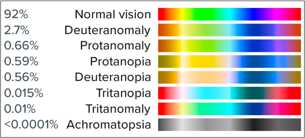
Image source: Wikipedia
Here’s a list, based on the data from the National Eye Institute.
1. Red-green color blindness
Red-green color blindness, as you might guess, makes it hard to tell the difference between red and green. It doesn’t mean a person can’t see the colors at all, just that they are difficult to compare. This is the most common type of color blindness, and there are four different varieties:
- Deuteranomaly is the most common, and it simply makes green look more red than it might otherwise.
- Protanomaly is the opposite—it makes red look more green, and less bright.
- Protanopia and deuteranopia are more extreme versions of both of the above. These versions of color blindness mean that you are unable to distinguish between red and green.
2. Blue-yellow color blindness
Blue-yellow color blindness is a less-common type of color blindness that blurs the line between blue and green, and the line between yellow and red. There are two different types of this variety of color blindness:
- Tritanomaly is the simplest type, and makes it hard to tell the difference between blue and green, and between yellow and red.
- Tritanopia causes you to be totally unable to tell the difference between blue and green, purple and red, and yellow and pink—as well as making colors look less bright.
While less common than red-green color blindness, it’s still something to consider.
3. Complete color blindness
Complete color blindness is actually quite uncommon. This type of color blindness means you cannot see colors at all, and is technically called achromatopsia.
Accessibility made simple
Creating accessible emails is no longer optional—it’s required. Learn about accessibility’s impact on brands from two industry experts.

Colorblind accessibility is non-negotiable
It’s highly likely that you have subscribers on your email list that are colorblind.
Accessibility matters because your audience matters—and with over 3 million email users worldwide, that audience views and experiences your carefully crafted emails in a wide variety of ways.
In the same way that subscribers view your emails in different email service providers (ESPs), subscribers all view your emails with different visual capabilities. And just like designing for Dark Mode or Outlook, it’s important to create a great user experience with your emails.
“If color is the only way you’re conveying meaning such as using red for errors and green for success, users experiencing color blindness might not be able to interpret your design at all. Accessibility is about making sure the experience works for everyone.”
It can be easy to think of your subscribers as numbers on a screen, but they’re people, too. Your job as an email marketer is to make lasting connections with people, not just hit the numbers. Making sure your emails can be read by the people you want to reach matters.
Colorblind accessible emails can also improve engagement
Designing accessible emails for colorblind users isn’t just the right thing to do. It’s also smart business sense, given how common color blindness is in the general population. If you want someone to engage with your email, they have to be able to find your text and CTAs—usually the first visual elements of an email that get hidden with low-contrast colors or color combinations that can’t be perceived well with color blindness.
“We’re not just making something accessible so we feel good about ourselves. Americans with disabilities collectively have twenty one billion dollars per year in disposable income after taxes and necessities. We’re really focusing on making something accessible because users with disabilities won’t spend that money with the companies that don’t follow these accessible best practices. We see the difference in our performance.”
When you practice accessible email design, you improve the customer experience for everyone—so it’s no surprise that doing so can increase engagement across your list.
Principles of color blindness accessibility
Accessible design principles revolve around your design systems at large, rather than coding for accessibility on specific campaigns.
“We have built, and continue to refine, design systems ensuring that every email we send meets accessibility standards,” says Kinkead. “We’re regularly thinking about how we can refine our brand identity while still meeting these standards and continuing to test every time we send to make sure we always deliver the best possible experience for all of our subscribers.”
Color is only one design element. When we think about designing for accessibility, if we only focus on color, we’ll end up whiffing the email for colorblind users. That’s why the biggest principle for color blindness accessibility is to rely on more than color to convey your message.
Then we test, test, and test again. “One of the biggest challenges we’ve faced recently is simplifying our color palette while maintaining accessibility,” says Kinkead. “We have a huge focus here at Litmus on making sure our emails are accessible, and even then we still ran into trouble when we tried to update our brand colors. We caught it early in testing and adjusted them to make sure they worked in light and dark backgrounds.”
Chances are, the changes you make for accessibility purposes make your emails easier to read for all your users, not just those with color blindness or low vision.
Do you need to create a separate email for color blind users?
No, you don’t need to create a separate email for color blind users. That’s because optimizing your email for color blindness actually makes your email campaigns more accessible to everyone—whether or not they have a visual impairment. We’ll talk more about how to do that below.
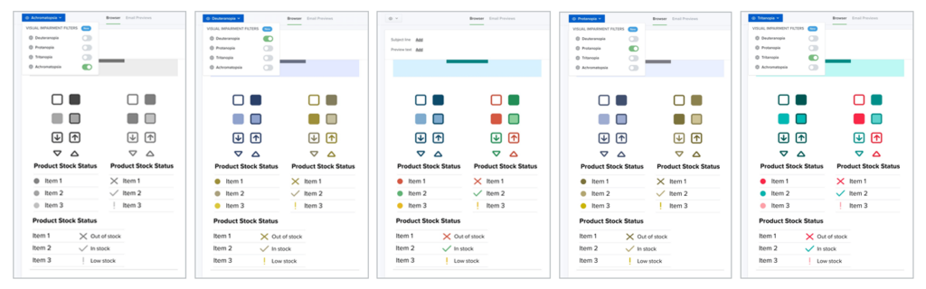
How accessible emails appear to color blind readers
Let’s look at an example of how accessible emails appear to color blind readers using Litmus’ Visual Impairments Filter. Here’s an email before any filters have been applied to it:
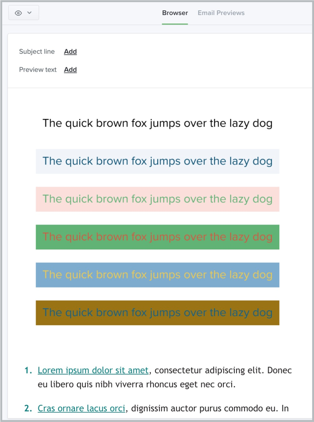
While this email looks “fine” to someone without color blindness, turn on a filter and you can see that some of the meaning is lost. That’s why accessible email design is so important.
It’s pretty simple, with black text on a white background. Now, let’s add a filter.
This is how that same email might appear to someone with deuteranopia. Notice how the difference between red and green disappears almost entirely, and the email appears to include mostly yellows and blues.
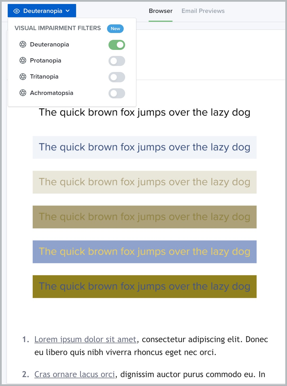
By using a simple background and high contrast text, however, we’ve ensured that all the text remains visible to readers with visual impairments. We’ll talk more about accessible email design best practices in a moment.
How to create an accessible color palette
As a designer, Kinkead focuses on crafting just the right mix of design elements like color, shape, line, space, and typography. This balance is what makes an email design fit with a brand’s overall identity and leads the audience toward the desired action for the email (ideally, conversions.)
Each one of these elements needs to be accessible. With color blindness, the obvious place to start is with color. “We’re always working toward a color palette that works in grayscale, and avoids problematic color pairings for people with color blindness. It should be flexible enough to ensure that no one is excluded from understanding the content, whether it’s UI elements, charts, or text,” says Kinkead.
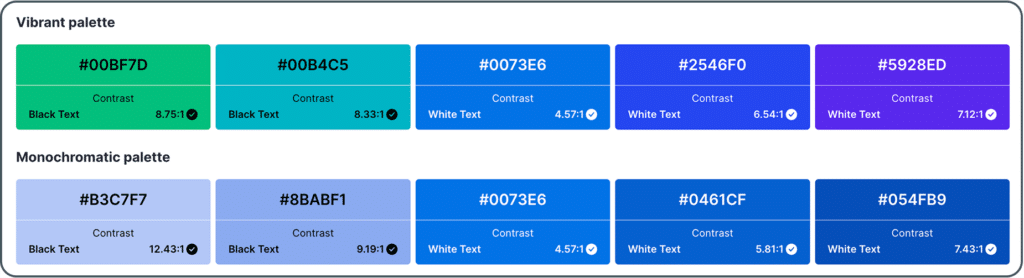
What is an accessible color palette?
An accessible color palette is a series of colors used for your email designs that meets accessibility guidelines such as the WCAG standards. The minimum contrast ratio is 4.5:1 for normal text and 3:1 for large text like headlines.
“This gives enough visual distinction between foreground and background colors so text remains readable for everyone, including people with low vision and color blindness,” says Kinkead. “Contrast ratio is basically a measure of how different two colors are in brightness. The higher the ratio, the easier it is to read. If contrast is too low, text blends into the background, making it nearly impossible for some users to see.”
This isn’t about choosing a brand new color palette just for colorblind users. Rather, this exercise should be about taking a hard look at your existing color palette and reworking it to make sure that it is functional for all of your subscribers or website visitors.
“You want it to be flexible,” adds Kinkead. “I like having neutral and accent colors that can work in different scenarios without causing accessibility issues.”
Your color choices are the most important aspect of designing emails for readers with color blindness. Work with your design team to translate the visual language of your brand into an accessible color palette.
Key considerations in building your color palette
There isn’t a specific set of colors that are “accessible.” Rather, it’s about the combination of colors and how they interact with one another.
As you build an accessible color palette, choose colors that make the text readable.
- The more high contrast you can make your emails, the more accessible they’ll be. Contrast refers to the difference between color hues (varying shades of a color). No matter what your brand colors are, you’ll want to stick with only a few colors in your email—no more than two or three at the most. Not sure where to start? Pull out a color wheel and go for the colors opposite one another, like blue and orange. Or keep it simple with dark colors on a white background.
- Avoid certain color combinations: Red/green, blue/yellow, green/blue, and blue/purple are all tricky combinations. It’s not about which colors you use, but about the combination of colors that matters in your design—and how important it is to the overall message of your email.
Make your text easy to read against any background. (Sorry, MySpace users with your pink-on-purple pages.) High contrast text and background color combinations work the best here, like the classic black on white or Dark Mode style, white on black.
Make accessibility part of your workflow
Litmus Accessibility Testing Checklist helps you identify and fix issues to ensure every subscriber has a great email experience.
5 best practices for designing emails for subscribers with color blindness
When designing for readers with color blindness, it’s natural to start with color. But it’s not the only aspect of your design that matters for accessibility. We’ll take a look at how other elements of your email design help convey your message more clearly or make it more confusing for those with color blindness. Here’s what you need to keep in mind:
1. Think about your email designs holistically
Are you using every design element effectively in your emails?
With something as powerful as color, it’s important to stop and think through the use cases for your design. It’s not just about the aesthetic—though of course that’s important—but matching the right color combinations to where they’ll be in the email. Also consider whether or not there’s enough variety to effectively differentiate your data points.
Says Kinkead, “In late 2024, we started using fewer colors overall to create a more cohesive, intentional design system. This actually helps with accessibility because it forces us to be more thoughtful about contrast, hierarchy, and how we use color meaningfully rather than relying on an overly complex palette that might not work for everyone.”
2. Don’t solely rely on color to convey information
The next big thing we can do to design for color blindness is to use more than color to communicate ideas. This is important for colorblind users, but it’s also relevant for screen reader accessibility, which reads emails aloud for subscribers with visual impairments. Every element of your email design can convey information—now it’s time to use that real estate. This requires a little bit of thinking outside the box, but will be a powerful tool in your design arsenal.
Incorporate icons or shapes into your design
Adding icons or shapes into your email design can add a backup layer of communication for your message without relying on color.
“The possibilities are endless when icons and shapes in an email. They are a great way to get the message across without having to rely on the use of colors or text”
Here’s an example of what this could look like using icons or shapes in addition to color to communicate a message. First, let’s take a look at this email with different approaches to product stock statuses:
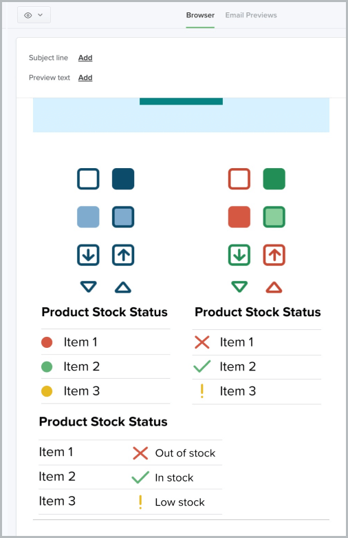
With accessible design, you can’t rely on color alone to get your meaning across.
Red, yellow, and green indicate when something is in stock or not, using the traffic light system.
Now, here’s our same email as above, this time with the tritanopia filter applied. Looks a little different, right?
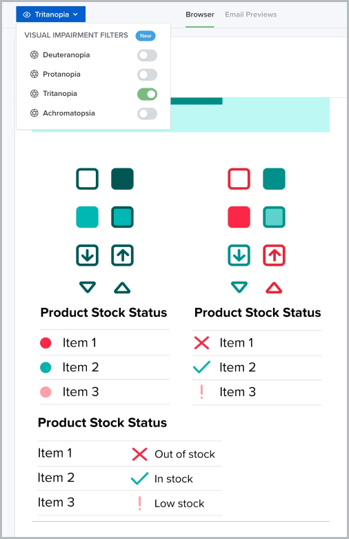
We can see three iterations of a message indicating a product’s stock status—but all three aren’t created equal. When the blues and yellows in the email are significantly reduced, the meaning of each icon is clearest when the shape of the icon communicates the status of the product, not just the color of the icon.
This is a great example of how to use shapes to communicate, rather than—or in addition to—color.
3. Organize your email in a clear and logical order
When a subscriber opens your email, they want to get the message as quickly as possible. Using a simple, clear layout makes this possible, whether you’re sending a newsletter that’s mostly text or a sales-driven campaign that’s showcasing new product images. Most emails follow the same pattern: a header that introduces your email campaign, body copy that adds more detail, and then a call-to-action.

Source: Really Good Emails
This email is a great example of a one-column design. A clear image, high-contrast text, and a CTA button make it easy to understand.

Source: Really Good Emails
You can also choose a classic S-curve design like this email from Krispy Kreme. This keeps the eye moving from side to side, pulling the subscriber down to the CTA.
4. Think of your text as visual, too
We often think of copy as separate from design, but the way you arrange the text in your email is its own design element, and one that you can optimize for accessibility, too. Make sure you’re writing with accessible language by using large text, easily readable fonts, and plenty of negative space goes a long way for readability.
At Litmus, we use at least 18px for body copy, and the smallest text in our emails (like footer copy or captions) is 14px. We also always left-align our text so it’s easier to read.
Actually use text in your emails
One of our biggest pet peeves in email design is the trend of image-only emails. Not only are they not accessible for visually impaired users, they often break in funky ways across different email clients and devices, making that sleek image your graphic designer worked hard on disappear. Your emails must be more than one big collection of images so anyone (color blind or not) can understand what you’re trying to say.
Add a plain-text option for colorblind readers
Writing for accessibility means using clear, thoughtful language, but it’s also about engineering the right experience for your subscribers. Adding a plain-text version of your email is another way to add more text. Most ESPs have the option to add or edit a plain text version of your HTML before you send. Checking this box gives your color blind readers one more way to be able to engage with your campaigns without needing to figure out why you’re sending an image awash in gray.Don’t forget your alt text
Alt text is one of those email elements that is so easy to add for accessibility but often gets overlooked. And it’s not just for color blindness. More users are blocking images or having a smart speaker read their emails outloads, so it’s a useful addition to your email for everyone. Good alt text clearly describes an image so that, if a reader can’t see it (for whatever reason) ,they still understand what you were trying to convey.
5. Use Visual Impairment Filters
The best way to ensure your emails are accessible to those with color blindness is to use a tool that checks how your email looks to people with color blindness. You could also review the WCAG standards, use color contrast plugins in design tools like Figma, or use other third party tools for each email campaign. But these can add time to your design process and your overall workflow.
That’s why we advocate for integrating accessibility tools into the tools you already have and already use (pssst…like Litmus!) This is both simpler, and a better way to think about designing for accessibility, whether you’re thinking about color or other accessibility features.
Since there are so many different variations of color blindness, it’s important to test your emails against all of them. Each email can display a lot of different ways to a lot of different eyes. I mean…
Plus, since different email clients can mess with color contrasts, you’ll want to not only test with visual filters, but also test for different ESPs, as well. You can feel the headache coming on, right?
For Litmus users, we offer the Visual Impairment Filters feature across Litmus Builder, our Previews and QA checklist, and Proof. This feature gives customers the opportunity to view their email as their recipients will with color blindness related visual impairments.
By utilizing this feature, you can easily check to see that text is visible against backgrounds and check your color use across ESPs. With Litmus, it’s easy to design emails that can be viewed in a multitude of ways with a wide range of color detection capabilities.
Learn from the best
Your favorite brands use Litmus to deliver flawless email experiences. Discover the ROI your emails can achieve with Litmus.

Industry-specific tips to ensure emails are colorblind accessible
Generally, Kinkead advises sticking to the same general principles above. “Whether it’s financial services, healthcare, e-commerce, or SaaS, the key is to pair color with additional visual cues like icons, patterns, or text labels so the meaning is still clear for users with color blindness or low vision,” she says.
What does accessibility look like for your industry? Here are a few examples:
Go beyond red and green with financial services reports
In emails containing financial summaries, avoid relying solely on red and green to show gains or losses. Instead, include symbols, like ↑ for growth, ↓ for decline, and text explanations next to any charts you include.
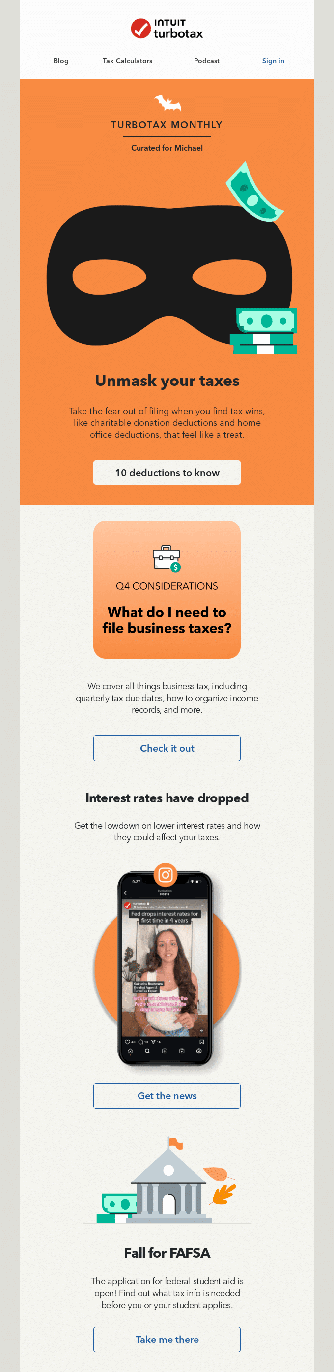
This email from TurboTax is a great example of high contrast and bright colors, using orange, blue, and black in a Halloween-themed email campaign.
Make sure you get important messages across with healthcare emails
Similarly, if you’re sending emails that include charts, data, or any other important information like appointment day/time, make sure that you’re not relying solely on color to get your point across.

If it’s an email about test results or appointments, keep it super simple so that everyone can get the message. Even better, use a plain text version that includes all of the text on a simple background, and always use alt text.
Include alt text with image-heavy e-commerce emails
Because e-commerce is so visual, many brands often skip the email coding and send all-image emails. Don’t fall into this trap! If you include an image of your product, use descriptive alt text that helps screen readers and those with color blindness understand what they’re buying.
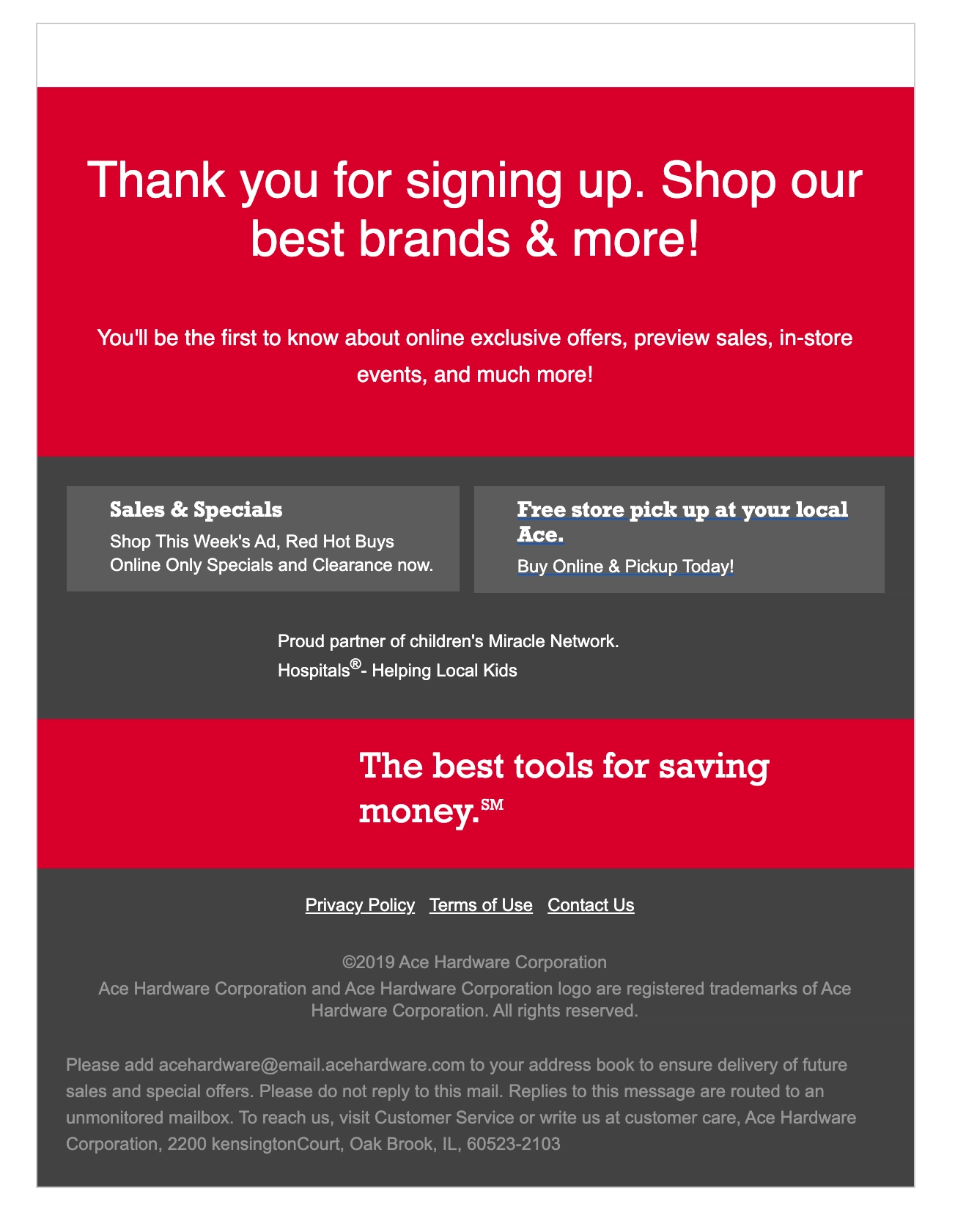
This is a great use of alt text to tell a story instead of color.
With e-commerce, you want to make sure someone can actually buy your products. Without alt text here in this images-off email from Ace Hardware, someone with low vision or color blindness would have no idea what the email is about. You can’t get those dollars if someone can’t interact with your email in the first place.
B2B SaaS emails don’t have to be boring to be accessible
If your brand uses a more animated style, evaluate your color palette to make sure you’re using high-contrast color combinations between your email background color, your headlines, and your body copy.
We’re still obsessed with this April Fool’s campaign we sent in honor of the 50th anniversary of email. We wanted to bring back all of our favorite ‘90s trends—I mean, just look at that Comic Sans typography—but with a modern approach to accessibility. You can see the full how-to here.
Create more accessible emails for subscribers today
Designing for accessibility isn’t about checking a box. It’s about making your emails easier to read and understand for everyone, whether they have a visual impairment or not. At Litmus, we believe that accessible email design is an important part of an email marketers’ job—because what makes an email better for your audience with visual impairment often makes the email better for everyone. With Accessibility Testing in Litmus Checklist, you can instantly see through your email testing or our email accessibility checker whether your email is accessible for all your subscribers and get actionable advice on how you can make your emails more inclusive.
Common colorblind accessibility FAQs
Still have questions? Take a look at our colorblind accessibility FAQs:
What are the colors to avoid for color blindness?
There are no specific colors to avoid for color blindness. Instead, make sure the combinations of colors you choose have enough contrast between them that they can be seen by colorblind users. Common combinations to avoid for color blindness include red/green and blue/yellow.
Can color blindness be considered a disability?
Yes, color blindness is considered a disability under the Americans with Disabilities Act (ADA) in the United States, which means that legally, if you send to subscribers located in the United States, you must follow Web Content Accessibility Guidelines (WCAG) to remain compliant. Similar accessibility laws exist in the E.U. and Canada.
What is the minimum contrast ratio for text and background colors?
According to WCAG standards, the minimum contrast ratio for text and background colors is 4.5:1 for normal text and 3:1 for large text like headlines.
What is color blind vs color deficient?
Color vision deficiency, otherwise known as color blindness, is a condition where an individual perceives colors differently. There are three types of color blindness: Red/green, blue/yellow, and achromatopsia, when a person can’t perceive color at all.

Start making a difference today
Maximize your email’s impact with Litmus to ensure accessibility and inclusivity for all subscribers — no matter their abilities.
The info in this blog is 2+ years old and may not be updated. See something off? Let us know at hello@litmus.com.

Kayla Voigt is a B2B Freelance Writer.
