Key takeaways ✨
|
If you’re a long-time subscriber to our newsletter, Litmus Weekly (now called Litmus News), there’s a chance you’ve seen our worst email to date. 👀
In honor of April Fool’s Day, we dug through our collective past and revived some of the classic tropes in email marketing history—scrolling text, gaudy graphics, a hit counter, and everyone’s favorite font: Comic Sans. Depending on who you ask, it’s either the world’s worst or best email.
How wonderfully 90’s this month’s Litmus Weekly is! Excellent job @litmusapp! Real laughter was produced when I opened it! #emailgeeks pic.twitter.com/LHNu75WMzy
— Anne Tomlin (@pompeii79) April 1, 2021
Whether it gave you a good laugh with its retro design or made you shudder remembering the days of building emails like that, one thing’s for sure—it was a trip down memory lane.
One thing we didn’t revive, though, is an inaccessible experience for our subscribers. Our email team is committed to email accessibility, regardless of how they’re styled. So, how did we keep the world’s worst email accessible?
Here’s a behind-the-scenes look at our process.
This isn’t your ordinary email newsletter.
Litmus News is your way to stay in the email loop with the latest industry news, best practices, and inspo for your next send.
Step 1: Start with an accessible foundation
At the heart of all of our emails is a foundation of HTML, CSS, and real text that helps keep all of our campaigns accessible. While a lot of brands opt for all-image emails, we prefer using as much text as possible—styled with CSS to keep it on brand—so that people using assistive technology like screen readers have actual content to consume.
Our retro Litmus Weekly is no different. While it’s heavily styled, all of that happens with CSS instead of Photoshop.
If you dig into the code, you’ll see a bunch of HTML, CSS, and semantic markup that provides not only human- and machine-readable content, but context for what that content actually means. You’ll also see a whole bunch of HTML tables, too, which can be confusing for people using screen readers. Knowing this, we apply an ARIA role to every table element to prevent it from being read as a table.
<table role=”presentation”></table>
The presentation role does exactly what it sounds like: it tells any assistive technology that the element is used for presentation only, so don’t bother doing anything with it. It’s what prevents screen readers from reading out every individual table row and cell to users, which is a very jarring experience.
Speaking of hiding things from screen readers, we use a similar ARIA feature for those 90s-inspired bullets, too. Instead of using an ARIA role, though, we include the “aria-hidden” attribute on the button images:
<img src="https://campaigns.litmus.com/_email/2021/April/04012021_Litmus_Weekly_retro/bullet-red.png" alt="" width="15" height="15" aria-hidden="true" />
Since the bullets are purely decorative, we’re removing them in line with the ARIA spec, which aims to improve the experience for assistive technology users by eliminating redundant or extraneous content.
The importance of email accessibility
One in four adults in the United States (U.S.) and European Union have a disability, and globally, it’s one in six. Yet, accessibility challenges in digital spaces like email are often overlooked.
These disabilities encompass vision impairments, color blindness, dyslexia, cognitive disabilities, age-related impairments, situational challenges (like a broken arm), and more.
If your emails aren’t accessible, you’re missing out on a large audience—and leaving significant revenue on the table, with an estimated $1 trillion in annual disposable income.
Looking for tools to help with email accessibility (or coding for accessibility)? Litmus’ built-in accessibility tools help ensure your emails can be read and experienced by all.
Here’s how it works:
↳ Source: From compliance to connection: Why businesses must embrace email accessibility
These include:
- Visual impairment filters that check how your email displays for subscribers with visual impairments across four color vision deficiency filters.
- Automatic accessibility checks across 40+ accessibility areas—plus guidance on any discovered issues.
- NVDA screen reader previews that support over 80 languages, helping screen readers accurately transcribe your message.
Get an overview of these features on our Help site.
Unlock endless revenue Let’s take a look at how much email-driven revenue you could be leaving on the table.
Step 2: Add alt text to GIFs, images, and animations
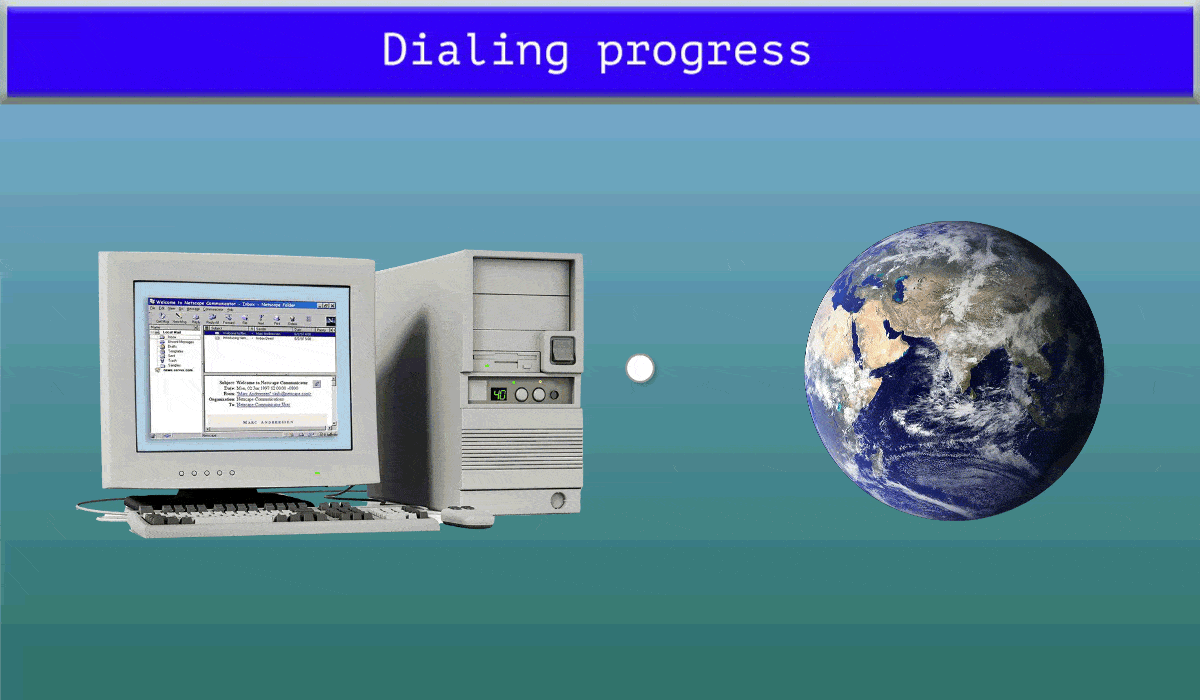
A retro email newsletter isn’t complete without some ridiculous animated GIFs and throwback images, which you can see throughout—from the dialing modem GIF up top to the visitor counter down below.
To keep all of the images accessible, we included alternative text (alt text) to describe them to people using assistive technology. For example, the “dialing progress” GIF describes what that image is: ‘Dialing progress’ with an image of a computer connecting to a rotating globe with animated dots.
And that collection of awkward yearbook photos from the Litmus crew? The alt text reads “composite of headshots from the 90s of the Litmus marketing department.”
Alt text is one of the best ways to increase the accessibility of your emails, both for sighted and non-sighted users. Even if someone can see those images, there’s no guarantee that they’ll be displayed in the inbox. Alt text helps your message get through no matter what.
Step 3: Make progressive enhancements when possible
Progressive enhancement means designing for the basics first—ensuring emails function well on older clients, desktops, and browsers—then adding features for enhanced experiences where supported.
A great example in this Litmus Weekly—and one of my favorite tricks in this issue—is the use of one of the greatest HTML tags of all time: marquee!
You probably noticed the scrolling date underneath the animated Litmus Weekly logo. While a lot of folks thought it was just another GIF, it’s actually live animated text.
First introduced in older versions of Microsoft’s Internet Explorer, marquee allows you to scroll and move text around your document. It’s old, it’s deprecated, but it sure is beautiful. And, since it’s animating the live text included in the HTML, it’s inherently accessible to assistive technology.
That being said, the movement could be distracting to some users, so use elements like marquee (or any other animation) cautiously.
Accessibility doesn’t have to be boring
We had so much fun creating our retro Litmus Weekly. More importantly, we’re thrilled that we didn’t have to sacrifice email accessibility for design, even when bringing back ridiculous design trends from decades past. Accessible emails can work well and look good (or terrible, depending on your tastes).
Want to make sure your emails have accessible design? Or what to make sure you’re writing with accessible language? Why not use our email accessibility checker? Or our Ultimate Guide to Email Accessibility goes over everything you need to know about accessibility—from copy to code.
Accessibility made simple
Creating accessible emails is no longer optional—it’s required. Learn about accessibility’s impact on brands from two industry experts.

Originally written and published by Jason Rodriguez on April 8, 2021.
The info in this blog is 2+ years old and may not be updated. See something off? Let us know at hello@litmus.com.

Carin Slater is the Senior Technical Producer at Stitch.
