Welcome to our new monthly blog series where I, your humble Senior Community Evangelist, recap our latest Litmus Talks and note key takeaways (and offer a few thoughts of my own) to occupy your precious brain space.
This month, I’m sharing my thoughts on our Live Email Optimization virtual event, where Litmus’ Director of Email Marketing, Jaina Mistry along with our Email Marketing Specialist Carin Slater and Email Design and Production Specialist Hannah Tiner review five submitted emails by our courageous audience and offer feedback and praise.
Read on (or jump ahead):
| Table of contents |
Consumer Reports ShopSmart newsletter
Consumer Reports sends a twice-weekly ShopSmart newsletter sent with the goal of driving clicks to affiliate shopping links and driving digital all-access subscriptions.
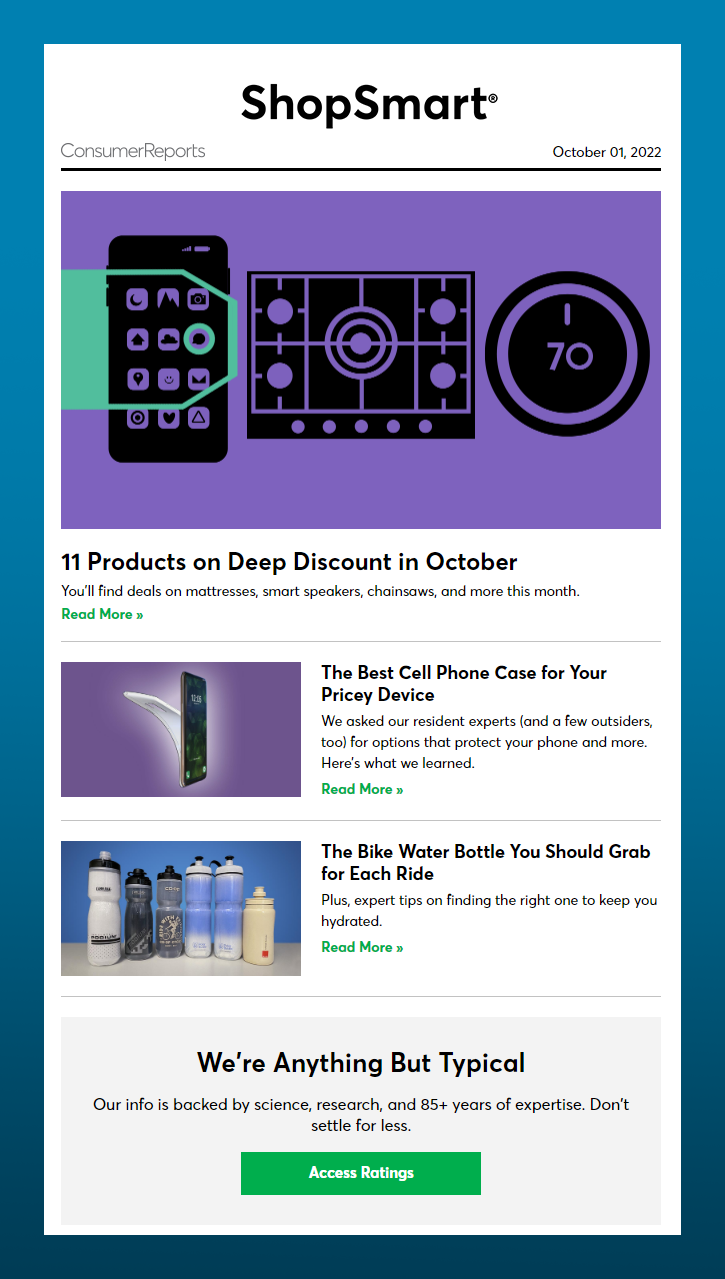
🌟 What works wellAnimated GIFs: An animated GIF as the hero image, designed with a simple palette of three colors and a relatively small number of frames, is effective at engaging initial visual interest while also keeping the data weight of the image manageable. A great choice to stimulate but not distract the reader, like an amuse-bouche before a full meal. |
❤️ What needs love
Text links: Text links don’t always do a good job of creating visual friction to compel readers to pause, and “read more” as the text doesn’t offer the reader any context for what to expect. Plus, using the same text over and over causes the reader to file those elements away as known and familiar—great for logos and brand recognition, but bad for calls-to-action (CTAs) where we want the reader to stop and engage.
Buttons are better at being visually differentiated—they use clearer, uniquely phrased CTA text to drive more of a response.
Standard Life newsletter
The goal of this Standard Life newsletter is to drive traffic to the blog section of their website, which is focused on providing relevant information to encourage customer retention.
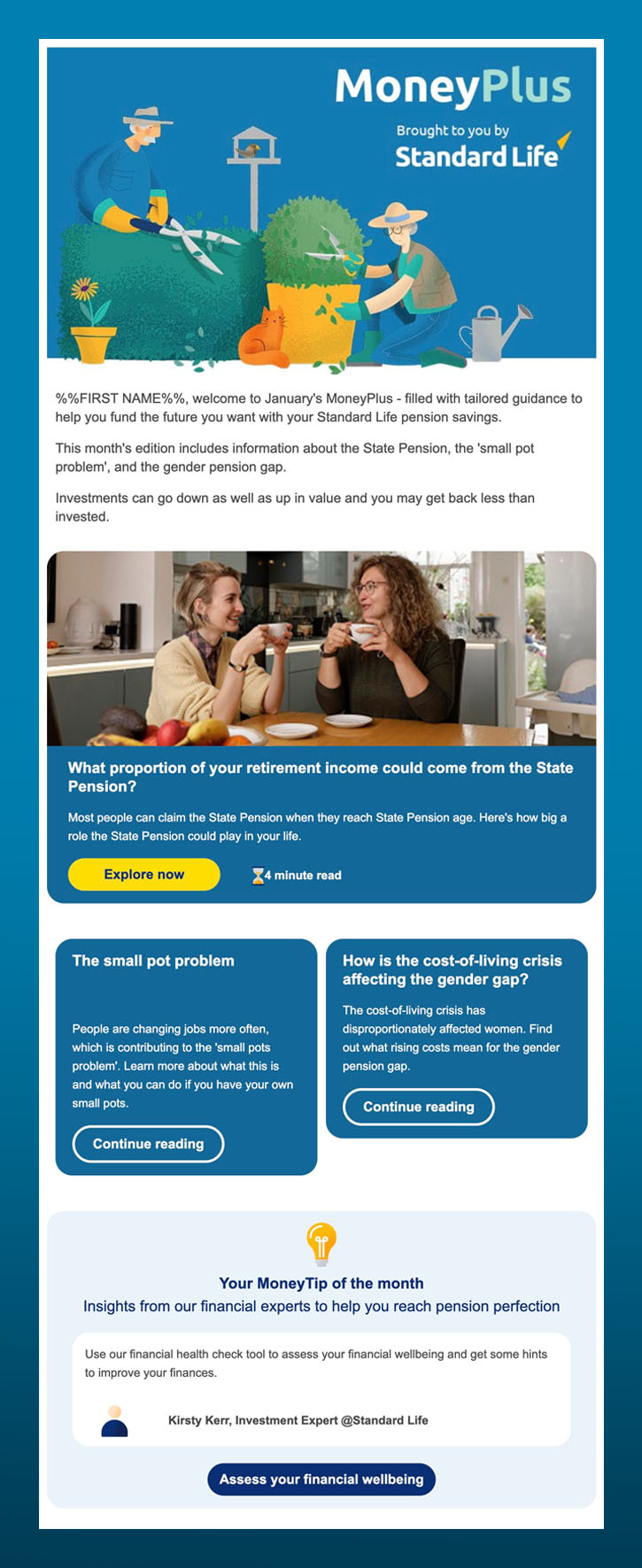
🌟 What works wellRead time estimates: Email works best as a channel when it sets clear expectations for the audience, and the use of read time estimates next to CTAs linking out to articles is effective at doing just that. While this has become more common practice on blogs, putting the estimates in the email itself shows the reader you respect their limited time and attention. |
❤️ What needs love
Imagery: In the same vein of setting clear expectations, if you’re quoting a person in an email—as they do in this one for a testimonial—it’s best to use an actual photo of them when at all possible instead of using a graphic. This helps establish credibility and gives our brains the little push needed to connect with the content emotionally. Something else that helps create credibility is using consistent styles of illustration and photography so that the email reads as visually consistent.
Feed 365 newsletter
The goal of Feed 365’s newsletter is to express gratitude and share updates with members of their monthly giving program.
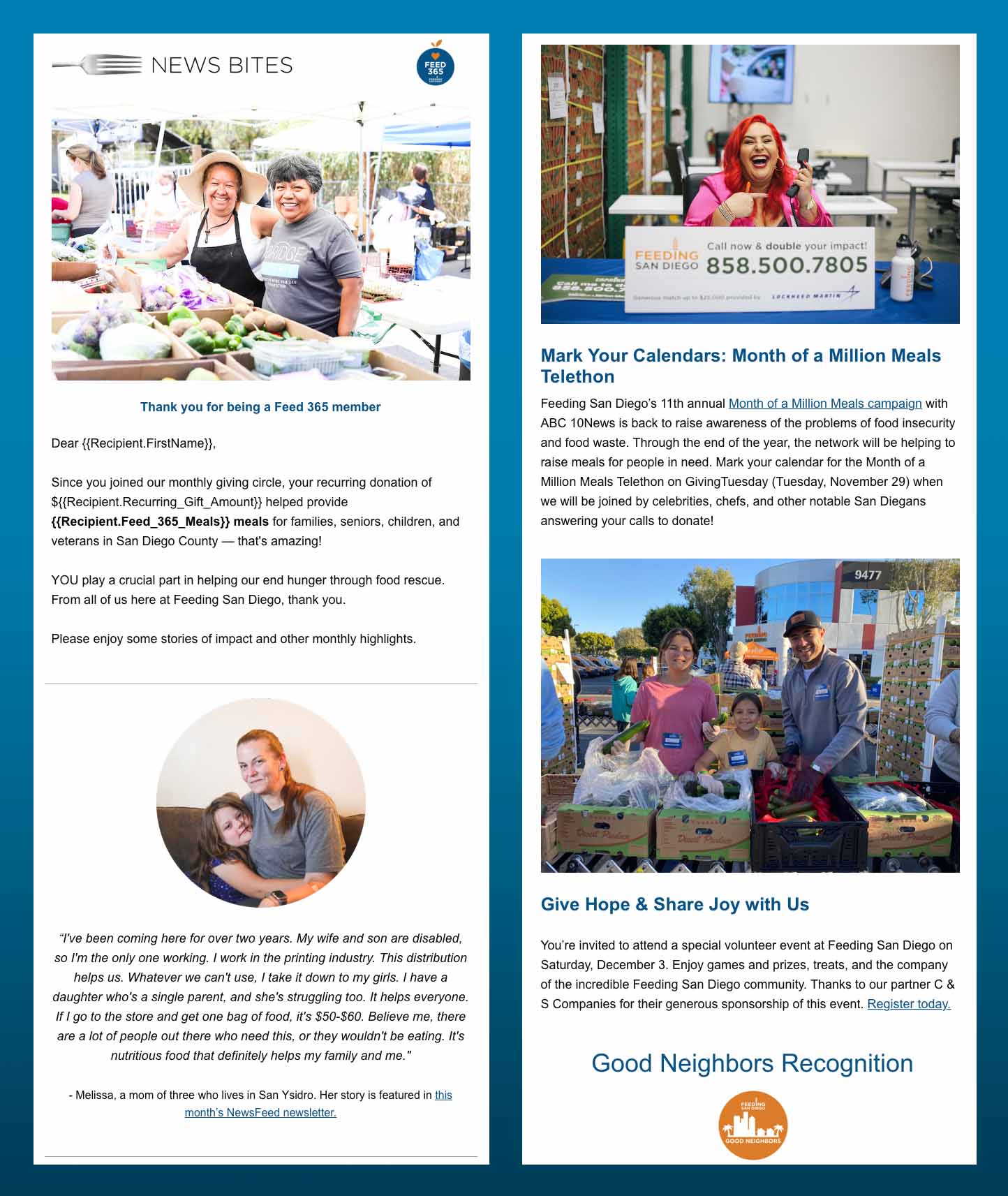
🌟 What works wellEmotional connection: Human beings mirror one another—it’s a deeply hardwired behavior. Using photography featuring actual people smiling prompts the reader to create a positive emotional connection, and creating that emotional response is central to making content memorable. We don’t remember things that don’t prompt a feeling. Similarly, describing the impact of donations and how they are used rather then simply totaling the numbers gives the reader real emotional stakes in what’s being presented to them. |
❤️ What needs love
CTAs: One of the ways you can show respect for your email audience is being straightforward as to what you are asking of them. This is why having clearly distinguished CTAs are important—it alleviates any confusion as to what the subscriber is expected to do.
Of course, CTAs are also central to measuring engagement and tied to most email programs’ success metrics, so they are also very important in a crunchy numbers sense. But I’d argue the primary reason to include them is to provide a clear next step for the reader to further the relationship you have with them.
American Automobile Association (AAA) newsletter
This monthly newsletter from AAA is intended to share news and updates with their members and help them make the most of their membership.
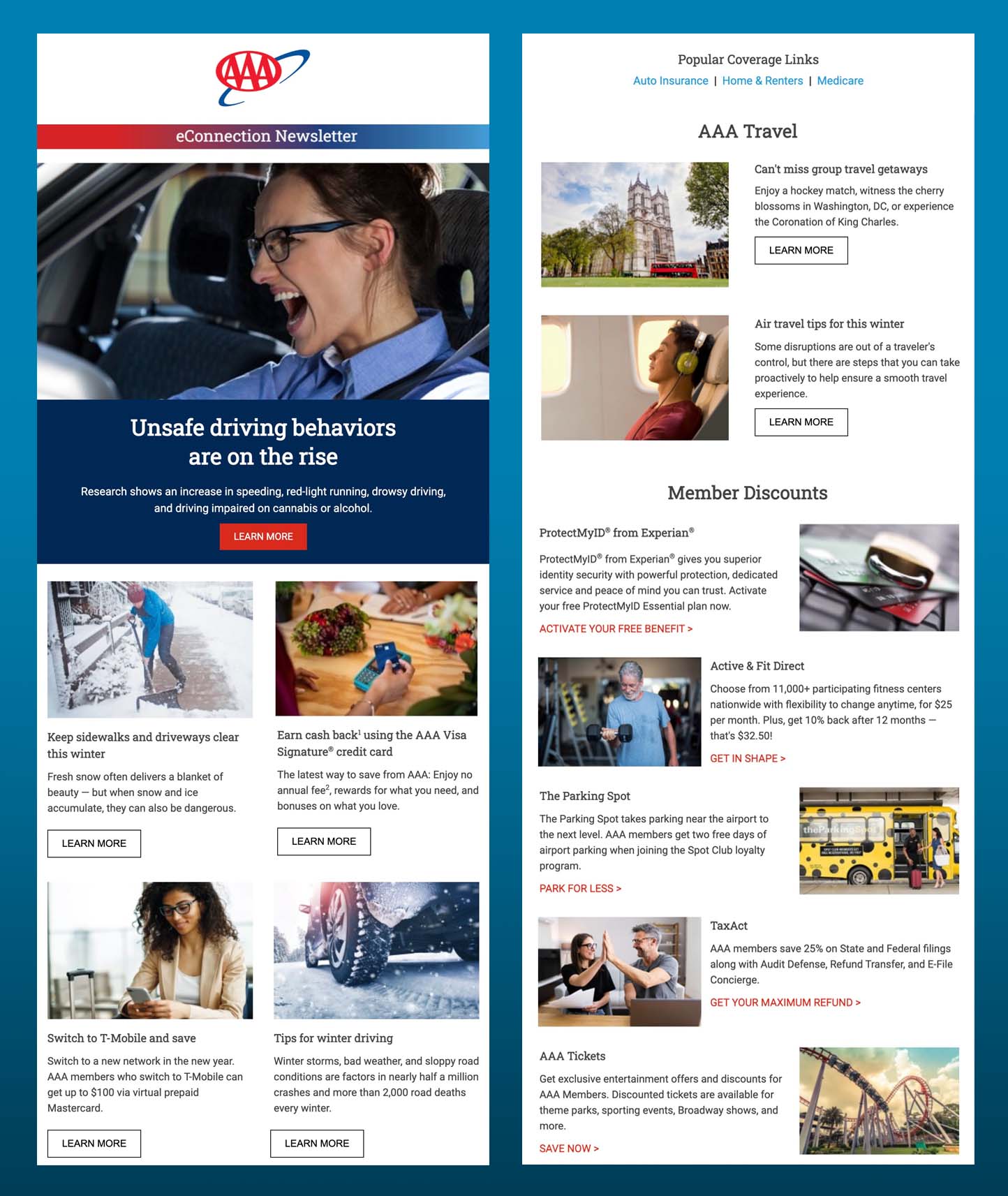
🌟 What works wellVisual hierarchy: One of the best ways to make your emails easy to read is to have a consistent visual hierarchy—how your content is styled and structured. When each priority level of your content has a distinct style and placement that stays the same from email to email, that creates both clarity and familiarity in the mind of the recipient—they don’t have to work to understand what you want them to engage with first, second, and so on. Reducing the cognitive load in this way gives the reader more capacity to notice what you do want them to stop and consider, like your CTAs. |
❤️ What needs love
Numbers: While we absolutely need an emotional connection to content to make it memorable, we also crave numbers to keep our comprehension of that content digestible. Strong statements without any quantification stimulate our brains but don’t let them rest. Numbers, statistics, percentages—these all work to contain what the reader is taking in so that it feels less amorphous and all-consuming.
JetBrains newsletter
This JetBrains email is aimed at driving registrations to an upcoming webinar.
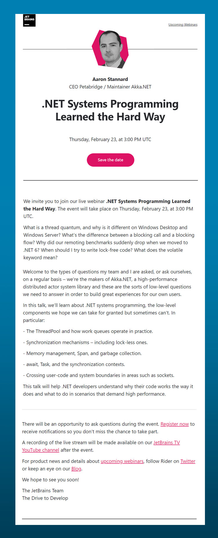
🌟 What works wellHero feature: In a single-topic email, a great way to show respect for your readers’ time and attention is to have a hero section that contains all the necessary information and an immediate CTA, and then you can add more detail below for those that desire it. This also allows you to measure who in your audience is just looking for the quick synopsis, and who among them craves more context, which might be an actionable bit of segmenting data down the line. |
❤️ What needs love
Content length: While offering more detail after a concise hero section can be helpful, multiple paragraphs of undifferentiated text is difficult to parse visually. As we know that most people skim emails, brevity is almost always going to be the correct approach, along with styling the content so that there are breaks and negative space to allow for easier comprehension.
Including a secondary CTA at the bottom of the email linking to a landing page allows you to capture those who found it worth their while to read that far. It’s also good to keep in mind which content is right for which channel—extended detail is probaby better served on a landing page, anyways.
Don’t want to wait for my recaps? You can sign up for our next Litmus Event right here.

Boost efficiency and scale email development
Craft consistent, on-brand emails with Litmus. Create and store reusable templates, code modules, and more.
The info in this blog is 2+ years old and may not be updated. See something off? Let us know at hello@litmus.com.

Logan Sandrock Baird is a Senior Community Evangelist at Beefree.
