Typography is one of those key brand elements that you never notice when it’s done right, but when it’s weird…it’s really weird. (No shade to Comic Sans, but…)
Emails should look and feel like they belong to your brand, but—like with all things email—it’s not as simple as copying-and-pasting a font from the brand guidelines your design team spent hours deliberating over.
With email marketing, you have two choices for your live text: Web fonts and web safe fonts. In this post, we’ll talk through the differences between the two, why we recommend web safe fonts, and how you can embed them in your emails so you can stay aligned with your brand and make your emails accessible for all of your subscribers.
In this article we’ll cover:
- Web fonts vs. web safe fonts
- How fonts work in email
- The problem with custom web fonts
- How to choose the right font for your brand
- How to embed web fonts in email
- Where to find web fonts
- Inspiration for using web fonts in your emails
Web fonts vs. web safe fonts
You’re probably reading this blog post with a web safe font—fonts you know and love like Arial, Helvetica, and Open Sans. These are pre-installed fonts that come with all operating systems, so you know they’ll render correctly if you use them in an email.
You also have the option to use a web font. These are hosted externally, offering you more variety (like using your brand’s custom font), but potentially less reliable for email templates.
| Web Fonts | Web Safe Fonts |
|---|---|
| More creative freedom with a wider variety to choose from. | Your subscriber likely has these fonts installed, making these a safe choice. |
| Align your emails with the rest of your branding materials. | Subscribers know what they look like and expect to see these fonts online. |
| Higher risk of your email not rendering exactly as planned, requiring additional testing and development time. | There are a limited number of web safe fonts, making it difficult for your brand to stand out. |
Let’s dive deeper into each:
What are web safe fonts?
Web safe fonts prompt the web browser to pull the font from your local font directory, AKA the pre-installed fonts on everyone’s computers. Web safe fonts are safe to use because there’s a strong chance your subscribers will already have them.
The downside of web safe fonts is that your options are more limited. Plus, web safe fonts are less likely to stand out (if that’s what you’re aiming for) because they’re so common.
Below are some of the best fonts for email due to their readability, widespread support across platforms, and web safe nature:
- Arial
- Helvetica
- Verdana
- Georgia
- Times New Roman
- Tahoma
You can’t assume that a popular font like Garamond, Courier New, or Cambria will be automatically web safe. Before you choose a web safe font (or a fallback font for web fonts, which we’ll talk more about), double check with a list like this one.
What are web fonts?
Web fonts are pulled from a server, either one you host yourself or an external one such as Google or Adobe. Because of this, the variety of fonts you can use is much larger and will work on any computer…as long as the email client cooperates.
Using a custom font sounds like a good idea, especially if your brand already uses one for other deliverables. We’ll talk more about email client support in a moment, but spoiler: Gmail and Outlook cause some trouble. (Can we expect anything else? 🫠)
Build impactful emails with expert techniques
Gain the essential skills in email development. Create responsive, high-performing emails that look great on any device.

How fonts work in email
When designers pick fonts for their website, they can generally pick anything they want, including a custom font. That’s because on a website, you can use CSS or HTML code to point to wherever the font is hosted online, whether it’s a Google Font, Adobe Font, or something else.
Emails don’t work like that because…of course they don’t.
Your email code declares a font using a CSS property called font-family. When your subscribers open your email, the browser reads the font-family property and pulls in the font to use. With web safe fonts, that’s easy-peasy. But email clients get picky about which web fonts they support, so you can’t just pick any font.
“I 100% recommend using a fallback font anytime you send an email, because web fonts aren’t supported everywhere,” says Carin Slater, Litmus’ Lifecycle Email Marketing Manager. “In theory, it should be very straightforward, but this is email we’re talking about here.”
This font-family property can have just one font name or multiple font names—often referred to as a font stack. Without listing multiple font names, the email client gets to decide your backup font.
The problem with custom web fonts in emails
Custom fonts introduce higher risk to your email marketing program. Because it’s not super likely the average reader will notice the differences between your branded font and a web safe font, it’s safer to go with a web safe font. That doesn’t mean you’re stuck with the same-old fonts that everyone uses like Helvetica, but it does require more development and testing time to get around some common issues:
1. Rendering issues
You can use a custom web font in your emails if that matters to your brand. But you’ll spend a lot of extra time and effort in development and testing to do so, and you’ll still need to choose a fallback font no matter what.
If you don’t pay attention to typography, you’ll see your email render just a little differently on different devices. If the default font is a little taller, for example, it may bump all of your text down a line, pull in less preview text, or mess up your carefully crafted responsive coding. Custom fonts might also interfere with elements like standard HTML bullets, leading to misaligned designs.
These are the kinds of tiny details that make an email marketer want to bang their head against a wall.
2. Compatibility challenges
Since web font support is hit-and-miss across email clients, it’s a good idea to analyze where your subscribers typically open emails. If most of your subscribers use an email client supporting web fonts, try it. If you find your audience is mainly on a non-web font-supportive email client, you can avoid wasting time and effort.
| Email client | Web font support |
|---|---|
| Apple Mail | ✓ Yes |
| Outlook 2013-2021 | ✘ No |
| Outlook Office 365 (Win & Mac) | ✘ No |
| Outlook for Mac | ✓ Yes |
| Windows 11 | ✘ No* |
| Gmail App | ✘ No** |
| iOS | ✓ Yes |
| Outlook App | ✘ No*** |
| Samsung Mail | ✘ No*** |
| AOL Mail | ✘ No |
| Gmail | ✘ No***** |
| Office 365 | ✘ No |
| Outlook.com | ✘ No |
| Yahoo! Mail | ✘ No |
*(ish? Some of the webfonts were showing up but it may be that the fonts were loaded on the computer)
**(Google overrides fonts – default on Android is Roboto, on iOS looks like Helvetica)
***(Fonts overridden – Roboto is default sans-serif)
****(ish. Liked Roboto, so there’s limited support of very specific web fonts – probably specific ones from Google Fonts, possibly only Roboto since it’s Google’s default)
3. Impact on user experience
The thing is, having a custom web font is the kind of design detail that few, if any, of your subscribers will notice. “A large part of the population is not going to be able to tell the difference between Proxima Nova and Helvetica,” says Slater. “Remember that the point of your email is to get the message across. We love it when we can design something beautiful, but if it’s beautiful and it’s unreadable, that’s an issue. It needs to be functional first.”
When will they notice? If your typography is creating a rendering issue that makes it impossible to read your emails. Broken fonts negatively impact your user experience, which makes it that much less likely someone will open or click on your email in the future. That’s the opposite of what we’re going for when we design emails.
Ultimately, typography plays a critical role in creating emails that convert by ensuring readability and maintaining a professional, on-brand design.
Best practices for using web fonts in emails
If you’re going to go for a web font anyway, keep these things in mind to adhere to email design best practices:
1. Choose a fallback font that matches your brand
If you want to use a web font, choose a fallback strategically that matches your brand’s font. Slater recommends a site called CSS Fonts to find lesser-used web safe fonts that work for your brand. The site tells you what percentage of PC and Mac users have each font so you can balance style and confidence that most subscribers will see your font of choice.
While selecting fonts, also ensure they contrast well with your email’s background color HTML settings to maintain readability.
“If you have a lot of people opening on Windows, in Outlook, and you’re using a custom font, that means very few people will actually see your web font,” she says. “If that’s the case, I’d go back to the design team and show them the numbers of how many people actually can have the brand experience they want to create. Between CSS Fonts and Litmus Analytics, you can see exactly how many people will see their chosen font. That usually helps start a productive conversation for the fallback.”
Look for a fallback font that is:
- In the same font family as your web font, like serif or sans-serif, to retain your design.
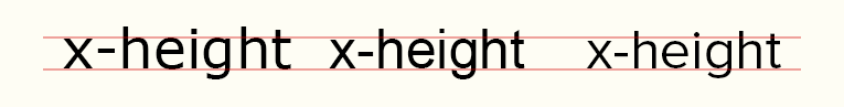
- A similar x-height to prevent your email design from falling apart when the fallback font is in use.
Observe the subtle differences in x-height between the fonts Verdana, Arial, and web font Proxima Nova.
Each email client has a default font if the font listed in the font-family stack is unavailable. For example, Gmail uses Arial, Apple Mail uses Helvetica, and Outlook uses Times New Roman. This goes for devices, too: MacOS uses SF Pro.
2. Avoid image-only emails that create accessibility issues
As a marketer and designer, you know the pressure to stay on-brand in email with colors, design, and—yes—typography. Web fonts let you show off your brand without relying on images for your text. Not to mention, relying heavily on images for email design can limit accessibility, as many subscribers have images turned off by default.
One way around the fallback issue is to use images instead of live text for your email. But that’s kind of a frying pan-fire scenario, because while your font will look great, image-only emails aren’t accessible for subscribers with screen readers or images turned off.
“Often a solution for people who don’t want to deal with web fonts, but still want their brand fonts, is to put all of this text into an image. It’s one thing if that’s for a headline or logo, but for body copy, you’re going to lose your message,” says Slater. “It’s much easier to include a fallback than try to add huge blocks of alt text and code around images.”
If you lock important copy in images because it’s a way to stay on brand, portions of your audience won’t know what your email says.
3. Test your emails before every send
Your subscribers may have a very different experience with your emails depending on their email client, browser, and device. (What’s new, right?) That’s why if you plan to use a web font, it’s super important to test your emails.
“We use Proxima Nova here at Litmus, with Helvetica as our fallback,” says Slater. “Helvetica is just the tiniest bit wider than Proxima Nova, so in some cases, a word will end up on another line, or sometimes it makes a text block taller than we want it to be. That’s such a minor detail, but if we didn’t test our own emails with Litmus, we wouldn’t be able to fix it so our emails look good everywhere.”
Send with total confidence
Preview emails in 100+ clients, catch errors, and ensure accessibility. Cut QA time in half.

How to choose the right web safe fonts for your brand
Whether you go for a web font as your primary or stay with a web safe font, it can be hard to know what to choose with all the options out there. “Our design team at Litmus is brilliant, and they tell me what to do,” jokes Slater. “I’m glad we sat down together to choose our fallback font, and we thought of that at the beginning.”
Here’s how to choose a web font that works best for your brand:
1. Brand consistency
Your typography affects your overall look and feel as a brand. Selecting consistent typography should align with your overall email design system to create a cohesive brand experience.
No matter what fallback you choose, start with one that looks as close as possible to the web font you’re already using across your other brand touchpoints, like your website, app, or on product packaging. For your font choices, look at categories like:
- Serif vs. sans serif
- Monospace vs. variable-width
- Headers vs. body copy
- Variants of your chosen font in the same font family
Your choice of font should reflect your brand identity—whether that’s a more formal, classic look or a squiggly Gen-Z vibe. Use the same font for the entire email, from header to email footer.
2. Readability across devices
Email accessibility has never been more crucial. It’s important to find a web font that fits your brand yet is still accessible. Some types of fonts are easier than others to read:
✖ Ornate or decorative fonts, such as display, cursive fonts, or handwriting fonts like Lucida Calligraphy or Brush Script MT, can make it difficult for people with visual impairments or dyslexia to differentiate letter shapes.
✔ Sans-serif fonts don’t have extended features or curls in their letters. Fonts like Arial, Calibri, Century Gothic, or Helvetica are easy to read.
✔ Slab fonts like Museo Slab and Rockwell have thicker lines and are also considered accessible.
For some audiences, sticking to a plain text email format ensures universal readability and avoids potential font rendering issues altogether.
When you think about readability, focus on the spacing and shape of the font. When in doubt, run your email through an accessibility checker like ours at Litmus. We test against 40+ different accessibility metrics to make sure that your emails can be read by your entire audience.
3. Tone and emotion
Your font can be an indicator of your brand identity, but it also helps give shape to the tone and voice of your emails. Your copywriters are already spending time crafting your message and your font can help bring it to life.
Evoke the strength and power of the Roman empire with fonts like Palatino or Optima, give your message a typewriter feel with old-fashioned fonts like Lucida or Monaco, or give it a mid-aughts magazine feel with Didot.
Power up your email strategy
Gain expert insights and industry benchmarks from the latest State of Email Report. Elevate your email game.
How to embed web fonts in emails
Because web fonts typically aren’t found on someone’s local device and instead are hosted elsewhere, you must “embed” or import your web font into your emails before using them using HTML or CSS.
1. Get the URL of your font file
To start, you need the web font’s URL to call it into your email. Where you’ll find it depends on the font source.
If you’re using a web font service: the site or tool should have the URL. If you’re using Google Fonts, finding the URL is tricky but not too difficult. Find out how in the next step for the @font-face embed method.
If you’re hosting the font yourself: get the URL from where the web font sits on your server. Check that it’s a public URL and not coming from a local server. Otherwise, your subscribers won’t be able to access the web font and will see a fallback font instead.
2. Import the web font using one of three methods
There are three methods for embedding web fonts in email (and a caveat that may limit which method you can use). The three methods for embedding your font are:
Importing a web font using <link>
The <link> method loads the resource inline as the HTML file’s code is read (from top to bottom), which could delay your email loading if your web font file is huge. Using this method for embedding fonts in your email is relatively simple—place this line of code in the <head> of your email, near the top:
<link rel="noopener" target="_blank" rel="noopener" target="_blank" href="https://fonts.googleapis.com/css2?family=Roboto&display=swap" rel="stylesheet">
Importing a web font using @import
The @import method defers loading the imported web font until the HTML is fully loaded. This method can lead to your web font taking a little longer to appear in your email while the rest is loaded. To use it, place this line of code in the <head> of your email between the <style> tags:
@import url('https://fonts.googleapis.com/css2?family=Roboto&display=swap'); Importing a web font using @font-face
Online web font services commonly offer five file formats to choose from:
- .eot
- .woff
- .woff2
- .svg
- .ttf
The .woff and .woff2 formats have the best support when it comes to email, so we suggest using one or both of these formats when you can. On the other hand, @font-face method is the only method that allows you to choose what file format you’d like to import, making it the most bulletproof way for implementing web fonts.
Here’s a typical @font-face declaration for importing a web font into email using Google Fonts as our chosen web font service:
@font-face {
    font-family: 'Roboto';
    font-style: normal;
    font-weight: 400;
    src: url(https://fonts.gstatic.com/s/roboto/v27/KFOmCnqEu92Fr1Mu4mxKKTU1Kg.woff2) format('woff2');
    }
If you use Google Fonts, first find the @font-face code by locating the font you want to use on Google Font. Then, choose the style you want to use. A flyout menu will appear on the right.
In the flyout, there will be a choice for <link> or @import. Both of these will have a URL (highlighted in the screenshot above). You can copy that URL and paste it in the address bar of your browser to find the CSS stylesheet that Google uses.
Copy and paste the ‘Latin’ version of the @font-face between your <style> tags.
At Litmus, the @font-face method is our go-to implementation for importing web fonts into our emails.
(All credit for this method of importing web fonts goes to email accessibility advocate Paul Airy, as detailed in a past Type: E newsletter.)
Here’s something to keep in mind: You can make beautiful code that works in Litmus all day long, but if your ESP changes your code, as we know most of them do, then nothing you do will matter. 😭
Make sure your ESP doesn’t change your code in a way that would cause your fonts to stop working.
3. Use your fonts in email
You should have already chosen a fallback, but if you haven’t yet, now is the time. It’s easy to add your fallback into your font stack. Just use the font-family name defined in the import method followed by your fallback font(s) in either the CSS inline or in the head:
font-family: 'Roboto', Verdana, sans-serif;
Think of this as a prioritized list of preferred fonts. If an email client can’t comply with your number one choice, it will fall back to the next one on your list.
For example, using the above font-family stack, the font rendered will be Verdana since Gmail will ignore the (unsupported) first font in the list since. Suppose the device used doesn’t support Verdana (which would be very rare since Verdana is a web safe font). In that case, the device will use the default sans-serif font for its system, as this is the third font in the list.
This is equally important when coding a table in HTML, which often requires fallback fonts to ensure uniformity across different email clients.
4. Avoid faux bold or faux italic
If you have accompanying bold and italic versions of your web font files, then let’s use them!
Typeface designers have put a lot of thought and effort into getting all the different styles of a font just right, so it’s best practice to apply the original type design rather than allowing the email client or browser to haphazardly apply a faux bold or faux italic to the regular font.
Basically, do NOT do this:
@font-face {
  font-family: 'Roboto';
  font-style: normal;
  font-weight: 400;
  src: url(https://fonts.gstatic.com/s/roboto/v27/KFOmCnqEu92Fr1Mu4mxKKTU1Kg.woff2) format('woff2');
}
style="font-family: 'Roboto', Verdana, sans-serif; font-weight: bold; font-style: italic;"
Like web design, you can pull in the genuine fonts by including these styles in your @font-face stack, like so:
@font-face {
  font-family: 'Roboto';
  font-style: normal;
  font-weight: 400;
  src: url(https://fonts.gstatic.com/s/roboto/v27/KFOmCnqEu92Fr1Mu4mxKKTU1Kg.woff2) format('woff2');
}
@font-face {
  font-family: 'Roboto';
  font-style: italic;
  font-weight: 400;
  src: local('Roboto-Italic'),
  src: url(https://fonts.gstatic.com/s/roboto/v27/KFOkCnqEu92Fr1Mu51xIIzIXKMny.woff2) format('woff2');
}
@font-face {
  font-family: 'Roboto';
  font-style: normal;
  font-weight: 700;
  src: local('Roboto-Bold'),
  src: url(https://fonts.gstatic.com/s/roboto/v27/KFOlCnqEu92Fr1MmWUlfBBc4AMP6lQ.woff2) format('woff2');
}
@font-face {
  font-family: 'Roboto';
  font-style: italic;
  font-weight: 700;
  src: local('Roboto-BoldItalic'),   src: url(https://fonts.gstatic.com/s/roboto/v27/KFOjCnqEu92Fr1Mu51TzBic6CsTYl4BO.woff2) format('woff2');
}
As you can see, the different styles pull in different fonts regardless of the font-family. This way, if you style your font in the HTML like this:
style="font-family: 'Roboto', Verdana, sans-serif; font-weight: bold; font-style: italic;"
…then it will pull in the genuine ‘Roboto-BoldItalic’ font! Likewise, just adding font-weight: bold; will pull in ‘Roboto-Bold’ and just adding font-style: italic; will pull in ‘Roboto-Italic’.
Do NOT do this, either!
So, you might be wondering—why do it this way instead of declaring a different font-family for each style, which also pulls in the genuine fonts? This is how that looks:
@font-face {
font-family: 'Roboto Bold Italic';
src: local('Roboto Bold Italic'), local('Roboto-BoldItalic'), url(https://fonts.gstatic.com/s/roboto/v27/KFOjCnqEu92Fr1Mu51TzBic6CsTYl4BO.woff2) format('woff2');
}
style="font-family: 'Roboto Bold Italic', Verdana, sans-serif;"
This presents a problem. Using font-family names to store styles creates overly-complicated and redundant CSS and strips your text of styling if your fallbacks kick in. So, for example—if you’re viewing the above code in Gmail (which doesn’t support custom web fonts), you will only see unbolded, un-italicized Verdana instead of Roboto Bold Italic.
By keeping your font-family and font-weights or font-styles separate, your fallback fonts will retain the correct styling.
5. Use a fix for Outlook
Outlook has a wonderful quirk to watch out for, especially if many of your subscribers use it.
If you use the <link> or @import method, Outlook will display Times New Roman regardless of what fallbacks you put in for your font. 🤦
The simplest fix for this is to use the @font-face method. But if you need to use the <link> or @import method, use Microsoft Office (MSO) conditionals to comment out that section of your styles. This method will keep Outlook from seeing those, and it’ll use your fallback fonts as intended.
If you find Outlook converting your font to Times New Roman, you can add mso-font-alt: ‘Arial’; to the @font-face block to provide an alternative fallback for Outlook:
@font-face {
  font-family: 'Roboto';
  font-style: normal;
  font-weight: 400;
  mso-font-alt: 'Arial';
  src: url(https://fonts.gstatic.com/s/roboto/v27/KFOmCnqEu92Fr1Mu4mxKKTU1Kg.woff2) format('woff2');
}
Another solution is coding the font-family with the web-safe font stack inline and including a <style> block to override the fonts with the web font. Then it’s just a matter of hiding that style block from Outlook:
<!--[if (gte mso 9)|(IE)]><!-->
 p, h1, h2, h3, h4 { font-family: 'Roboto', Verdana, Helvetica, sans-serif !important; }
<!--<![endif]-->
style="font-family: Verdana, Helvetica, sans-serif;"
Where to find web fonts in emails
Let’s look at our favorite sources for web fonts.
1. Google Fonts
Google Fonts is free, and you can download the web fonts to your computer if you mock-up designs in Adobe Photoshop, Sketch, or another design software.
2. Adobe Fonts
Adobe Fonts isn’t entirely free but is included in Creative Cloud subscriptions. The service supports both the <link> and the @import method for use as web fonts (more on that next).
3. Web font services
There are several other web font services available on a paid basis. You’ll need to make sure you get the correct license to use them in your email.
- Type Network (Web License)
- Process Type Foundry (Web License)
- Optimo (Digital Ads License)
- Fontspring (Custom Email License)
- Typotheque (Web License)
- Production Type (Online Advertising License)
- MyFonts (Web License)
- Commercial Type (Web License)
With the web licenses, there may be a choice to host the font yourself or to have the font hosted by the provider. In some web licenses, you pay for a certain amount of page views with each email that loads the font counting as a page view, so make sure you consider that when purchasing a license.
Inspiration for using web fonts
Web fonts can be a great branding tool. Here is some email inspiration and examples of web fonts done right:
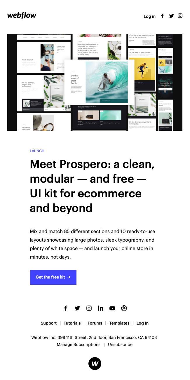
1. Webflow: Clean and clear UX
Webflow uses system fonts as a fallback for their web fonts and uses font weights to ensure a great typographic experience in their body text no matter what font appears.
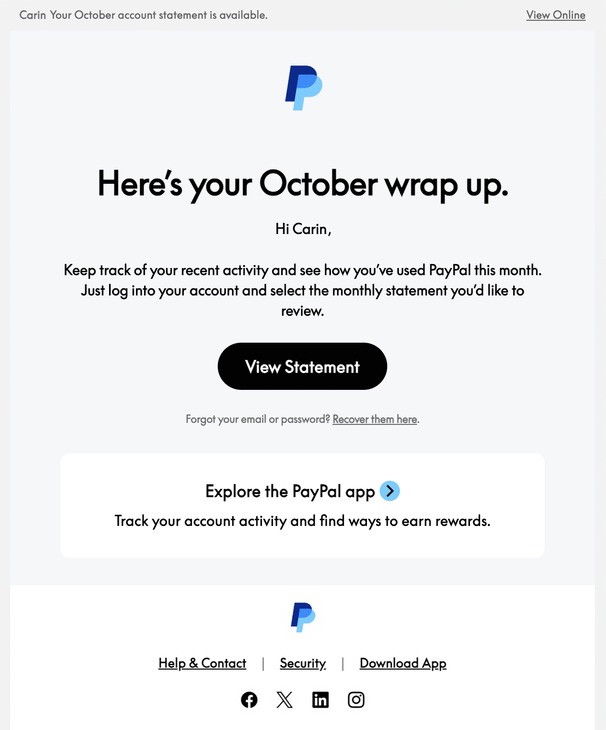
2. PayPal: The new modern
PayPal uses the Supreme font family, a descendant of Futura, for their emails and their app, which has a super clean look and feel. It’s a very of-the-moment, digital media font that is starting to get more popular because it’s extremely readable and modern.
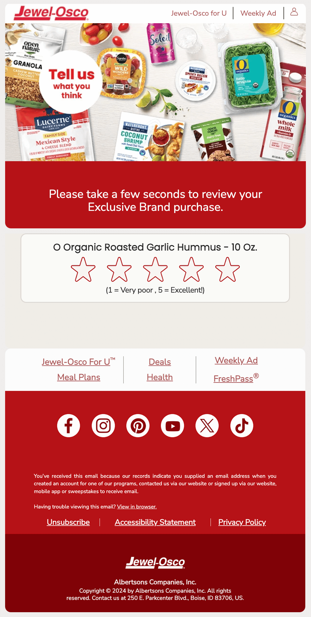
3. Jewel Osco: Matchy-matchy
Jewel Osco uses Nunito Sans, which has a balanced, spacious look and feel from Adobe Fonts. Their fallback has a great match with Poppins, another more geometric font that matches Nunito so well it’s hard to tell the difference.
4. Ted Goas: A full font stack
It’s easy to default to something like Arial for an email newsletter, but fellow email geek Ted Goas uses Space Grotesk, a very cool sans serif typeface.
What stands out about this email, though, is hidden in the code: Instead of one fallback, he’s added a whole bunch, including Lucida Bright, Book Antiqua, and Georgia, so that no matter what email client his subscribers are using, he’s in control of the brand experience.
5. Lego and CrunchLabs: Playful building blocks
You gotta love when a font reflects a brand so well, and that’s true of toy brands Lego and CrunchLabs. Lego is known for their blocky, playful sans serif font called Noto Sans. They default to Arial as a fallback, which gets the job done.

And CrunchLabs also offers a rounded, playful font without making it too childish. Their emails are easy-to-read without feeling formal or stuffy.

Stay on-brand and error-free with Litmus
Web fonts are a great way to keep the text in your emails both branded and accessible. But as you can see from this post, many nuances exist. That’s why it’s equally important to…
Always! Be! Testing!
We’ve done our best to test a bunch of different circumstances, but your ESP may unexpectedly distort your code. Test your emails before sending them out to ensure your fallbacks work correctly.
Adding web fonts is worth it as a great progressive enhancement to help you provide the best experience for your subscribers in their inboxes.
Originally published on April 11, 2019, by Jaina Mistry. Last updated January 14, 2025, by Kayla Voigt and Jaina Mistry.
The info in this blog is 2+ years old and may not be updated. See something off? Let us know at hello@litmus.com.

Jaina Mistry is a Brand and Content Marketing Leader.
