They say, “You never get a second chance to make a first impression.” I’m not exactly sure who ‘they’ are, but I agree with them in this case.
In email marketing, your first impression comes from three parts: the sender or ‘from’ name, the subject line, and the preview text—aka the email “envelope.” Together, these elements form a crucial part of any effective marketing strategy. Everyone remembers the ‘from’ name and subject line, as your email service provider (ESP) won’t let you send an email without them.
But preview text is a whole different situation. And if you forget it, you’re leaving that piece of your first impression up to the whims of your subscriber’s email client.
In this post, you’ll learn how to take control of your preview text and add it to your templates to ensure your email’s first impression is flawless.
- What is email preview text?
- Why is email preview text important?
- The difference between preview text vs. preheader text
- How to add preview text to your email
- How long should email preview text be?
- What is a good preview text for email? (+ tips to optimize)
- The future of email preview text: AI-generated summaries
What the heck is email preview text?
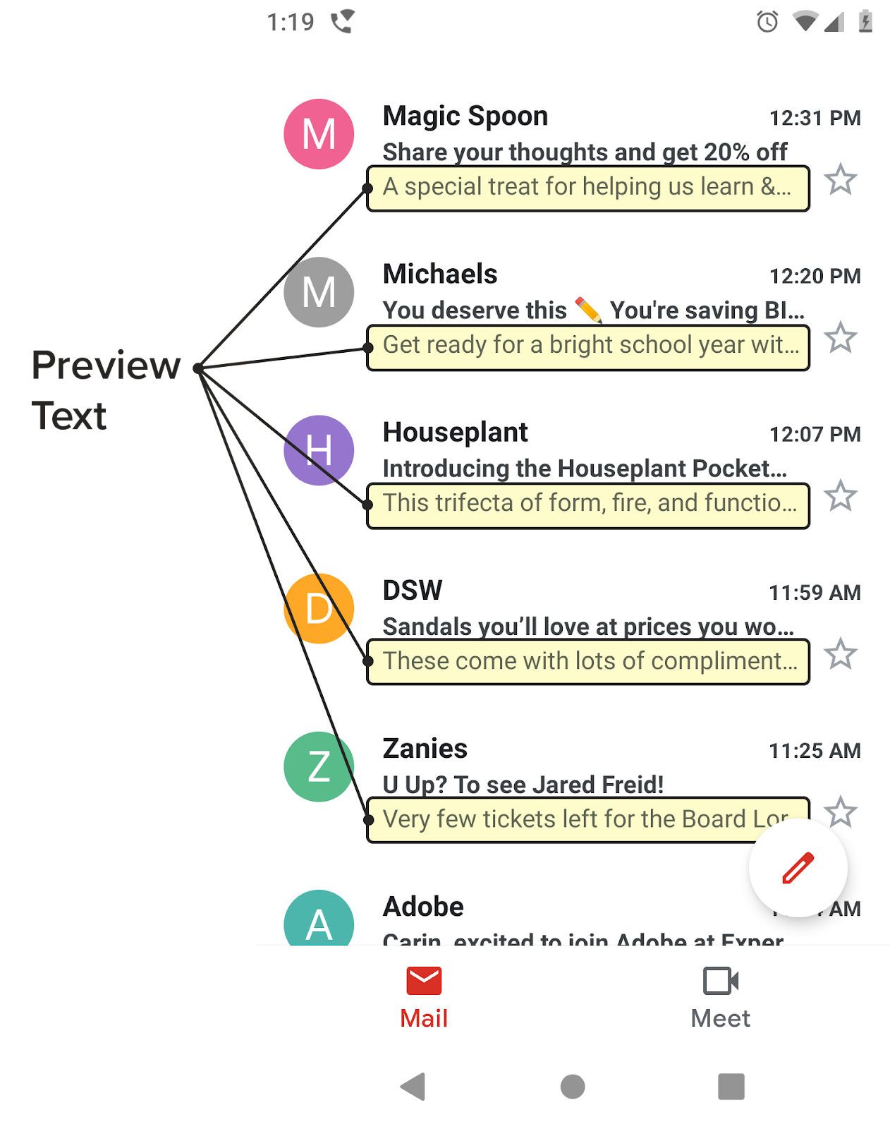
Preview text is the bit of text below or next to an email’s subject line in the inbox that gives extra insight into what’s inside the email. We’ll use the term ‘preview text,’ but you might see other names for it, too:
- Gmail refers to this as Snippets
- Apple Mail refers to it as a preview
- Outlook calls it a Message Preview
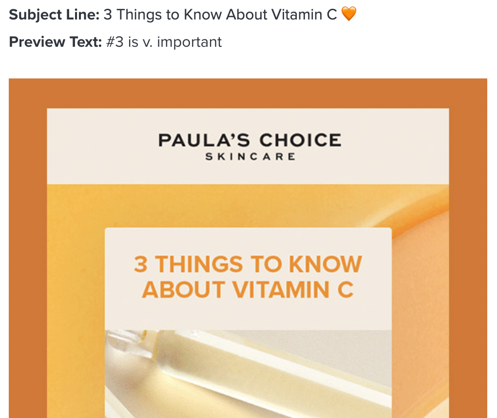
No matter what it’s called, this copy is the preview text. Here’s an example of what preview text looks like:
Preview text is well supported in all email clients these days (at least the ones based in the United States). Most email clients show email preview text by default, which means it’s a widely available way to connect with your subscribers and support your subject line.
But, the mechanics of how email clients pull this content depends on the email client itself and the subscriber’s inbox settings.
While email clients typically pull preview text from the first lines of copy in your email, there are a few that will pull it from an image ALT text. In rare cases, email clients generate preview text from code such as <a> tags. Although, code being pulled in isn’t as common as it used to be.
What does your preview text look like? See what shows up by previewing your emails in over 100 email clients, apps, and devices—with Litmus Email Previews. And ensure you send the perfect preview text for every email in every inbox. |
Why is email preview text important?
You have limited space (and time) to convince subscribers to open your email, so every character counts. Here’s how email preview text improves your subscriber experience and boosts performance.
Increases open rates
Email preview text lets you add more context to your subject line, which can boost your email open rates.
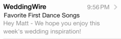
Don’t believe us? Do some preview text testing of your own. Autoplicity saw almost an 8% increase in their open rates when they started using preview text. And WeddingWire saw a 30% increase in click-through rates by testing theirs.
Builds anticipation and sets expectations
Your email preview text can build on your subject line to pull subscribers in further and further. For example, if your subject line announces a sale, the preview text can say ‘up to 60% off!’ or ‘Now through Friday’ to help subscribers understand what they’ll see inside the email.
Enhances personalization and relevance
Email preview text feels a bit like a note tacked onto a standard subject line, which means you can lean into that personal feeling and add a name or relevant details based on a subscriber’s actions.
“Customers want to receive more relevant, personalized emails, and delightful emails—but marketers struggle to find the right data points to create these experiences. Using a tool like Litmus Personalize, marketers can go beyond the limitations of their ESP to create truly personalized emails customers expect, while also providing the perfect opportunity to collect critical zero- and first-party data to help inform future campaigns.”
Strengthens brand voice and messaging
Is your brand straightforward or playful? Do you make jokes or talk stats? The preview text is more space to flex your brand’s tone. If you need help getting your point across, Litmus Assistant’s AI tone-of-voice editor can help.
Prepare your email program for what’s to come
Get the data, insights, and trends you need from nearly 1,000 marketers to future-proof your email program from The State of Email Innovations Report.
The difference between preview text vs. preheader text
What about email preheader text? Some marketers use these terms interchangeably, but they are actually two different things.
- Preview text shows up in the inbox, right after the subject line
- Preheader text is the text that shows up in your email above your header area, above your email’s body copy (hence why it’s called preheader in email marketing)
In the past, hiding content in your email was looked down upon and considered not good practice. The preheader text had to be visible in your email to not land in the spam folder. But as email has evolved, hidden content has become much more common and doesn’t hurt your email deliverability like it used to.
Nowadays, visible preheaders are much less common since they take up valuable real estate at the top of your email and usually don’t add much value to your design. If you use visible preheader text, make sure it makes sense in your email and with your subject line. If the preheader text only works as a support to your subject line, then don’t show it in your email.
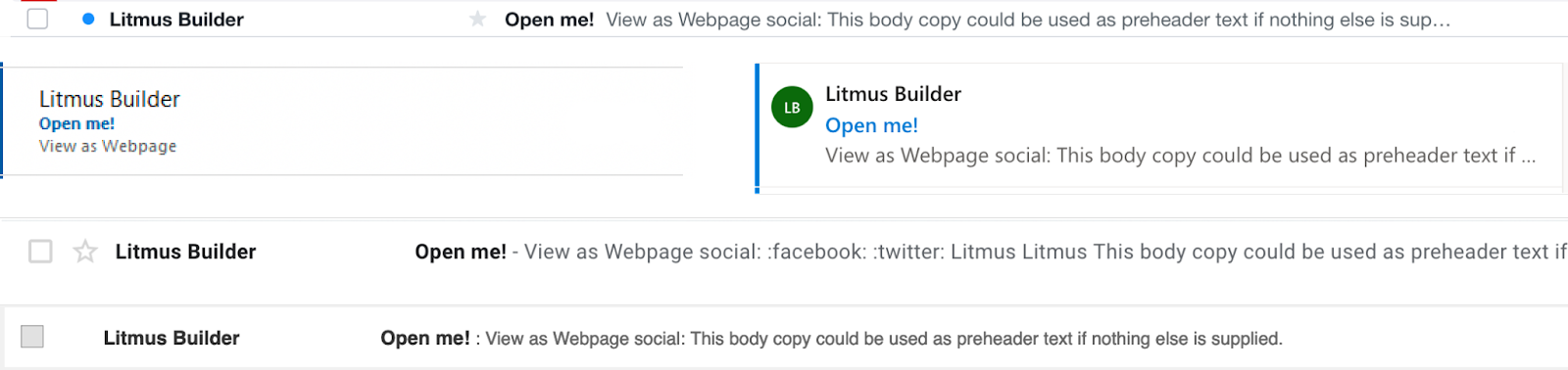
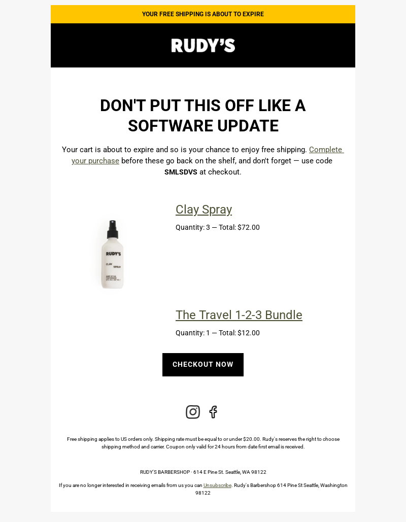
You could also add in hidden preheader text that’s only for showing up in the inbox, and then include visible preheader text that works with the email design, such as in this abandoned cart email from Rudy’s eCommerce store:
Subject line: Don’t let free shipping go to waste
Preview text: Let us make it easier with free shipping
Preheader text: YOUR FREE SHIPPING IS ABOUT TO EXPIRE
How to add preview text to your email templates
Adding preview text to your email templates is super easy! Let’s take it step by step.
1. Craft your compelling snippet
Do you want your email preview to drive sales? Spark curiosity? Make subscribers laugh? Your first step is picking a goal or theme that aligns with your message. Here are a few you can try:
- Curiosity: spark interest with a question, cliffhanger, or exclusive offer teaser.
- Email personalization: use dynamic tags like names or purchase history to make it relevant.
- Call-to-action (CTA): gently encourage the recipient to open the email.
Then, get to writing! AI tools like Litmus Assistant can help you brainstorm options, and your final choice should balance cleverness and clarity. You probably don’t want your preview text to make subscribers scratch their heads and say, “Huh?”
2. Add preview text through your email tool
The way you add preview text to your email code depends on your email design tool and whether you also want a distinct preheader text.
There’s no right or wrong answer here, and you can always test methods to see which your email list responds to.
If you want the same text for the email preview and preheader:
You won’t need to do anything to add the preview text in your email if your email design already has a visible preheader or you plan on using the initial copy in your email.
Make the preview text copy the first thing in your email, even above images or links, to prevent alt text from showing up in the preview text. You could put this copy as the alt text for any image above your copy, but then you’d end up with a duplicated copy, and the alt text wouldn’t pertain to the image, which is not good for accessibility.
If you want custom preview text:
Many ESPs have a field you can fill in (usually next to the one where you add your subject line) if you want a different copy snippet to appear as your preview text. Adding preview text to these dedicated fields in email tools will automatically add the code to your email.
If your ESP doesn’t have a dedicated field for preview text, it’s simple to add manually at the top of your code right after the <body> tag, like this:
<body>
<div style="display:none;">Your preview text goes here</div>
</body>
3. Preview and test your snippet
You should always check that your preview text renders how you expect it (and want it!) to, and there are some simple hacks and tools to help you.
For example, if your preview snippet is short and the inbox is pulling in more of your email content to fill the extra space, you can use an easy hack to remedy it.
If you’re nervous about adding code to your email, use an email builder to add preview text as you build—like with Visual Editor in Litmus Builder.

Without the hack, the inbox will pull in more of your email content to fill the extra space after your preview text, like so:

See the “View this email in your browser” bit after the intended preview text? Yikes.
If you’re nervous about adding code in your email, add preview text in with Visual Editor in Litmus Builder.
Here’s how:
- Create or add your email in Litmus Builder
- Hop over to the Visual view, then click on the subject line and preview text module in the preview pane
- Add or edit your preview text in the editor on the left side. That’s it!
4. Optimize your preview text for each email marketing campaign
Preview text is another email marketing element that you can test and optimize. For example, do conversions increase more when you include an exact discount percentage in the preview text or when you hint at the scale of the sale? Follow all the same A/B testing best practices as you would with any other element, like changing a single variable and setting up distinct parameters.
Character limits: how much is too much preview text?
Character limit varies by client and device. As your subscriber can change preview text settings in their email client, they can see anywhere from 5 lines of preview text (about 278 characters) to 0 lines of preview text. Even Gmail allows users to turn off snippets (friendly reminder, that’s what they call preview text).
With no way to track how much preview text shows up, we recommend keeping the preview text under 90 characters. Keep in mind that sometimes shorter or no preview text may be just the thing to make your email stand out in the inbox.
However long you decide to go, make sure the most important part is near or at the beginning so your message comes across—even if it gets cut off. We’ve got more tips up next.
Tips to optimize your email preview text (and draw people in)
Now that you know how to add preview text to your email, what should you even say? With these tips, you’ll craft the perfect message that’ll have your subscribers opening!
Think of preview text as your subject line’s best friend
Peanut butter and jelly. Chicken and waffles. Some things just go better together. The same can be said of your subject line and preview text. They should work together and flow seamlessly from one to the other. Think of the preview text as an extension of the subject line. You can use it to create sense of urgency or inject humor into the email inbox. If you’re leery of using emojis or personalization in your subject line, add them to the preview text.
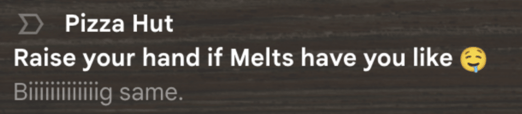
Chubbies is notorious for their delightful, sometimes hilarious, subject line and preview text combos. For example:
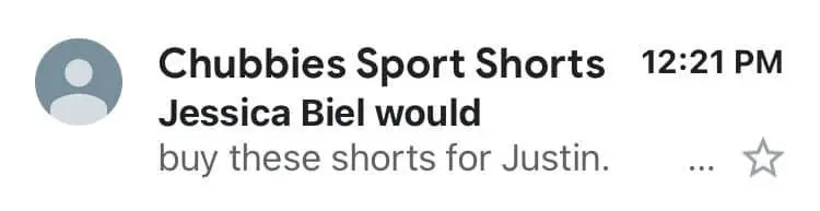
Like Justin Timberlake completes Jessica Biel, this preview text literally completes the subject line, so it reads like one sentence altogether.
Keep in mind AI-generated email summaries
Over the past year, Gmail, Apple, and Yahoo have each introduced their respective versions of AI-generated summaries, altering the inbox experience for users who enable or engage with it. Remember that for Apple subscribers, not all subject line/preview text combinations are going to work; prioritize getting your main message or hook across in your subject line. (More on this below!)
Source: Apple
Don’t lose your message
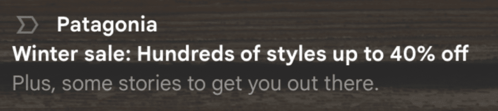
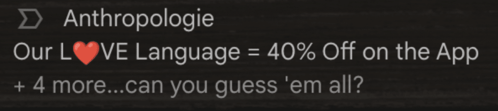
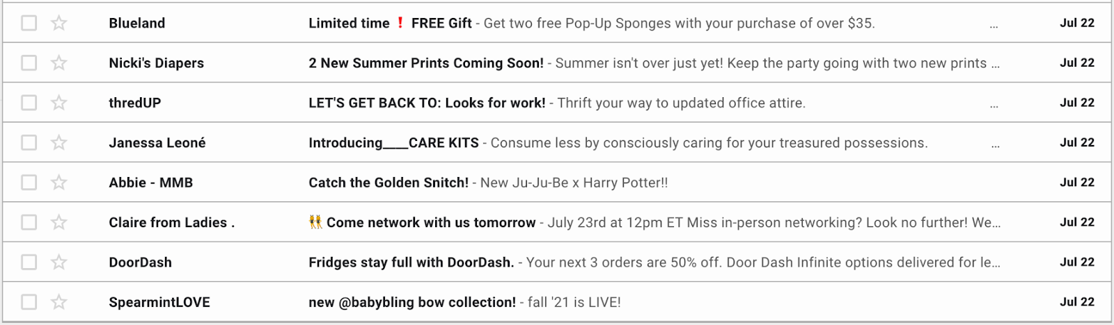
In webmail clients like Gmail, you only have so much space for both the subject line and the preview text together. So, if you have a long subject line, consider keeping the preview text nice and short. Notice how some preview texts aren’t fully displayed in this snapshot of a Gmail inbox? Yet others have a lot more space left to make an impact.
And don’t forget to test in as many places as you can to avoid any unfortunate cropping. Words like “associate”, “assume”, “assembly”, and “assorted” may be cut in compromising places if you’re not careful.
Consider how the length of your subject line and preview text work together in the limited space of the inbox
Avoid repetition
Reusing existing subject and headline copy in your preview text can be tempting, especially if you’re in a rush. But recycling the same copy in all those places will make for one repetitive inbox message. Plus, if your subject line doesn’t hook someone, then using that copy in your preview text, too, is missing a second chance at reeling your subscribers in.
Get creative, using this extra space to play off of the subject line and further encourage your subscribers to open the email.
- Use personalization. If you’ve had success with using personalization in other parts of your email marketing campaigns, try personalizing preview text, too.
- Sum up the email. If your subject line includes a CTA, use preview text to include more details. For example, if your subject line is “50% off new arrivals,” use preview text to explain what type of merchandise has arrived.
- Include a CTA or secondary CTA. Does your email have a few CTAs? Consider showcasing them in your preview text if they pair well with the subject line.
- Be honest. As always, you should never trick your subscribers into opening your emails. The sender name, subject line, and preview text should work together so subscribers know what to expect when they open. Follow this best practice for your newsletters—and for any/all sends.
- Encourage scrolling. If you’re sending a newsletter, highlight a featured article (or two).
A/B test to increase performance
Learn what works—and what doesn’t—with continuous email A/B testing. Add preview text to your A/B testing rotation. Test different preview text and subject line combinations. You might find that some strategies produce higher open rates while others generate more clicks.
Tailor to your target audience
Your email preview text is another opportunity to create something that resonates with your email list, so keep their goals and personalities in mind as you write. Match your brand voice and nod to what your audience cares about, like value, innovation, exclusivity, or exploration.
Don’t forget the CTA
If you use your subject line to catch attention in the inbox, you can use the preview text to set context for the type of content of the email inside. Here are a few examples:
Newsletter preview text CTA examples:
- Explore featured books
- Check out what’s new
- Open for inspiration
Promotional preview text CTA examples:
- Save up to 40% on sewing machines
- Shop the collection
- Claim huge savings
Leverage emojis strategically
Unless emojis are an integral part of your brand, sprinkle them in here and there, like when your preview text is just a bit too long and you need to swap a word for a symbol. Adding imagery in the preview text emphasizes the copy and stands out in the inbox, but if you overuse emojis, they lose their intrigue.
Preview text examples with emojis:
- Cancel plans and add to 🛒
- Everything for your remodel is here 🙌
- ❄️⛄❄️⛄❄️ winter sale ❄️⛄❄️⛄❄️
- 💡Bright projects ahead
Maximize your email ROI
Factors like optimized email preview text can boost engagement and unlock untapped email-driven revenue.
The future of email preview text: AI-generated summaries
During the first half of 2024, Apple, Gmail, and Yahoo each announced versions of AI-generated email summaries. This raises an important question: is this the end of traditional preview text?
According to Email Client Market Share, Apple, Gmail, and Yahoo rank among the top four email clients. For those concerned about the fate of preview text, it’s not obsolete but possibly the start of a new era in email previewing.
Of these three inbox providers, Apple is the only one making a notable shift to the valuable email “envelope” space—made up of the sender name, subject line, and preview text.
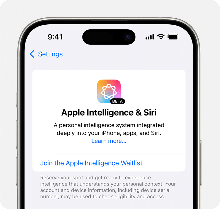
AI-powered email summaries with Apple
As of October 2024, AI-powered email summaries are now available on iOS 18.1, iPadOS 18.1, and macOS Sequoia 15.1 as part of Apple Intelligence. Instead of relying on manually set preview text, Apple Intelligence analyzes the email content and generates its own summary, displayed just below the subject line.
Rather than previewing the first few lines of each email, users can now see AI-generated summaries directly in their inbox without opening the message. For longer threads, a single tap provides a summary of the most pertinent details.
Apple has stated all AI processing occurs on the user’s device, which means results will vary from user to user.
Keep in mind: while the latest software updates are out now, it doesn’t mean all Apple iPhone users will be updating their devices with it. Eventually, adoption will increase as older software versions get phased out, but remember this is currently only a subset of the larger Apple audience.
As of November 2024, Apple Intelligence is only available for the following devices:
- iPhone 16
- iPhone 16 Plus
- iPhone 16 Pro
- iPhone 16 Pro Max
- iPhone 15 Pro or iPhone 15 Pro Max
- Any iPad with A17 Pro or M1 and later
- Mac with M1 or later
Additionally, iPhone users will need to sign up for Apple Intelligence by joining the waitlist:
“Summarize this email” with Gemini in Gmail
With Gemini, Gmail users who have Gemini activated in Google Workspace or a Google One AI Premium plan can now generate email summaries with a click or via the Gemini sidebar. This feature works for both single emails and entire email threads.
Source: Google
This works to help users save time by sorting through messages to gather the most important points, addressing the occasional difficulty of searching for emails in your inbox.
It’s worth noting that this feature is available only to Google Workspace users with Gemini enabled. Although exact usage statistics are unknown, a comparison of mobile app downloads between ChatGPT and Gemini shows a notable difference in popularity (4.2 million downloads for ChatGPT vs. 783,000 for Gemini in September 2024).
Previously, Gemini was a paid feature for Google Workspace, but as of August 2024, it is now accessible to free Gmail users.
AI-powered email summaries in Yahoo Mail
Yahoo also introduced AI-powered email summaries as part of The New Yahoo Mail, using AI-powered summaries to surface key points.
Source: Yahoo
Not every email will have this enabled; users will need to manually enable it for it work in their inbox.
What about alternative text sources, like ALT text and all-image emails?
ActionRocket has also pointed out how AI-generated summaries aren’t necessarily looking at the ALT text in your emails—neither is it scanning the text in your images. Using live text will help mitigate AI interpreting your all-image email as “too short to summarize” or pulling in elements you likely won’t want highlighted, “Unsubscribe or manage your email preferences here.”
Best practices for AI-generated email summaries
As noted earlier, AI-generated email summaries are currently available only to a subset of Apple, Gmail, and Yahoo users. So, while preview text isn’t disappearing, it is evolving.
To stay ahead of this shift and make the most of your email’s “envelope” real estate—sender name, subject line, and preview text—focus on these best practices:
- Prioritize the subject line. Since AI-generated summaries may alter preview text display, focus on crafting subject lines that get your main message across—even if preview text is truncated. Ensure your subject line instantly communicates the most compelling part of your email’s offering, whether that’s urgency, a special offer, or a hook to drive subscribers to open your email to learn more.
- Ensure your sender name is recognizable. The last thing you want is to create confusion (and mislead someone into thinking your email is spam). Make it friendly, recognizable, and easy to read.
- Avoid all-image emails. AI may not interpret ALT text in images effectively—and won’t analyze the text in your images, either—so use live text for more optimized summaries and web safe fonts for improved readability and accessibility.
- A/B test your email “envelope.” For continuous learnings and optimization, test subject lines, preview text, and from name combinations for guidance on what’s working (and what’s not).
- Monitor open rates. Regularly check your open rates, especially with Apple, Gmail, and Yahoo audiences. Although this isn’t possible directly through your ESP, Litmus Email Analytics can help!
- Use AI tools for guidance. Plug your email content into ChatGPT or similar AI tools to see how it might be summarized in subscriber inboxes.
- Design with hierarchy. Follow email design best practices with semantic headings to enhance your email’s readability and effectiveness when it gets summarized by AI.
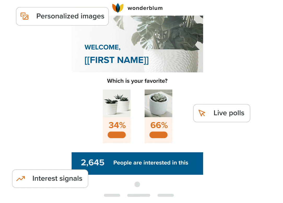
Drive engagement with dynamic content
Personalize emails with live polls, personalized images, scratch-offs, and more. No coding experience required. Learn more.
Start using email preview text to your advantage
Email preview text is like a subject line sidekick that can boost open rates and conversions by adding more context and detail. In email marketing, it’s a great opportunity to engage readers right from their inbox. So go ahead, have some fun with it! Experiment with new CTAs and copy, but remember to test each email before sending so you know the preview text can live up to its potential.
Send with total confidence
Preview emails in 100+ clients, catch errors, and ensure accessibility. Cut QA time in half.

The info in this blog is 2+ years old and may not be updated. See something off? Let us know at hello@litmus.com.

Carin Slater is the Senior Technical Producer at Stitch.
