Are your emails not converting as well as they should? While you’re switching up your copy or content to optimize the subscriber experience, you might be overlooking one very critical element: design.
Design isn’t just about making things look pretty. And beautiful designs alone don’t automatically equate to high performance. If you want to create good looking emails that sell, you need conversion-centered design.
What is conversion-centered design?
Conversion-centered design (CCD) is exactly that: design that’s focused on conversions. Think of your email’s main goal. Then, use persuasive design and psychological triggers to help guide people toward the action you want them to take. It’s not a trick; it’s CCD. But how exactly can you achieve that?
Ensure your CTAs are a home run
Get automatic notifications when a broken or slow-loading link is detected, so you can fix it before it reaches your subscribers with 24/7 Link Monitoring in Litmus Email Guardian.
9 tips to create high converting emails
There are several principles of CCD, all of which can be applied to email marketing. I’ll show you how.
1. Fulfill the expectation set by the subject line
This tip isn’t just about design. As a solid foundation, your entire email needs to be cohesive in its singular goal—from the subject line to the call-to-action inside. This means not using misleading tactics that trick subscribers into opening your email. This is the opposite of CCD and will lead to lower conversions.
Additionally, your email should map to the destination, as promised by both your subject line and the content of your email. No bait and switch: What got your subscriber to open and click should lead to exactly that. It should be about providing a consistent journey, starting with the subject line through all the way to the landing page. This upholds expectations and helps build trust for the long haul.
For more on how to get opens, clicks, and conversions, check out these subject line tips from email experts. Note: if you wrapped an ESP migration, re-validate redirects, UTM conventions, and templates in your new ESP, so can fulfill the expectation set by your subject line.
2. Consider verbs that tease in your CTAs
No amount of design can help a poor call-to-action (CTA). So before we talk about design considerations, make sure you nail your CTA.
A good CTA doesn’t merely amplify the act of proceeding, it amplifies the value of it.
Your subscribers didn’t wake up looking to download or sign up for anything. Instead, they may have woken up wanting or needing something. Your button text should reflect the latter and tease—or set the expectation of—what your subscriber will encounter next.
| To sell a… | Instead of… | Try this… |
| Project management app | Download now. | Start planning. |
| How-to blog post | Learn more. | Show me how. |
| Pair of sneakers | Buy today. | Run faster. |
3. Draw focus to your CTA with encapsulation
Encapsulation is the wrapping that you put the most important content in. The idea is to make it clear to the reader that the content is important to them. An example would be to centre a CTA within a tunnel or window. This could be achieved using photography, a pattern, or a radial gradient.


Interested in this approach? Learn how to do it with these helpful blog posts:
- How to Wow Every Subscriber with an Email Background Image Easily (+ the Code to Do It!)
- The Best Way to Code HTML Email Background Colors and Gradients
4. Make your CTA stand out with contrast
Crossing over from the considerations we make for accessible design is well-considered contrasts. When designing with CCD in mind, it’s about making sure your CTA is in contrast to other elements in the email and therefore stands out.
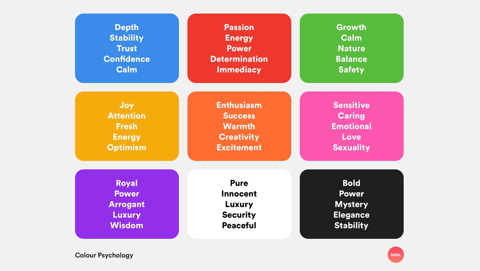
With CCD, we also look at colour psychology as it can be used to get an emotional response from your subscribers:
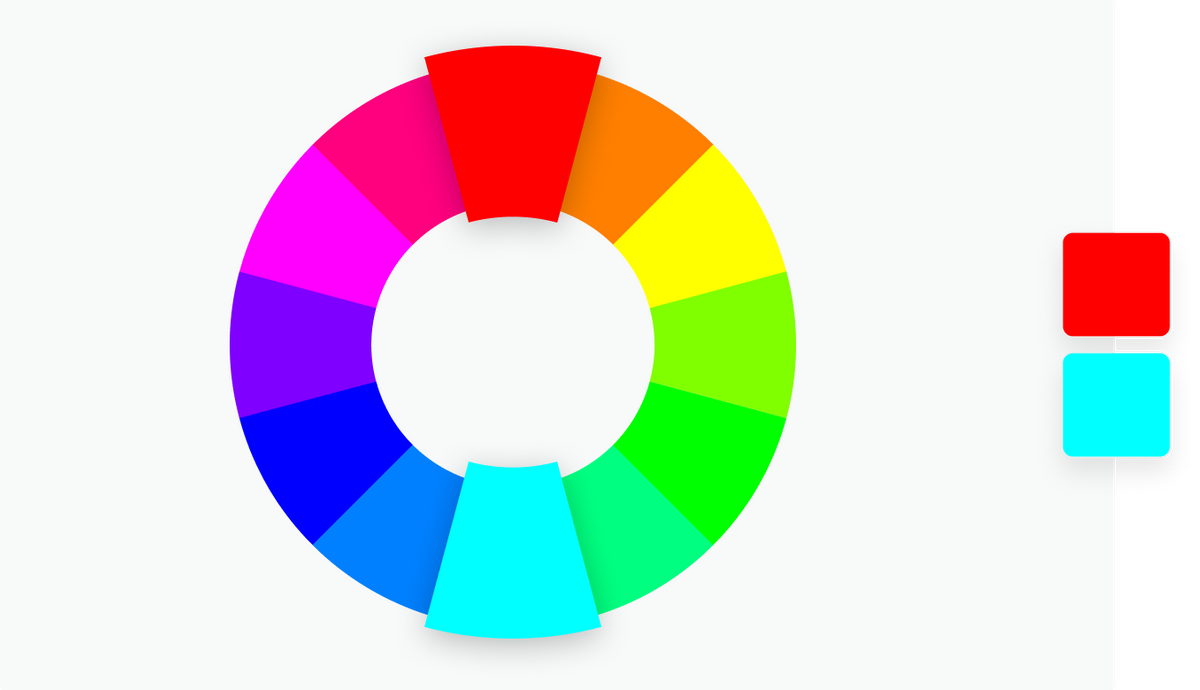
For the greatest level of contrast, Interaction Design Foundation recommends using colours that sit opposite each other on the colour wheel.
Not all color contrasts work well for all readers though, so be sure to test contrasts within your own brand’s colour palette for email accessibility.
5. Point to important content with directional cues
Directional cues are visual indicators that point to important content and help subscribers take action. Examples of such cues include arrows, lines, shapes, and line of sight.
With arrows, you can quite literally point out important content, help guide readers through an email, and steer them towards clickable elements. Lines and shapes can have the same effect but are much more subtle.
With photography, you can create pathways and use line of sight from human photography to direct readers to specific elements.

6. Leave lots of whitespace to make CTAs easier to find
Leaving lots of white space within a composition helps subscribers locate the areas within an email where they can take action. A great example is white space around a CTA. Centre positioning and generous padding top and bottom helps to draw the eye to a button or styled text link.
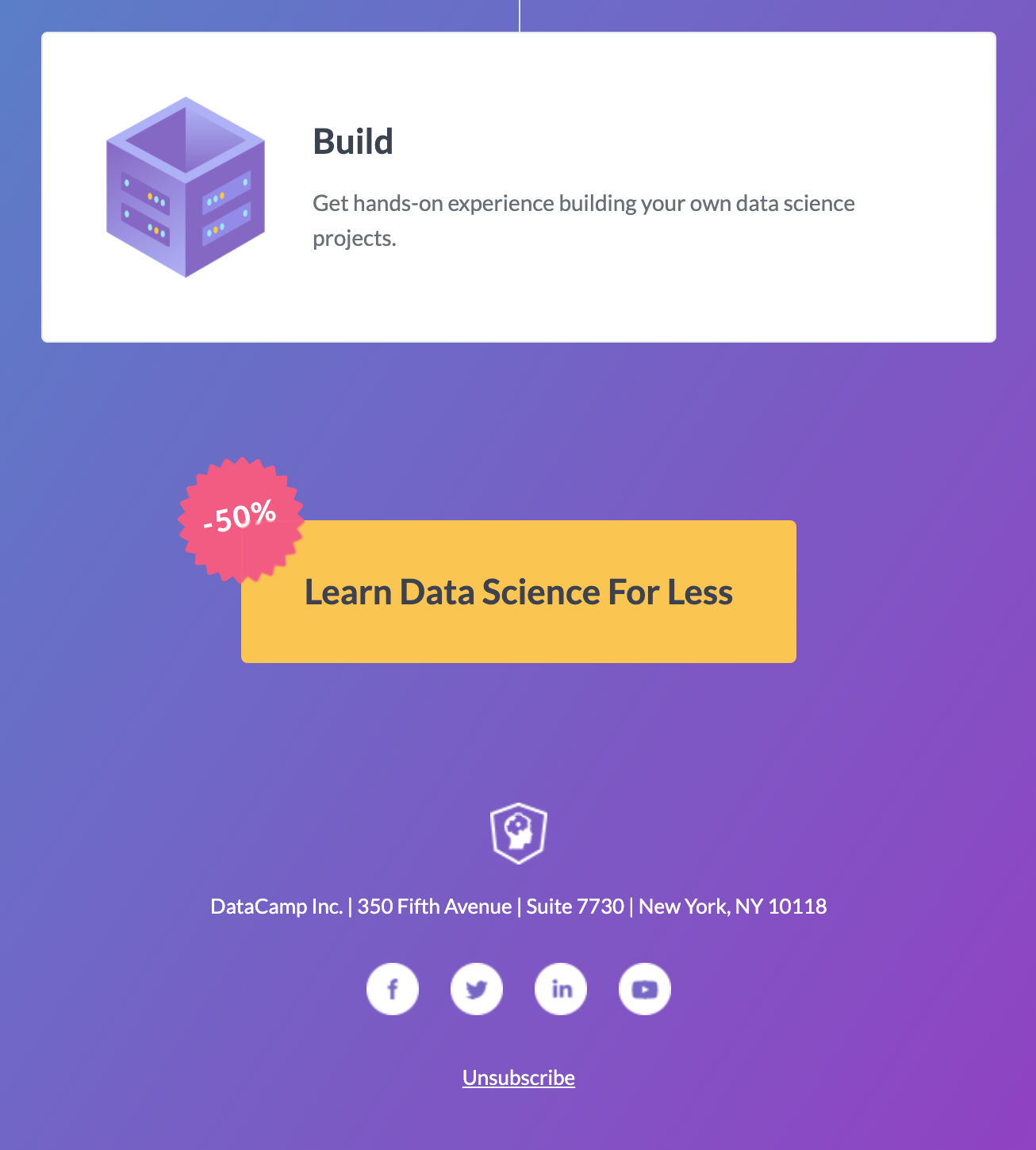
The final button in the email above is given ample white space to ensure that it isn’t missed, along with a clear offer reminder.
7. Give people a peek of what they’ll get
Show, don’t tell. There’s truth to the old saying, “A picture’s worth a thousand words.” People want to see or preview what they’ll get before they commit to taking action. Is it worth their time and money? Email design is perfect for showcasing your product or service.
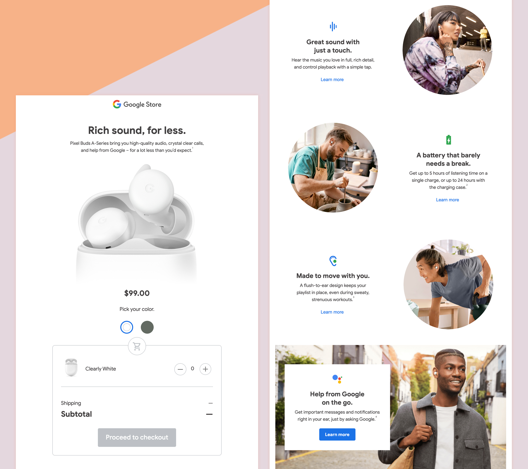
Google showcases their Pixel Buds wireless earphones in this interactive promotional email. With enlarged imagery in the hero area, the subscriber can study the product. Further imagery in the body of the email shows examples of the product in use.
Interactivity offers a more immersive experience, with the option to switch between colors, add the item to a shopping basket, and click through to the checkout. This is a great way to increase conversions through interactivity because it shortens the journey toward making a purchase.
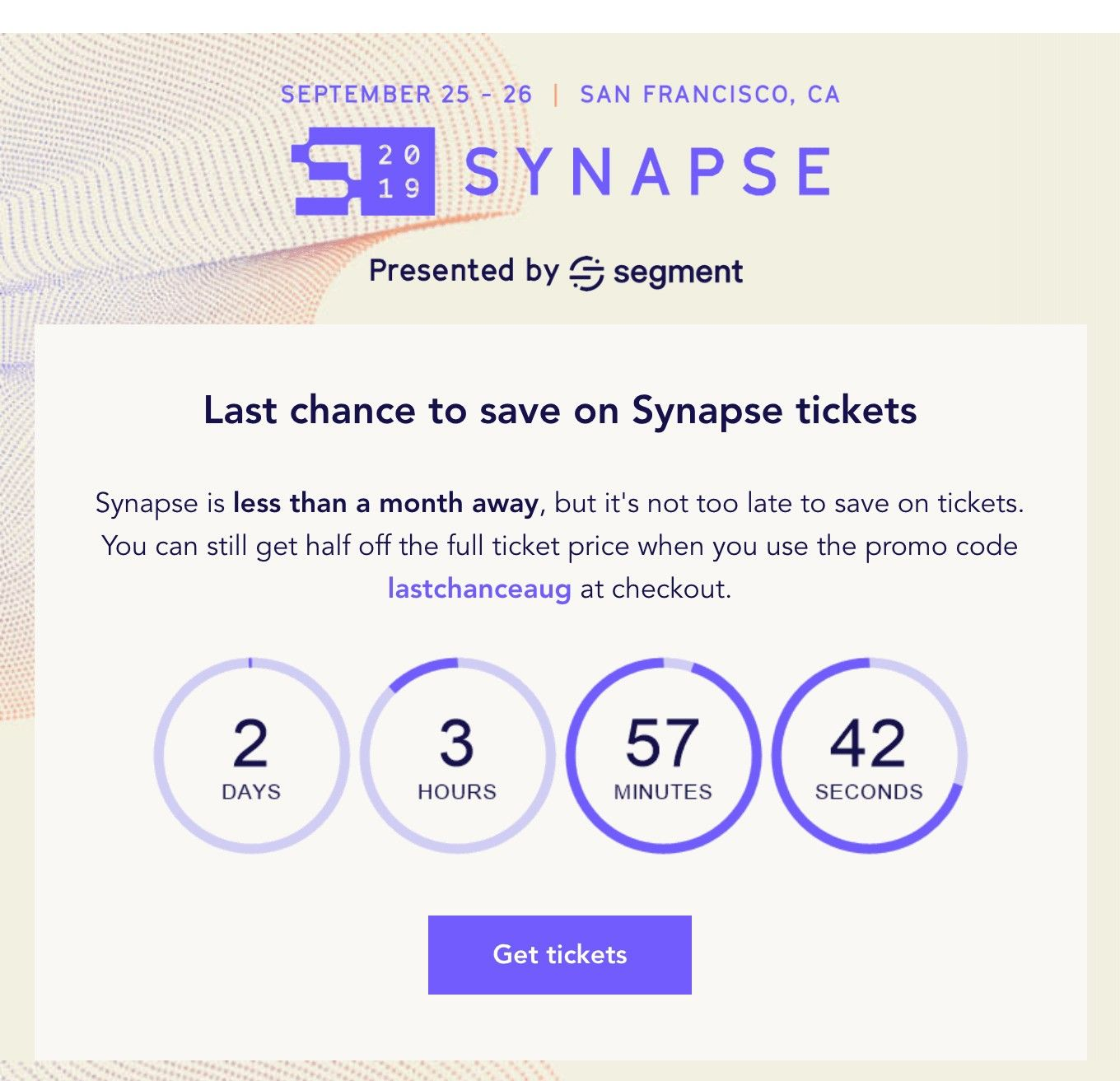
8. Use urgency to encourage action
Sending emails that have a sense of urgency—such as “early bird prices ending,” “1 day until…,” or “starts in 1 hour”—can drive action by limiting decision making time.
Visual techniques and elements like countdown timers, bold and large typography, shorter messaging, and CTAs that are visible upon open can help subscribers take rapid action, which can all be added with your email design marketing tool.
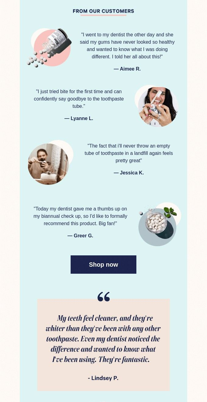
9. Inspire confidence with social proof
Including positive customer feedback about your product or service can elevate trust and help give prospects that extra confidence required to take action. This could be in the form of a testimonial, review, or star rating.
The path to conversion is clear
People spend an average of just 10 seconds reading an email. So it’s crucial that skimmers understand the context of your entire email without needing to read the body. Conversion-centered design is one way to allow for this and quickly get your subscribers to your call-to-action before they lose interest. Try out the tips in this article to clear the path to conversion, and let us know how it goes!
Ensure your CTAs are a home run
Get automatic notifications when a broken or slow-loading link is detected, so you can fix it before it reaches your subscribers with 24/7 Link Monitoring in Litmus Email Guardian.
The info in this blog is 2+ years old and may not be updated. See something off? Let us know at hello@litmus.com.

Lily Worth was a Senior Email Designer at Litmus
