Now that Apple’s Mail Privacy Protection dominates reading environments, email designs must accommodate several scenarios—including webmail, desktop, and mobile–often without a lot of visibility. When you don’t have insight into where your audience is opening, using a hybrid/responsive design is a must. It’s a great way to guarantee a good experience for your subscribers everywhere, no matter where or how subscribers interact with your emails. Responsive or hybrid email design makes all the difference!
But what’s the difference between hybrid and responsive email design, why are the methods important, and which should you choose? Read on to understand which design strategy is best for your campaigns.
What is hybrid email design?
Hybrid email designs adapt to device sizes without using media queries and breakpoints, which apply styles based on conditions like screen width. Since some email clients strip or ignore media queries, hybrid design helps you create a mobile-friendly experience across more environments. You can always include media queries as an enhancement for clients that support them.
Hybrid email gets complicated, though, when you start using it on complex layouts. While there are techniques for dealing with two-, three-, and four-column layouts, they are harder to implement and more fragile than the corresponding “target-classes-and-override” approach of traditional responsive emails.
What is responsive email design?
Responsive email design adjusts its size across different devices to maintain style and usability, which means subscribers have a great experience on any device or email client.
Responsive email design uses media queries to change fixed-width tables and images on desktops into fluid ones for smaller screens. What does this mean for subscribers? Email marketing campaigns that use responsive design look great and maintain usability across devices.
How to design a hybrid email
Since some email clients ignore media queries, but plenty of your subscribers use those services, email designers can use a hybrid or ‘spongy’ email design.
Hybrid coding still uses fluid tables and images but, in contrast to responsive emails, those tables and images are fluid by default. Instead of using media queries to trigger those fluid states on smaller screens, hybrid coding favors Microsoft conditional comments to restrain fluid tables on larger screens.
The hybrid coding approach, sometimes called spongy coding, was pioneered by MailChimp’s Fabio Carneiro and popularized by Mike Ragan and Nicole Merlin.
While there are variations to the approach, hybrid emails work on the following principles:
- Fluid tables and elements by default
- Max-width CSS to constrain widths on desktop
- MSO conditional comments to constrain widths in Outlook
Let’s look at the very basic steps to design a hybrid email.
Step 1: Create a hybrid table with fluid percentage values
A hybrid email design starts with a hybrid table. It differs from responsive code with media queries, though, because instead of using fixed pixel values for the width of both the table and image, we are using fluid percentage values. This method allows the content of the email to flow to fill different screen sizes.
<table border="0" cellpadding="0" cellspacing="0" width="100%">
    <tr>
        <td align="center" style="background-color: #00a9f7;">
            <table border="0" cellpadding="0" cellspacing="0" width="100%">
                <tr>
                    <td align="center" valign="top" style="padding: 40px 0px ">
                        <!-- IMAGE -->
                        <img alt="Example" src="http://placehold.it/600x300" width="600" style="display: block; width: 100%;" border="0">
                    </td>
                </tr>
                <tr>
                    <td align="center" valign="top" style="padding: 0px 10px 20px 10px;">
                        <!-- HEADLINE -->
                        <p>Announcing Some News</p>
                    </td>
                </tr>
                <tr>
                    <td align="center" valign="top" style="padding: 0px 10px 60px">
                        <!-- COPY -->
                        <p>Lorem ipsum dolor sit amet, consectetuer adipiscing elit. Aenean commodo ligula eget dolor. Aenean massa. Cum sociis natoque penatibus et magnis dis parturient montes, nascetur ridiculus mus. Donec quam felis, ultricies nec, pellentesque eu, pretium quis, sem. Nulla consequat massa quis enim.</p>
                    </td>
                </tr>
            </table>
        </td>
    </tr>
</table>
Step 2: Add a CSS max-width property
Percentage value width tables are helpful for mobile devices. Still, if we left the table as it is in step one, our subscribers would see obnoxiously wide emails on desktop. We can add the CSS max-width property to the table and image to prevent that.
<table border="0" cellpadding="0" cellspacing="0" width="100%">
    <tr>
        <td align="center" style="background-color: #00a9f7;">
            <table border="0" cellpadding="0" cellspacing="0" width="100%" style="max-width: 600px;" >
                <tr>
                    <td align="center" valign="top" style="padding: 40px 0px">
                        <!-- IMAGE -->
                        <img alt="Example" src="http://placehold.it/600x300" width="600" style="display: block; width: 100%; max-width: 600px;" border="0">
                    </td>
                </tr>
                <tr>
                    <td align="center" valign="top" style="padding: 0px 10px 20px 10px;">
                        <!-- HEADLINE -->
                        <p>Announcing Some News</p>
                    </td>
                </tr>
                <tr>
                    <td align="center" valign="top" style="padding: 0px 10px 60px">
                        <!-- COPY -->
                        <p>Lorem ipsum dolor sit amet, consectetuer adipiscing elit. Aenean commodo ligula eget dolor. Aenean massa. Cum sociis natoque penatibus et magnis dis parturient montes, nascetur ridiculus mus. Donec quam felis, ultricies nec, pellentesque eu, pretium quis, sem. Nulla consequat massa quis enim.</p>
                    </td>
                </tr>
            </table>
        </td>
    </tr>
</table>
Step 3: Use conditional comments to account for Microsoft Outlook
In most cases, adding a CSS max-width property keeps widths at bay. However, Microsoft Outlook isn’t like most cases because it doesn’t currently respect the max-width property. It’s necessary to use conditional comments to make hidden, fixed-width ghost tables that only Outlook sees to account for this.
That bit of code essentially tells Outlook to wrap our content in the fixed-width table contained within that comment.
Since all those elements are fluid by default, our email works well on nearly every smaller screen. And, since it doesn’t rely on media queries to trigger those responsive styles, it works in problematic clients like Gmail, too.
<table border="0" cellpadding="0" cellspacing="0" width="100%">
    <tr>
        <td align="center" style="background-color: #00a9f7;">
            <!--[if mso]>
            <table align="center" border="0" cellspacing="0" cellpadding="0" width="600">
            <tr>
            <td align="center" valign="top" width="600">
            <![endif]-->
            <table border="0" cellpadding="0" cellspacing="0" width="100%" style="max-width: 600px;" >
                <tr>
                    <td align="center" valign="top" style="padding: 40px 0px">
                        <!-- IMAGE -->
                        <img alt="Example" src="http://placehold.it/600x300" width="600" style="display: block; width: 100%; max-width: 600px;" border="0">
                    </td>
                </tr>
                <tr>
                    <td align="center" valign="top" style="padding: 0px 10px 20px 10px;">
                        <!-- HEADLINE -->
                        <p>Announcing Some News</p>
                    </td>
                </tr>
                <tr>
                    <td align="center" valign="top" style="padding: 0px 10px 60px">
                        <!-- COPY -->
                        <p>Lorem ipsum dolor sit amet, consectetuer adipiscing elit. Aenean commodo ligula eget dolor. Aenean massa. Cum sociis natoque penatibus et magnis dis parturient montes, nascetur ridiculus mus. Donec quam felis, ultricies nec, pellentesque eu, pretium quis, sem. Nulla consequat massa quis enim.</p>
                    </td>
                </tr>
            </table>
            <!--[if mso]>
            </td>
            </tr>
            </table>
            <![endif]-->
        </td>
    </tr>
</table>
What are the pros of sending hybrid emails?
Yes, creating hybrid emails takes a few extra steps. However, the effort is worth it (and we’ll cover a way to save time further down)! 😀
Cross-client compatibility
If every one of your subscribers used the same email client and the same device, your email design and testing workflow would be much simpler. However, the reality is more nuanced, and you need to adapt your email design for cross-client compatibility. Hybrid email design gives you the best chance of delivering an excellent subscriber experience across environments.
Creative freedom
You have an email design vision, and hybrid email design ensures email clients won’t put their own spin on it. Setting up conditions in your email design gives you creative control over the look and feel of your campaigns.
Dynamic content support
Dynamic content updates content and imagery for each individual subscriber and is a scalable way to create hyper-personalized experiences—as long as subscribers can see it. Hybrid email design prevents the content from being hard to see or interact with on mobile devices.
Improved deliverability
Engagement metrics like click-through and unsubscribe rates impact your deliverability, and an easy-to-use mobile email contributes to the subscriber experience.
Future-proofing
Trying to keep up with the latest phone models and dimensions is a losing game, so you should use hybrid design to fit across devices, instead.
Why an Email is Unresponsive
An unresponsive email is one with a definite width that doesn’t adjust based on device size or one with a multi-column layout that’s too wide for mobile devices. Let’s look at an example of an unresponsive email.
Here’s what the code would look like for a section of an email with an image, headline, and a bit of copy.
<table border="0" cellpadding="0" cellspacing="0" width="100%">
<tr>
<td align="center" style="background-color: #00a9f7;">
<table border="0" cellpadding="0" cellspacing="0" width="600">
<tr>
<td align="center" valign="top" style="padding: 40px 0px">
<!-- IMAGE -->
<img alt="Example" src="http://placehold.it/600x300" width="600" style="display: block;" border="0">
</td>
</tr>
<tr>
<td align="center" valign="top" style="padding: 0px 10px 20px">
<!-- HEADLINE -->
<p>Announcing Some News</p>
</td>
</tr>
<tr>
<td align="center" valign="top" style="padding: 0px 10px 60px">
<!-- COPY -->
<p>Lorem ipsum dolor sit amet, consectetuer adipiscing elit. Aenean commodo ligula eget dolor. Aenean massa. Cum sociis natoque penatibus et magnis dis parturient montes, nascetur ridiculus mus. Donec quam felis, ultricies nec, pellentesque eu, pretium quis, sem. Nulla consequat massa quis enim.</p>
</td>
</tr>
</table>
</td>
</tr>
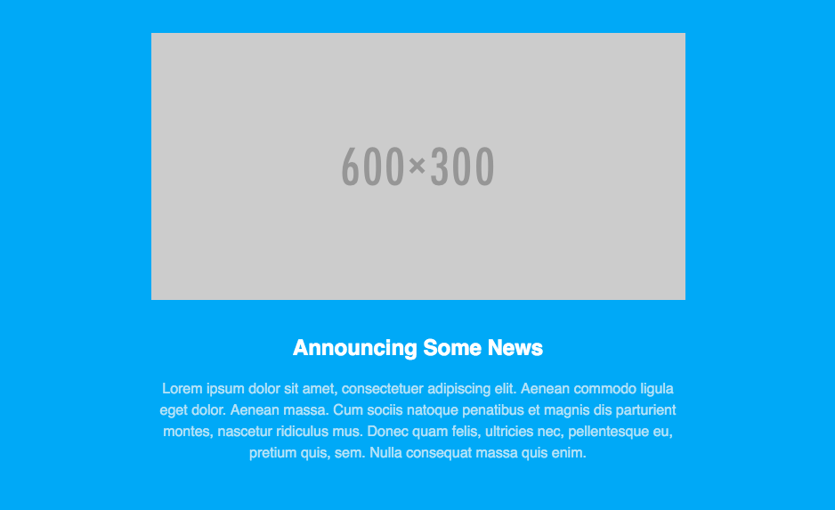
</table> You can see that while we use a 100% wide container table for full-width background colors, the content is wrapped in a table that is 600 pixels wide. Likewise, the image is 600 pixels wide. On desktop, that section of the email looks like this:
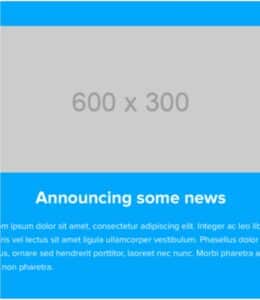
If we were to view that email in Gmail’s mobile client, we’d see this:
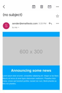
And if we viewed it on an iPhone, we’d even start to lose text:
The fixed-width table and image prevent that content from shrinking down to fit on the smaller screen. How can we fix that? How do we make those elements fluid? With a media query in the head of our HTML.
How to design a responsive email
Responsive email design uses CSS media queries to transform fixed elements on desktops into fluid ones for smaller screens. You can explore a Litmus Community post about coding a responsive email from scratch or watch our Responsive Email 101 webinar to get an in-depth look at the code. For now, let’s look at the basic steps to create a responsive email.
Step 1: Set a max-width rule for larger screens
Media queries allow us to specify how to style elements under certain circumstances. We feed media queries some conditions and styles, which are applied to our email when those conditions are met. In the case of email and mobile, those conditions are the screen sizes.
<!DOCTYPE html>
<html>
<head>
<title></title>
<meta http-equiv="Content-Type" content="text/html; charset=utf-8" />
<meta name="viewport" content="width=device-width, initial-scale=1">
<meta http-equiv="X-UA-Compatible" content="IE=edge" />
<style type="text/css">
	@media screen and (max-width: 600px) {

	}
</style>
</head>
The max-width: 600px rule is our screen size. In this case, any screens larger than 600px wide will see the fixed-width version of our email. Screens that are smaller than 600 pixels will force the styles in the media query to be rendered, allowing us to override inline styles in our email and optimize the design for smaller screens.
Step 2: Create a responsive media query for tables and images
In our media query, we can override those fixed widths by targeting those classes and applying the appropriate styles.
@media screen and (max-width: 600px) {
  .responsive-table {
    width: 100% !important;
  }

  .responsive-image {
    height: auto;
    max-width: 100% !important;
  }
}
Then add the classes to the table and images that you want to make responsive:
<table border="0" cellpadding="0" cellspacing="0" width="100%">
    <tr>
        <td align="center" style="background-color: #00a9f7;">
            <table class="responsive-table" border="0" cellpadding="0" cellspacing="0" width="600">
                <tr>
                    <td align="center" valign="top" style="padding: 40px 0px ">
                        <!-- IMAGE -->
                        <img class="responsive-image" alt="Example" src="http://placehold.it/600x300" width="600" style="display: block;" border="0">
                    </td>
                </tr>
                <tr>
                    <td align="center" valign="top" style="padding: 0px 10px 20px 10px;">
                        <!-- HEADLINE -->
                        <p>Announcing Some News</p>
                    </td>
                </tr>
                <tr>
                    <td align="center" valign="top" style="padding: 0px 10px 60px">
                        <!-- COPY -->
                        <p>Lorem ipsum dolor sit amet, consectetuer adipiscing elit. Aenean commodo ligula eget dolor. Aenean massa. Cum sociis natoque penatibus et magnis dis parturient montes, nascetur ridiculus mus. Donec quam felis, ultricies nec, pellentesque eu, pretium quis, sem. Nulla consequat massa quis enim.</p>
                    </td>
                </tr>
            </table>
        </td>
    </tr>
</table>
Our email will be fluid in email clients that support media queries and work well on smaller screens.

Step 3: Target columns on mobile devices for an easy-to-read email
You can use this same technique of targeting classes and overriding styles to change the layout of your email, too. In a two- or three-column layout, you can target the columns and make them 100% wide on mobile to create an easy-to-read, single-column layout.
Step 4: Adjust other design elements for usability
Media queries also let you adjust the size of text (which helps if you have web safe fonts), links, and buttons on mobile—increasing or decreasing each size to aid in readability and usability.
What are the pros of sending responsive emails?
Subscribers should have a consistently positive experience with your emails regardless of their device, and responsive emails help you send beautiful and usable emails.
Mobile optimization
More than half of all emails are opened on mobile devices, which means optimizing for smaller devices is just as important as desktop.
Enhanced user experience
There are 300,000 potential renderings for every email you send—we even calculated how many different options for email rendering there really are. Responsive email design gives you a better chance of your email displaying correctly across screen sizes, email service providers, operating systems, email clients, and image settings.
Increased click-through rates
Engagement metrics like click-through rates are arguably more important than open rates. Still, subscribers won’t click on elements that don’t display correctly. Responsive emails that are pleasant to interact with have a better chance of engagement.
Brand consistency
Consistent branding helps subscribers recognize and connect with your content, and you need emails to look the same across desktop and mobile.
Accessibility compliance
Content hierarchy and spacing are email accessibility best practices, and adjusting content to different screen sizes maintains usability.
Should you design a hybrid email or a responsive email?
As we’ve seen, both traditional responsive and hybrid email design have pros and cons. When deciding on which one you should use, you should ask yourself these three questions:
- Do I need to support Gmail?
- How complex is my layout?
- How comfortable am I with complex code?
Here’s how your responses to those questions influence which email design you should use.
When to Use Hybrid Email Design
If, after reviewing where your subscribers open, you need to support clients like the Gmail app or Inbox—or want to make your campaigns ready for future email client updates—then hybrid coding is likely the best approach. While complex layouts can get confusing, and fewer designers and developers are familiar with hybrid coding, the time investment in learning and testing the approach will pay off in the long run.
- Your audience includes users with a wide range of email clients and devices, including older ones
- You want a more flexible solution that combines responsive design with fallback options for older email clients
- You prefer a simpler implementation that uses a mix of responsive elements and fallbacks for broader compatibility
- You want to strike a balance between responsiveness and compatibility
When to Use a Responsive Email Design
It takes some practice and experimentation to become proficient at developing robust hybrid emails. If you don’t have the knowledge or time to invest in learning hybrid coding, traditional responsive might be for you.
Here are some ways you’ll know it’s time to use responsive design:
- Your audience primarily uses modern email clients and mobile phones
- You want to provide a consistent user experience across different screen sizes and devices automatically
- You have the resources to create and test complex coding to ensure compatibility across various email clients and devices
- You want to optimize readability and usability for your mobile audience.
Need a starting point?
Are you short on time or resources to build your own hybrid or responsive email templates? Check out our Free Email Templates Hub where we showcase dozens of modern, high-quality templates that are free to download and use.
Each template has a responsive, hybrid, and mobile-aware version and can be easily adjusted to fit your needs. You can also download the plain HTML or export it directly to Litmus Builder to customize it for the ESP of your choice.
This article was originally published on April 21, 2016. It was most recently updated on October 11, 2023.

Create on-brand, error-free emails—fast
Build, preview, and QA test your emails in one seamless flow—with Litmus Builder. No more hopping back and forth between tools.
The info in this blog is 2+ years old and may not be updated. See something off? Let us know at hello@litmus.com.

Carin Slater is the Senior Technical Producer at Stitch.
