What email design trends and best practices do we see on the horizon this year?
In our recent Litmus Talks “Email Marketing Trends in Focus for 2023” we spoke with experts Anne Tomlin (Owner, Emails Ya’ll), Aaron Beatty (Director of Digital Engagement, Attain Partners), and our very own email team Hannah Tiner (Email Design and Production Specialist, Litmus) and Jaina Mistry (Director of Email Marketing, Litmus) about top email marketing and design trends submitted by email geeks.
Combined with our own thoughts, here are email marketing design trends we expect to see in 2023 with examples.
8 Email Marketing & Design Trends to Know (And 1 to Ignore)
Discover the eight email marketing and design trends that will impact your your campaigns—plus how to tap into them to boost email performance.
Should you leverage email marketing design trends?
In 2022, the monthly average of email opens recorded for each month was 1.5 billion. Compared to 1.01 billion emails opens in 2021, that’s 490 million more email opens on average. With that many email opens, what can you do to stand out in the inbox?”
One way is by leaning into email design marketing trends. Leveraging the latest design trends can help your brand establish (and maintain) relevancy—and can even help build trust with your subscribers.
For example: are your email recipients more likely to resonate with an email template designed in 2010 or in 2023? Whether or not it’s impactful will depend on your subscribers and customers—and ample testing—but leaning into the latest design trends can be a powerful way to establish relevancy with your audience and provide contemporary context to your marketing emails.
Usability
This year, we expect to see more email designs with usability top of mind. “There’s been an increased expectation for good user experience with email—and for accessible design. Over-designed, image-only emails that are clunky to use are going to start to lose out to the more streamlined, easy-to-use emails,” says Tiner.
The following email from Strava is clearly designed with usability in mind.
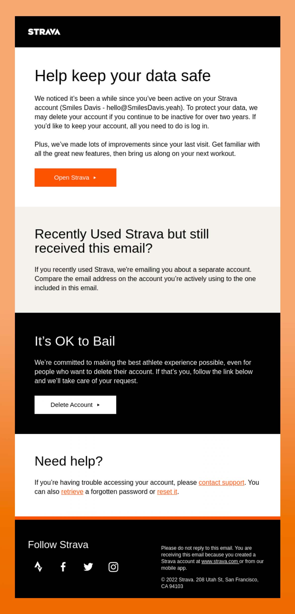
Strava considers a variety of actions a user may want to take, including a help section to contact support and an option to retrieve or reset a password.
The email also factors in other usability considerations, like:
- Clear hierarchy with distinct sections
- Call-to-action (CTA) buttons that are descriptive
- Responsive design so the email scales well on mobile

| “Even when an email is packed with content, subscribers should still be able to easily find relevant, important information and complete the intended conversion. It might mean creating distinct sections in emails, using bullet points, providing descriptive subheaders, using clear CTA buttons—all those good conversion-center design techniques.” |
How email marketers will tap into usability this year
Here’s how we expect to see brands lean more into usability this year in their email designs.
Designing for multi-device experiences
“To make emails more usable, it’s important to investigate what kind of devices and environments subscribers are interacting with your emails in. Many readers are accessing emails on mobile devices and expecting an app-like experience.
While designing emails, make sure the experience and visuals are consistent across devices and email clients. Additionally, consider aligning your email design with the styles in your website, app, or product so subscribers can follow a consistent visual language across different platforms,” says Tiner.
Bringing UX ideas to email design
Email designers may also want to take some notes from user experience (UX) design best practices. This may look like conducting user research and testing, making email content easy to engage with, and putting your subscribers first when thinking about what kind of content to include in an email.
UX design also emphasizes the importance of accessibility and equity, so considering the unique needs of subscribers with disabilities and diverse backgrounds.
“At this point now, accessibility is more of an expectation. People expect to see the kind of things that we consider standards now, for ALT text, accessibility for Dark Mode, providing plain text versions of emails, and having screen readers read emails easily. Making sure these are at the beginning of your design and content considerations—and not the end—is really important,” says Tiner.
Tomlin adds, “The more you follow accessibility best practices, the more usable your email is gonna be. It’s really in your best interest to put accessibility best practices into place in your email code.”
Minimalism
This next trend goes hand in hand with usability: minimalism.
Tiner explains, “Graphic design lately has seen a lot of a resurgence in brutalism—the kind of architectural and graphic design techniques of using very simple, bare bones design. I think we’ll definitely continue to see a shift towards a more minimal design for emails.
In part, I think that it’s due to the shorter attention spans and read times with subscribers as to why we might be seeing this as an industry-level trend.”
While some brands may go for more avant-garde anti-design trends, we expect to see more brands lean further into minimalism with stripped back color palettes (with one or two accent colors), simplified compositions, and generous spacing—bringing simplicity to the inbox.
How to harness the power of minimalism in your email designs
How can brands harness the power of minimalism? Tiner shares:
- Pairing back on the amount of content
- Providing ample negative space to give design elements breathing room
- Creating shorter emails
- Writing concise copy
- Limiting yourself to one or two buttons
- Using select, feature images rather than complex layouts
Examples of minimalism in email design
Let’s take a look at examples from brands applying minimalist techniques to their designs.
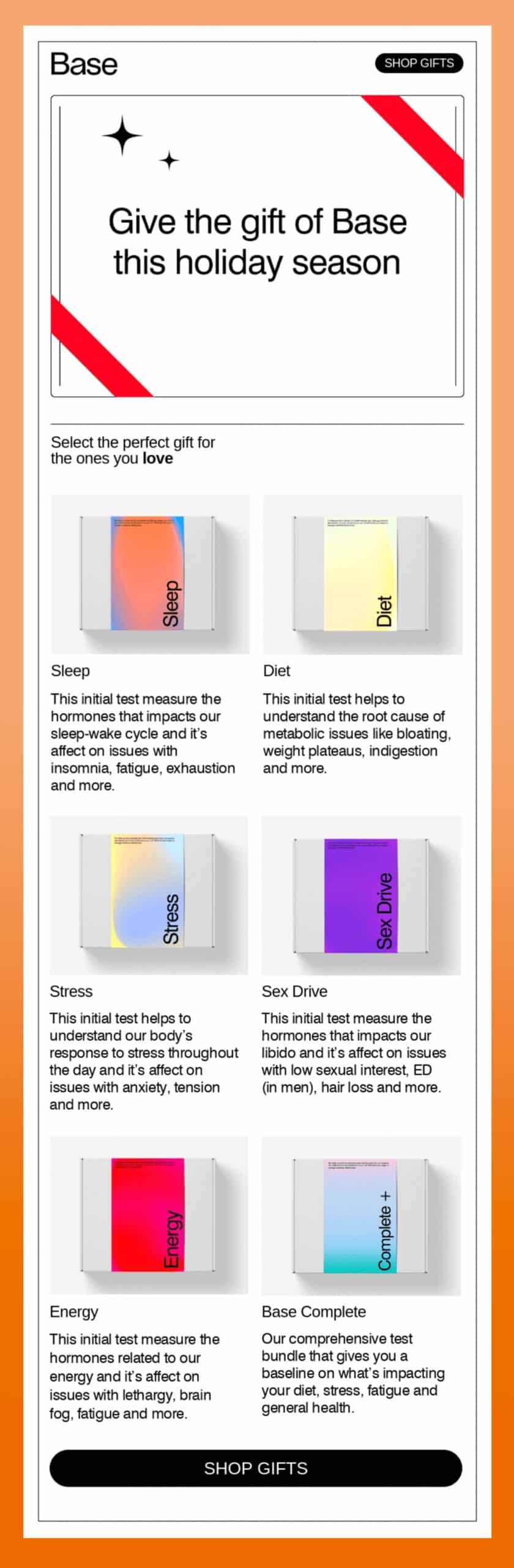
Example 1: Pared-back designs that focus on content
This email from Base uses a limited color palette, letting the email content shine—in this case, product imagery.
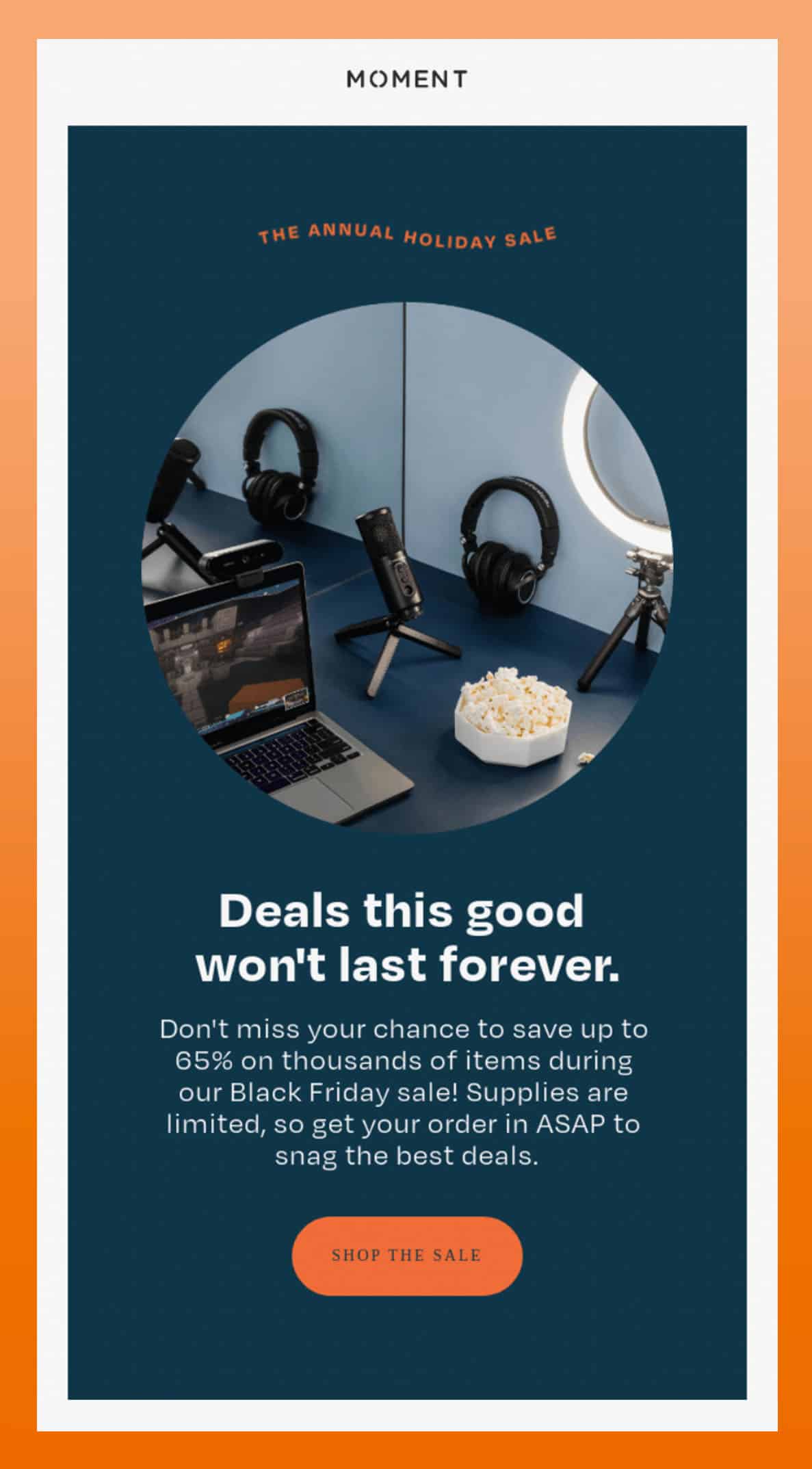
Example 2: Negative space
Moment provides ample negative space to give breathing room for design elements. Negative space (also known as white space) helps subscribers and your customer base quickly digest the message to complete the desired action: shopping their annual sale.
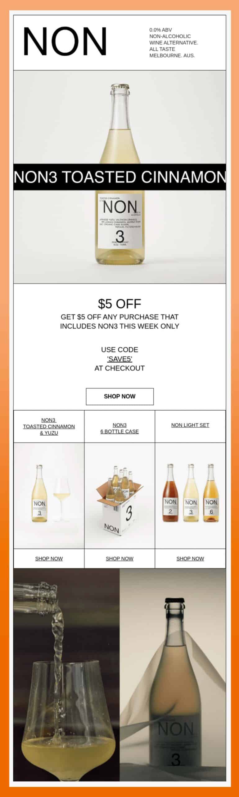
Example 3: Styling with strokes (vs. color)
NON embraces minimalism by styling with strokes rather than lots of color. Each email module is lined, giving the email a clean and concise look.
Shape trends
Most email designs feature a strong sense of symmetry and vertically stacked visual elements. But we’re seeing more email designers utilize interesting shapes to break up their designs or add emphasis to certain sections.
Whether they’re organic, geometric, or abstract, we expect to see them leveraged across our inboxes this year, in the following ways.
- Rounded corners
- Isolated product images
- Collage/overlap
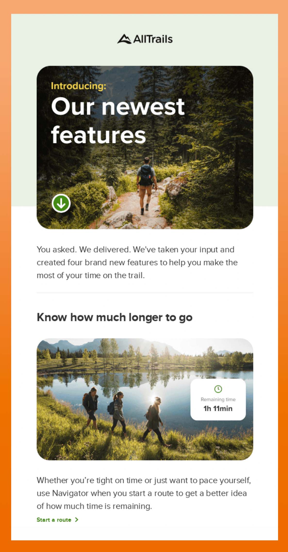
Rounded corners
AllTrails frames their imagery with rounded corners. This creates visual consistency, unifying the different images. It also creates visual interest while not distracting from the copy.
Isolated product images
This holiday gift guide email from Danner features the growing trend of isolating individual images of products. This creates an interesting variety of organically-shaped silhouettes and evokes the experience of online shopping.

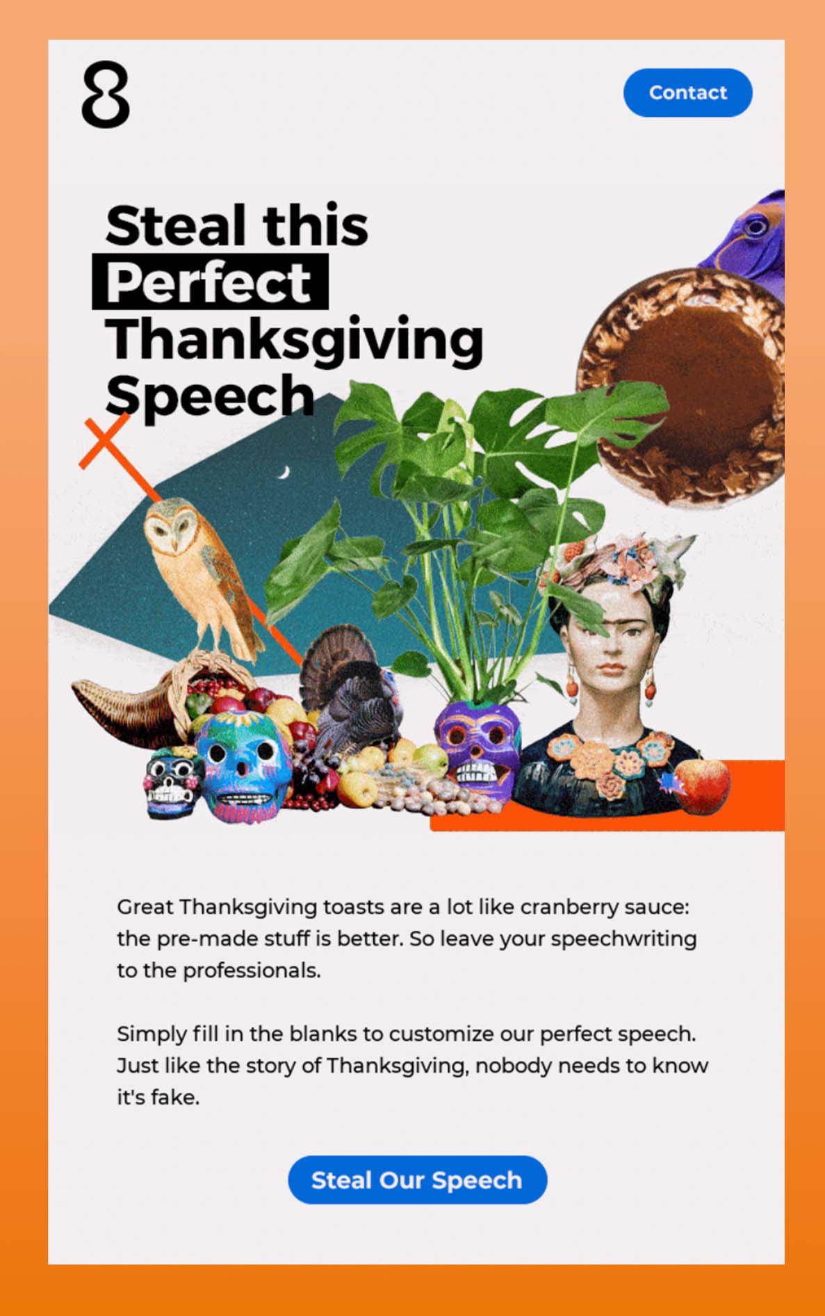
Collage/overlap
A collage combines multiple visual elements to create a new image. Overlapping images allows you to display imagery without as much real estate and can be even more effective—as shown below by 8AM Creative.
Color trends
The use of bold color in email design is an ongoing trend that has grown steadily in popularity over the past few years. We expect to see more of that this year—especially to create high contrast color palettes and striking accent colors.
These colors include:
- Electric green
- Bright yellow
- Tech periwinkle
- Emerald/evergreen
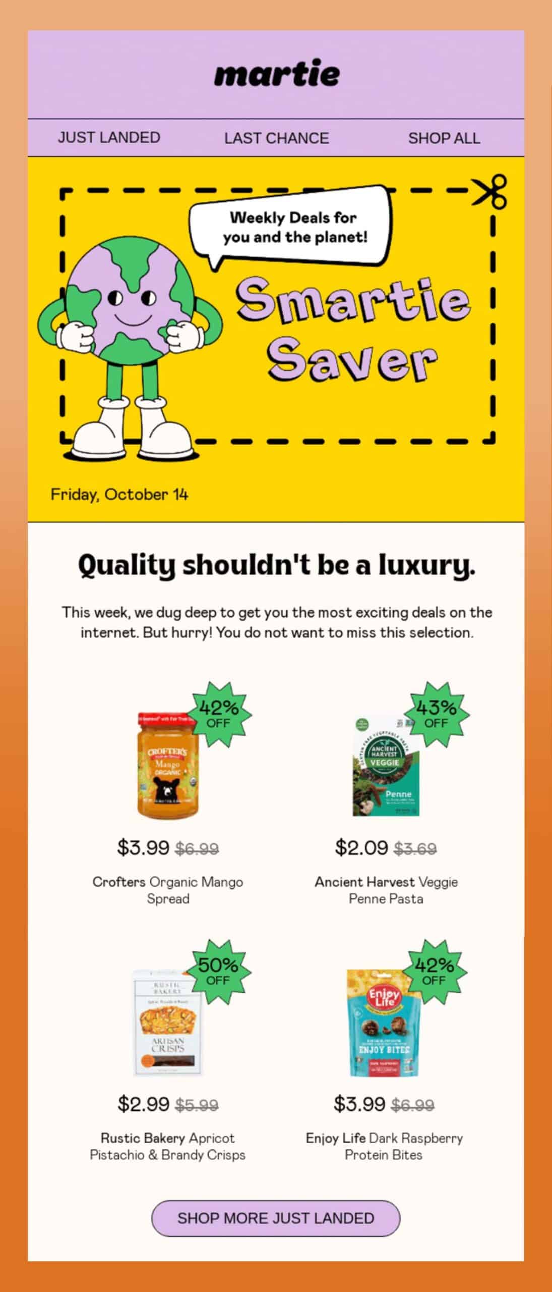
Electric green
Martie uses electric green throughout their email. It not only colors a playful illustration of a planet, but also accents their discount amount, drawing interest to urge subscribers to take action.
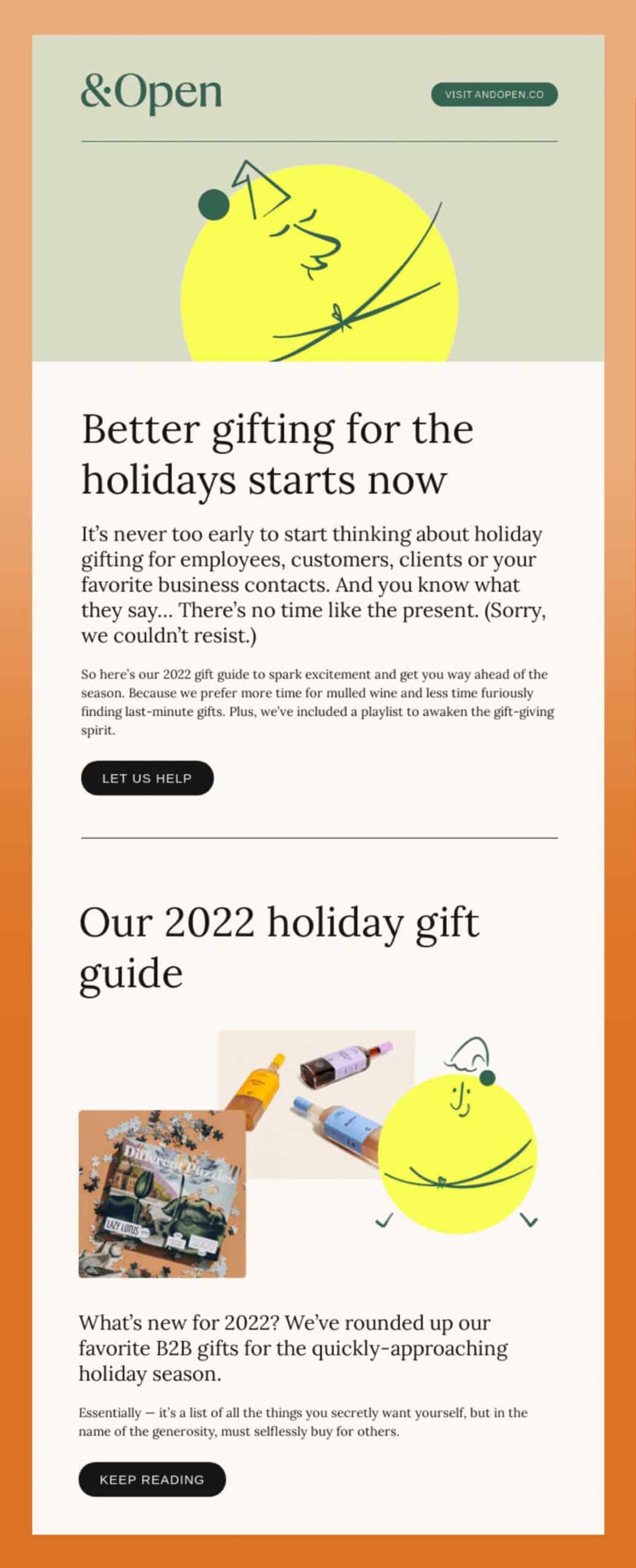
Bright yellow
&Open opts for bright yellow to color their character illustrations, bringing a bit of fun and personality to their email.
Tech periwinkle
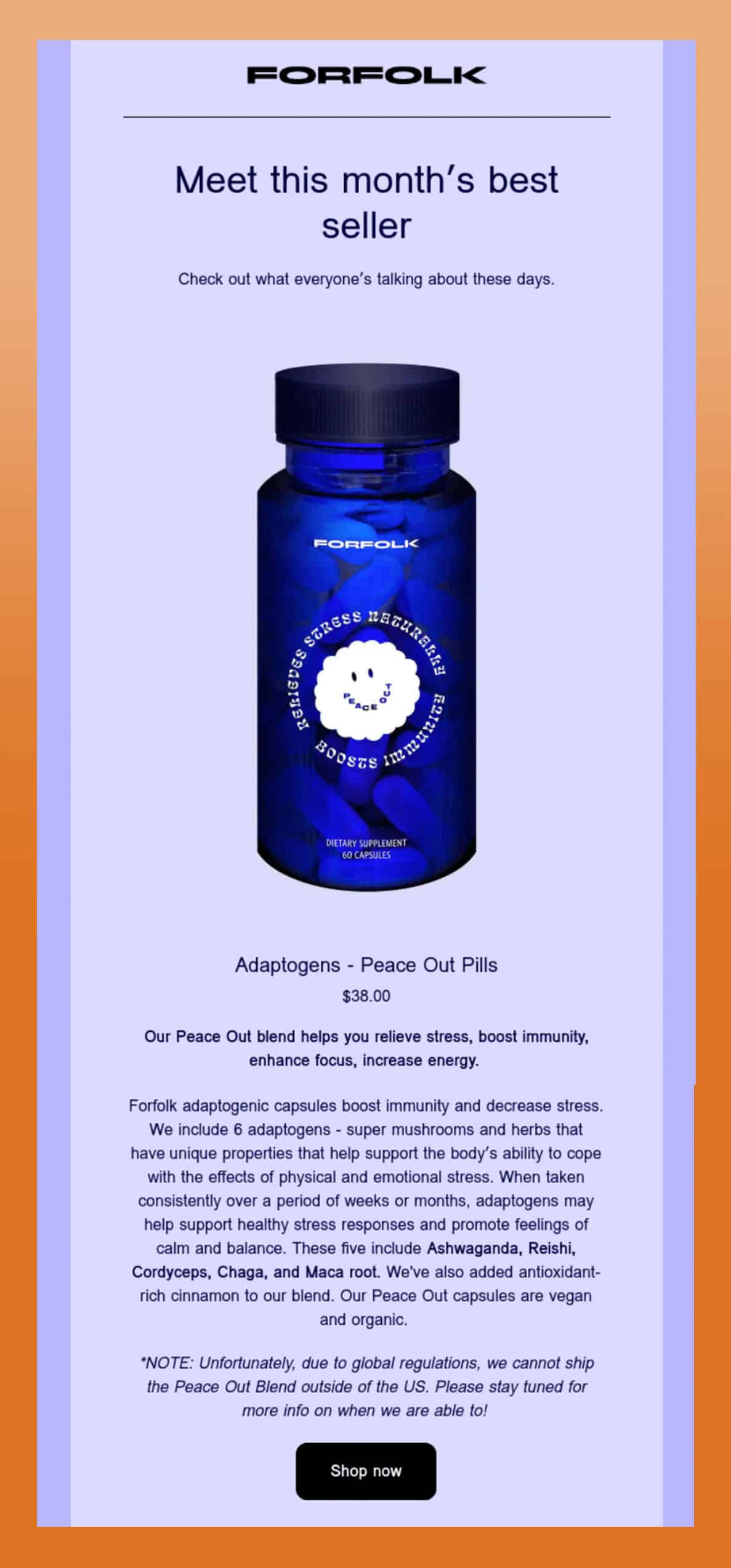
Forfolk leans into tech periwinkle, using different shades in the body and background.
Emerald/evergreen
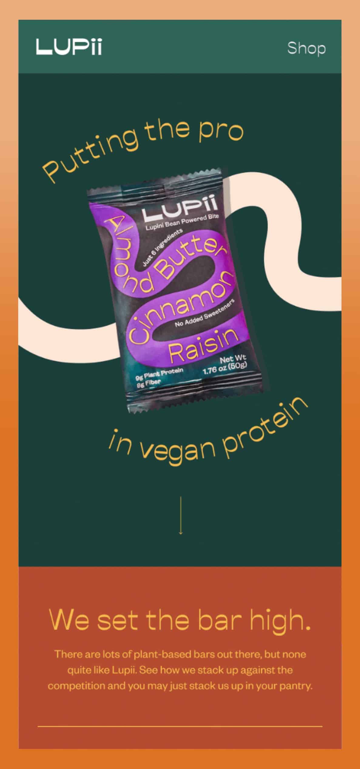
Lupii opts for emerald/evergreen which contrasts nicely with the other warm tones used throughout the email to create an earthy-but-modern aesthetic.
Artificial intelligence (AI)
Our State of Email report found that in 2021, 70% of brands increased email marketing campaign workload while budgets stayed the same. That means email marketers are having to do more with less. As a result, smaller email teams who find themselves strapped for resources may start to lean into AI-creation tools.
Could AI benefit email marketing teams?
There are many ethical and legal concerns around AI-generated images, but as problematic as AI can be, can it help marketing teams that lack designer resources?
For teams limited on design resources (or none at all), AI can take the baseline from “nothing to something better than nothing,” says Beatty. “For somebody who is a designer, it would take it from starting from scratch to starting with something that they can then potentially build on.” Tiner adds, “I know that some designers have also been using AI to create mood boards or brainstorm for jumping off points.”
In terms of practicality, Tiner says, “There is definitely a quality gap. A lot of what’s being created is pixel-based rather than vector-based, which isn’t going to scale really well. It’s going to be interesting to see if this is a method of creating images that actually sticks around or if wanes a little bit, like a fad.”
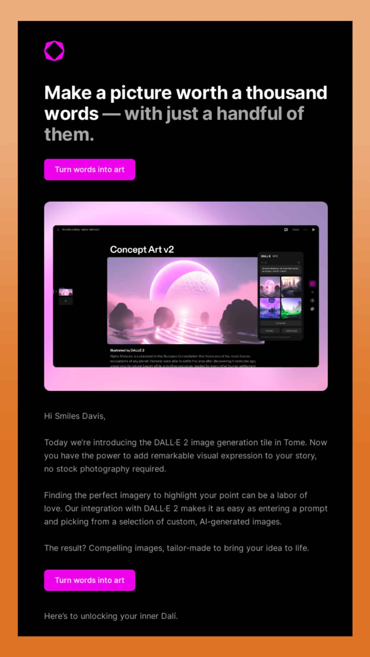
Example: AI generated image in email
While the rise of AI is relatively in its infancy, we can expect to see it being used as a talking point for brands in marketing emails or in the email designs themselves.
“I’ve seen a lot of AI-generated images when there’s a story specifically about AI, or when AI is in the news, or a new tool gets released,” shares Tiner.
Here’s an example from Tome where they highlight their product—powered by AI.
Will you leverage these email marketing design trends?
Having an on-trend email can speak volumes—but only if it’s right for your audience. The key to leveraging design trends is honing in on the ones that align with your brand and goals. Identify what works with your specific industry, team, and resources—and always make sure to test.
Which email design trends do you think we are likely to see in 2023? Let us know on Twitter!
Ensure your designs come across right
Broken emails lead to less conversions. Preview your emails across 100+ email clients, apps, and devices to ensure an on-brand, error-free subscriber experience. Every time.
The info in this blog is 2+ years old and may not be updated. See something off? Let us know at hello@litmus.com.

Kimberly Huang is a Content Marketing Professional.
