Email design is one of the most important parts of your email marketing program. Whether you’re A/B testing a new email template or trying to boost conversions through conversion-centered design (CCD), your emails should be both beautiful and actionable.
Since email design encapsulates every visual element of your email, there’s a lot to understand and test.
This guide explores the email design best practices that should be the foundation of your email design program!
What is the importance of email design in your email marketing campaigns?
Email design is the process of strategizing, creating, and testing your email marketing campaigns’ visual look and email layout. It’s not enough for your emails to be pretty, though—great email design is accessible, resonates with your target audiences, and inspires engagement.
For example, a bold, eye-catching email can lose impact if it’s inaccessible (e.g. using an all-image format that prevents screen readers from conveying the content to visually impaired users). Likewise, impactful content displayed in a hard-to-read font or low-contrast color scheme will fall flat.
“Accessibility is an investment in your ability to retain future subscribers at a higher rate.”
Email design is important because it influences the user experience, which affects email engagement, sales, satisfaction, and loyalty.
What are the key elements of good email design?
Email design includes every visual element of your message, including:
- Header: the visual introduction to your email that often has your logo
- Body content: the font and layout choices of your content
- Call-to-action (CTA): the size, shape, color palette, and location of your buttons
- Images and visuals: which images you choose, how you format them, and where you include them
- Footer: the social links, unsubscribe button, and other legal info at the bottom of your message
- Interactivity: design elements like content accordions or in-email polls that boost engagement
- Mobile-friendliness: what your email looks like across mobile devices
17 effective email design best practices for email marketing
There are a lot of variables in your email design. Consumer behavior is always evolving—same with marketing and design trends—so let’s get straight into best practices.
Tip 1: Create a modular design system for common types of email content
Great email design starts with the content—specifically, the type of content you need to create space for. The design can’t just look pretty; it needs to be functional.
Here at Litmus, we use a modular email design system to create emails using reusable content blocks. Instead of building every email from scratch, a modular design system has commonly used content sections and designs you can mix and match for each campaign.
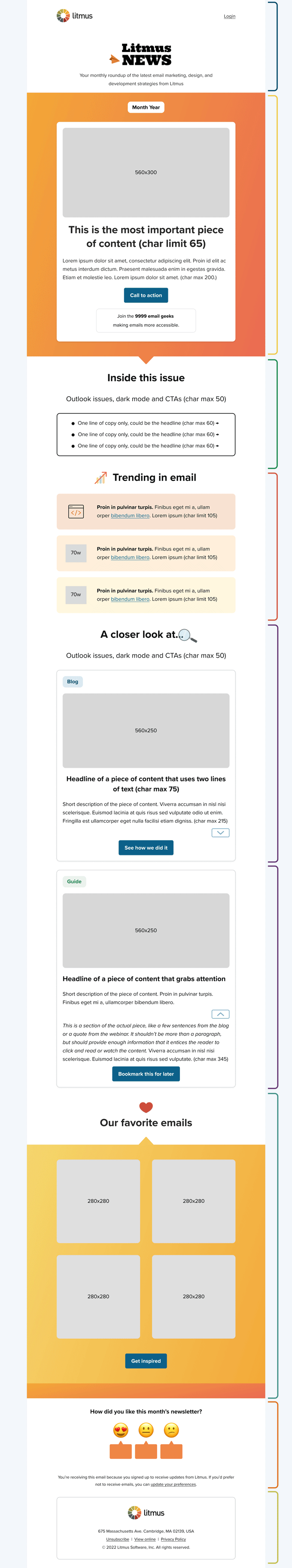
The Litmus newsletter uses modules to build the content
While building modules takes time upfront, it saves you effort in the long-run. Before you build modules, ask yourself:
- Are there sections repeated throughout your emails? For example, create a partial for your footer.
- What brand guidelines do you need to adhere to? Talk to stakeholders about colors, fonts, and spacing between modules.
- Will your emails include video? If so, create a video testimonial block.
- Do you want to include live polls? There are tools for that, too.
“Process-wise, I ask as many questions as possible to get the project’s scope, so I can understand what type of content will be in the email. Especially if it’s something like a new newsletter, I want to make sure I’m asking for everything and the kitchen sink.”
Tip 2: Use a responsive email design
Responsive email design adapts to the device the subscriber opens an email on so that the message looks great across all platforms. You create responsive designs using CSS media queries that detect the screen size and then change the design accordingly. You could create these @media attributes for each new email, but we suggest responsive email templates to make your life easier.
Your next campaign awaits
Choose from a wide range of professionally designed email templates to make your campaigns stand out and save time.

Tip 3: Keep in mind overall consistency
Build an email style guide to create an email experience that matches the rest of your brand identity. Are the elements you’re putting in your email matching your branding guide’s overall tone and style while still respecting email? Pay attention to consistent experiences and imagery across each iteration of your email templates.
Tip 4: Have a flexible email framework
Email design vision and reality don’t always align, so it’s best to stay flexible. Create email templates that have space to add or remove elements, like a banner here or a button there, to adapt to each email brief quickly.
Tip 5: Think of constraints
Creating a beautiful email is a collaborative experience, and knowing your design limits lets you communicate concerns or preferences before you’re too deep into a project. Hannah Tiner, shared:
“We try to include only three to five events in our Litmus Experience newsletter—so I may push back if we want to include more than five or figure out a dynamic way to show it.”
Set limits for details like the number or type of images, interactivity, and length.
Tip 6: Use UX design best practices to inform the email
Your emails are less like a piece of art in a gallery and more like a handcrafted chair. Your subscribers use your emails, not just look at them, so it’s helpful to learn some UX design basics to round out your email design skills.
“As much as I can, I think about the experience of what using the newsletter is going to be—rather than just how it looks to me at a certain ratio. I’m thinking about where it will break and what it will look like in a bunch of the different previews in Litmus.”
At the same time, email is distinct from web and print design. Make sure your email design isn’t trying to do what the web can do, and respect the limitations of it.
Send with total confidence Preview emails in 100+ clients, catch errors, and ensure accessibility. Cut QA time in half.
Tip 7: Design your hierarchy and CTA for the email goal
Every email should have one goal, like getting subscribers to click the call-to-action button to your sales page or increasing the read rate.
Ask yourself: what is the most important information to get across? Make sure you have a clear understanding of the goal of the email. Then, you can use design concepts that service it.
With your goal in mind, you can create a design that makes the process as smooth as possible.
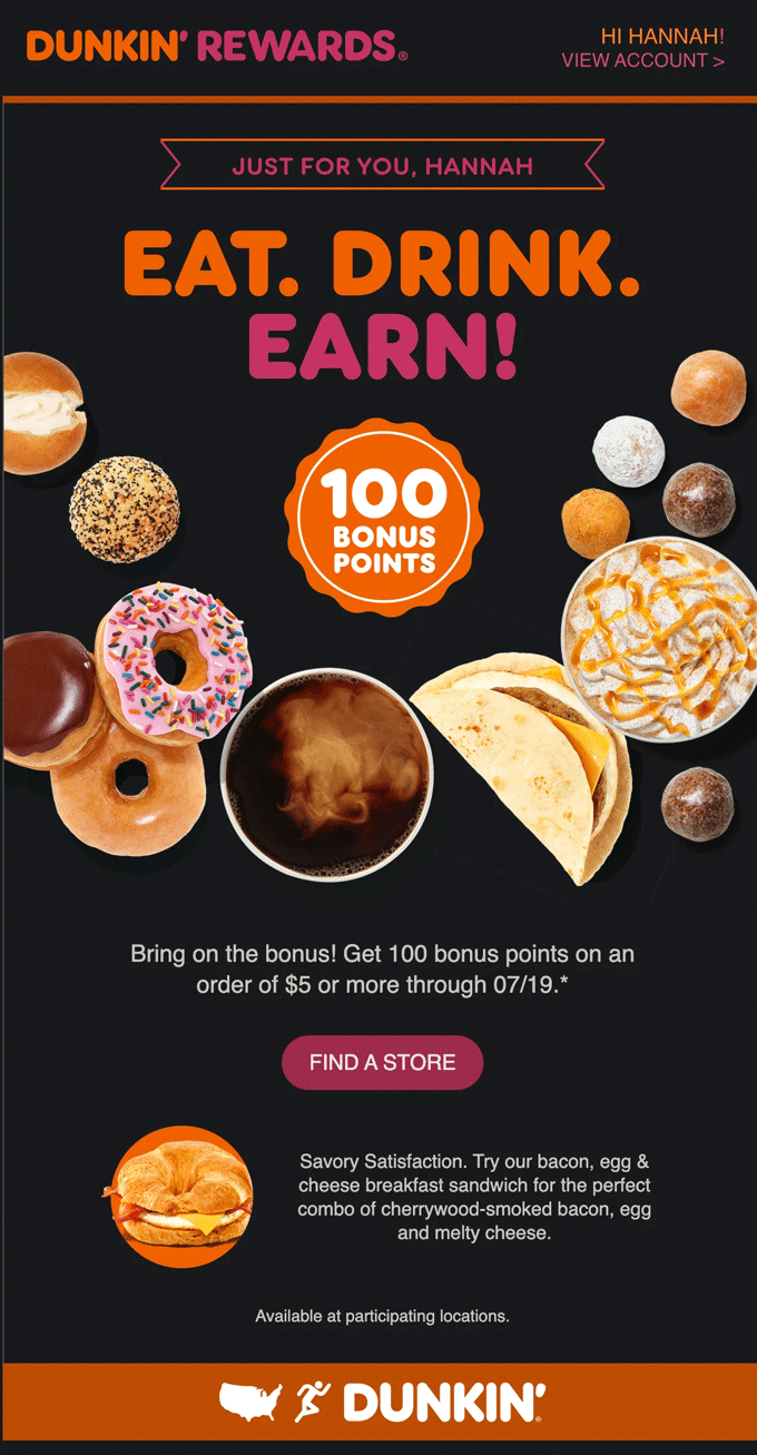
This Dunkin Donuts email is a Litmus team favorite with a compelling hierarchy and CTA button.
Tip 8: Make progressive enhancements along the way
You’ve heard “the only constant is change,” right? That applies to your email designs, too. Design with progressive enhancements in mind and know where to push boundaries and where to play it safe.
Focus on creating a minimal viable product (MVP) that looks clean, functional, and will get the job done. And know that it will render on even the most problematic of email rendering engines.
From there, design for “nice to haves.” Have those stages where you know you can add progressive moments of surprise and delight for your subscribers.
Tip 9: Reduce visual clutter by keeping it simple and focused
Remember to have enough white space in your designs. You want to reduce visual clutter as much as possible, and make sure your email is clear to read and easy to scan. You can even experiment with plain text emails for maximum simplicity.
Tip 10: Utilize compelling visuals
Email imagery catches attention and supports your branding, but you have to use it strategically. Here are a few tips for great email design visuals:
- Use a faux video as a fallback
- Use animated GIFs to add personality (in small doses)
- Avoid image-only emails
- Add texture with background images
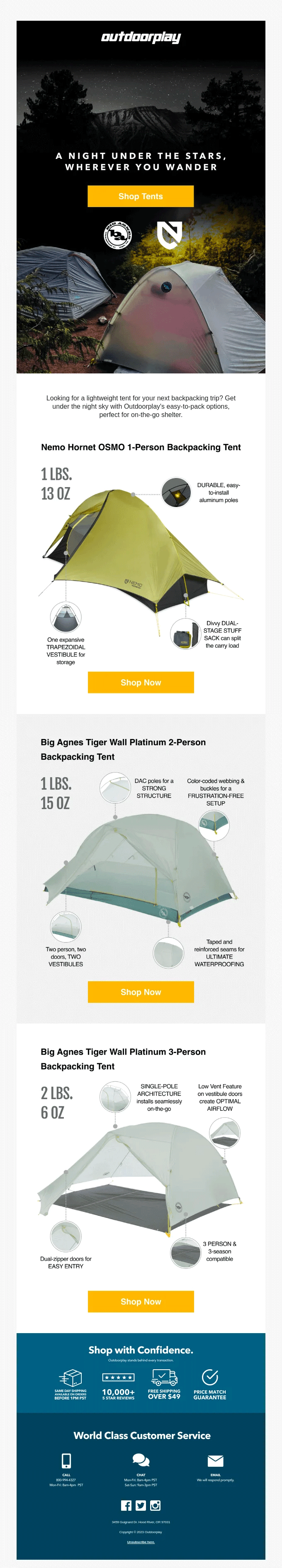
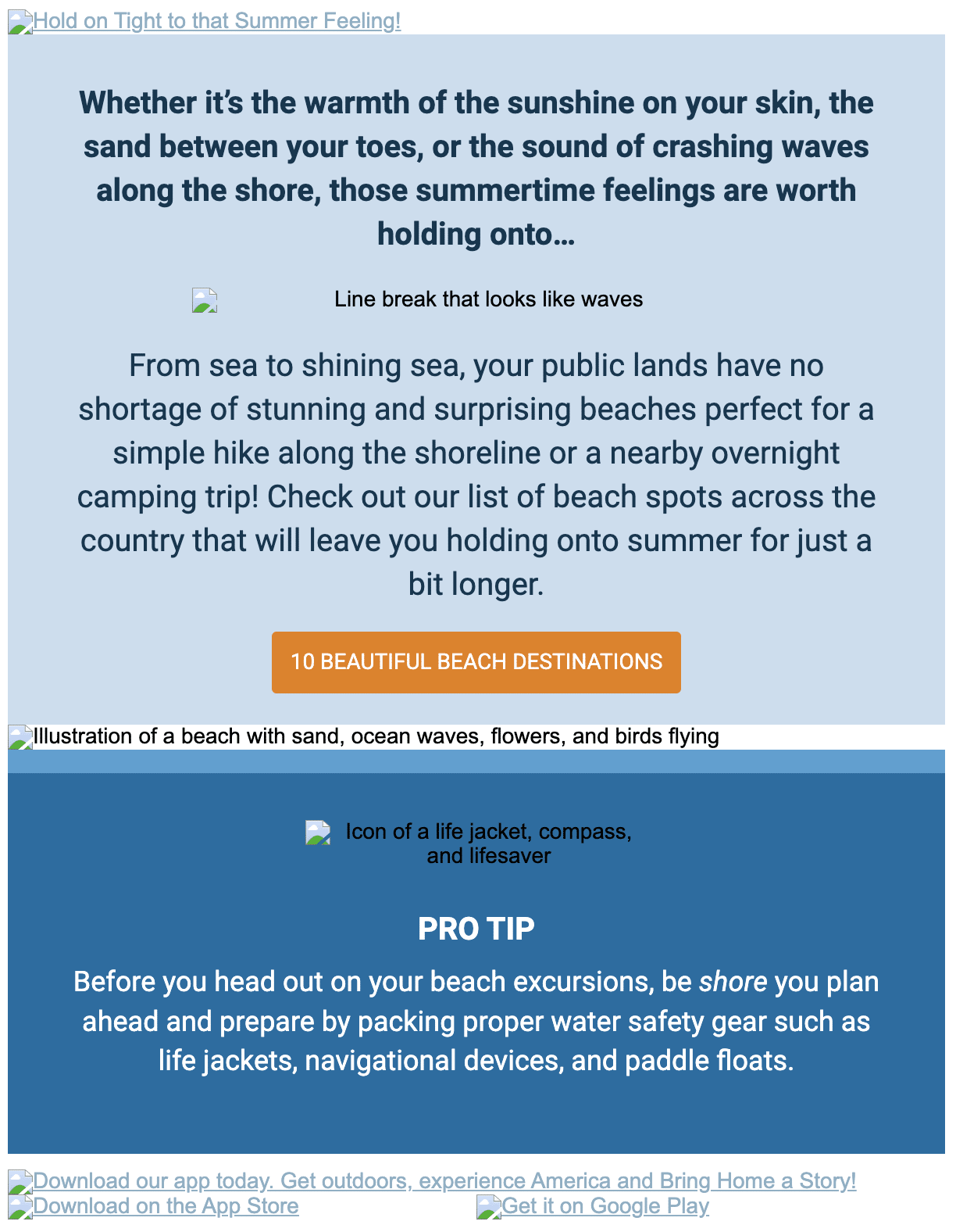
This Outdoorplay email is a great example of a simple (yet visually-driven!) email.
Tip 11: Craft engaging copy
Email copywriting and design work side by side to deliver a message, so you need to consider copy length and placement. Here’s a free framework to keep copy lengths within the ideal range for emails.
Great email copy is compelling and fits in your designs.
Strengthen your email copywriting skills
Learn how to craft compelling email copy that engages your audience and drives conversions.
Tip 12: Pay attention to typography and fonts
Your typography can carry as much visual power as your imagery… as long as subscribers can see it. Web fonts and web safe fonts are your two options for creating live text that looks and performs great.
- Web safe fonts signal the browser to pull in pre-installed fonts on your subscribers’ devices. They’re safe to use, but relying on these widely-available fonts limits your options
- Web fonts render from files you host on your server or an external one, like Google or Adobe. These fonts offer more design flexibility, but there’s a higher chance they won’t appear as you intended in your subscribers’ inboxes
Tip 13: Use descriptive ALT text for images
Email accessibility is non-negotiable, and one way to ensure everyone enjoys your emails is by adding ALT text to images. Your ALT text needs to be short but descriptive so it offers the same experience to subscribers with images turned off or using screen readers.
Recreation.gov describes each image in the email through ALT text.
Tip 14: Make sure your design is scannable
On average, a subscriber spends 8.97 seconds with an email. If your email is long in text, consider your visual anchor points (like html bullet points, headings, etc.) for readability, which can be achieved with color, bolding, emojis, and typography.
Tip 15: Use dynamic content to personalize email design at scale
Dynamic email content—copy and visuals that update within an email based on the subscriber—lets you create personal emails without designing 10 versions. Try adding dynamic product images to abandon cart emails, an add to calendar link for event-based emails, or location-based details for transactional messages.
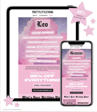
PrettyLittleThing uses Litmus Personalize to automatically adjust imagery based on when a subscriber opens the email.
Tip 16: Provide a visible unsubscribe option
Your unsubscribe button goes at the bottom of your email, but you shouldn’t bury it. Make sure the link is easy to see and click, and consider adding a preference center to let subscribers opt down instead of opt out.
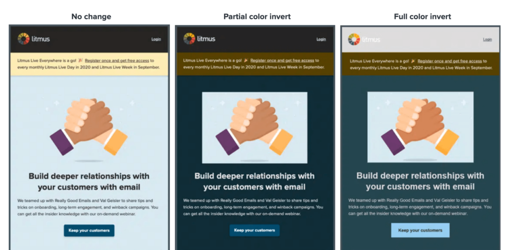
Tip 17: Optimize images for Dark Mode
More than a third of subscribers view emails in Dark Mode, which shows your emails in a darker color scheme. There are three ways email providers render Dark Mode emails, and you can either rely on their methods or code your own color scheme. Optimizing emails for Dark Mode is its own topic, so check out our guide to Dark Mode to get all the juicy details.
Using email analytics to improve your designs
Instead of guessing at how to improve your email design, use engagement data to learn what really works. Here’s how to use email engagement to improve your email design.
Email engagement data
- If engagement drops on long emails, cut content or redesign for brevity
- If image-heavy designs have high engagement, invest in more illustrations and photography for future email marketing campaigns
- If you have a transactional email—like a password reset—that has low engagement times but high click rates, your email is doing its job well
- If your product marketing email has high engagement times but low click-through rates, make the CTA easier to find
Email client data
- If the majority of your subscribers open on desktop versions of Microsoft Outlook, you may need to use more traditional email design approaches and Microsoft conditional comments (MSO).
- If most of your subscribers are opening in Apple Mail (desktop or mobile), you can code for the WebKit rendering engine.
Pro tip: a tool like Litmus Email Analytics can give you advanced audience insights, like read time, device usage, Dark Mode, and more for more informed decision making when it comes to email design.
See what you’ve been missing
Unlock powerful email insights with Litmus Analytics. Track engagement, device usage, and more to optimize future campaigns.
Essential email design tools to use
Specialized tools are key to creating effective email designs, yet our latest research found that many designers still rely on software that isn’t optimized for email’s unique demands. For example, Adobe Photoshop, while powerful, wasn’t built to handle the dynamic and interactive nature of modern email.
Instead of viewing email as a static combination of text and images, consider it a responsive layout made up of adaptable code components. To bring this vision to life, it’s important to choose tools specifically designed for the unique needs of email design.
Top email marketing design tools
Let’s explore the design tools that make it all possible—starting with the most popular email design tools:
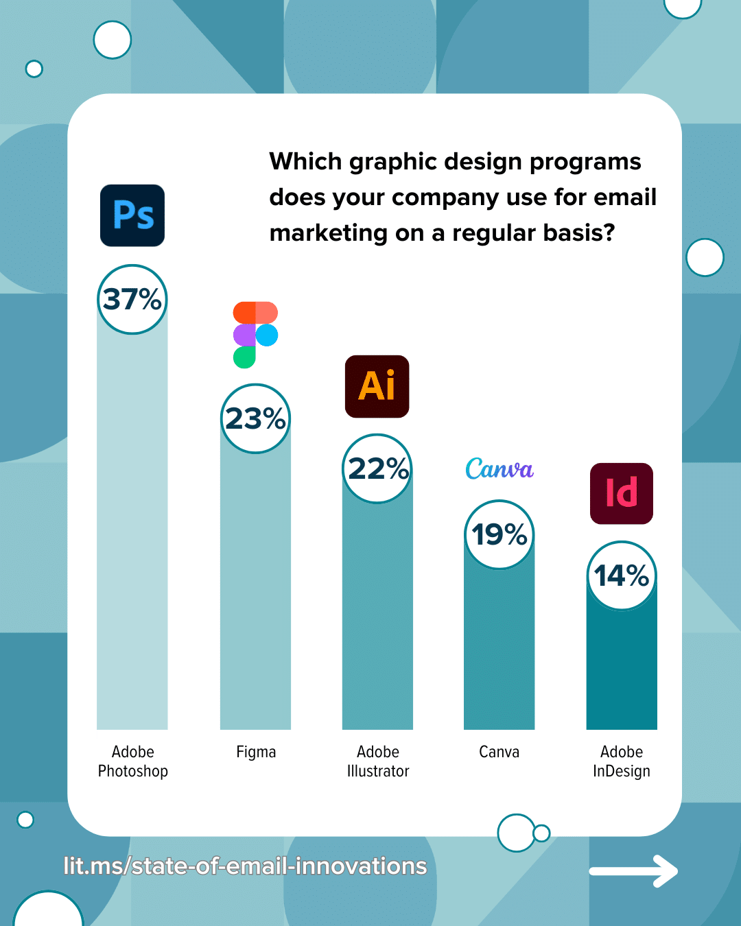
- Adobe Photoshop: 37%
- Figma: 23%
- Adobe Illustrator: 22%
- Canva: 18%
- Adobe InDesign: 14%
Coding with email builders
Our data shows that the most common method for building emails is reusing and modifying code from a previous email. However, the preferred approach is leveraging a library of standardized components, snippets, or partials for greater efficiency and consistency.
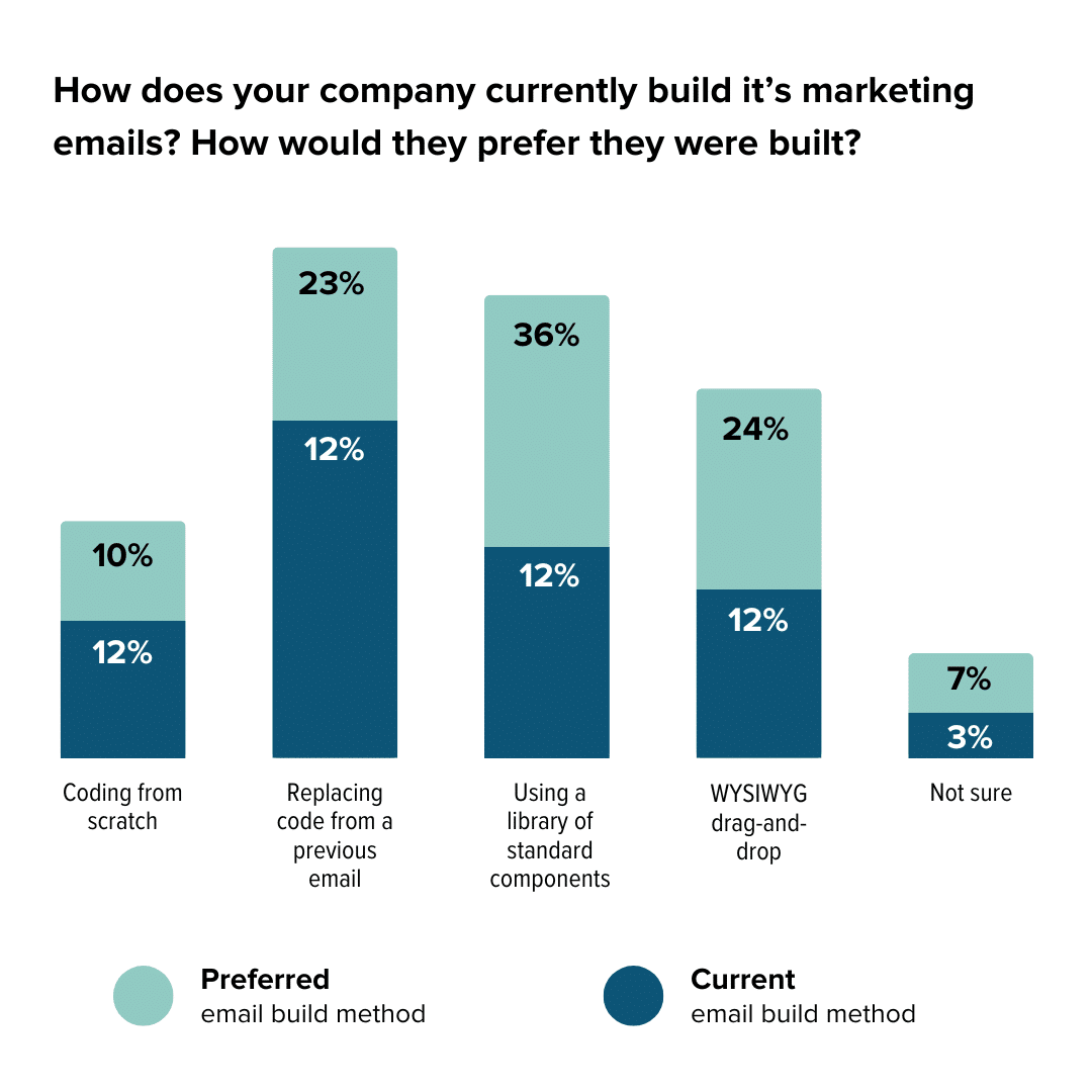
Our recommendation? Opt for a drag-and-drop builder (Litmus Builder is our email builder of choice) and lean on email templates to streamline your process. Pair that with an email design system and you’ll have everything you need for success.
“Ever since we started using a modular design system, my email production time has been cut down significantly. Emails that used to take me hours, now can be done in half the time! Combining the modules that I created with Litmus Design Library has only increased my productivity and now I can create some emails in as little as 10 minutes!
P.S. I know this quote sounds totally marketing-y and corn-y but it’s 100% true. I would be lost without my modular design system.”
Put these tips into practice with testing and optimizations using Litmus
We leave you with one final email design tip—test everything. Your subscribers (and you!) deserve to see your emails exactly how you worked so hard to achieve, and a few minutes of testing ensure everything is in its place.
Still not sure where to start? Check out our ultimate email checklist to get an in-depth walkthrough on our best tips for email building, from design, to copy, and beyond.
Design emails in record time with Litmus Builder
Create on-brand emails quickly with our email builder. No HTML skills? No problem. Test as you build. Let’s start building!
The info in this blog is 2+ years old and may not be updated. See something off? Let us know at hello@litmus.com.

Kimberly Huang is a Content Marketing Professional.
